TRIEC: Voices For Change
Brand Design, Naming & Awareness Campaign
April 2023
We worked closely with the TRIEC’s team (Toronto Region Immigrant Employment Council) to brand and launch a new campaign series. IS Design Labs project managed the creative development, copywriting, and communication deliverables in close coordination with the TRIEC team with the goal to engage employers, spark their curiosity, and change their hearts and minds towards building inclusive practices.
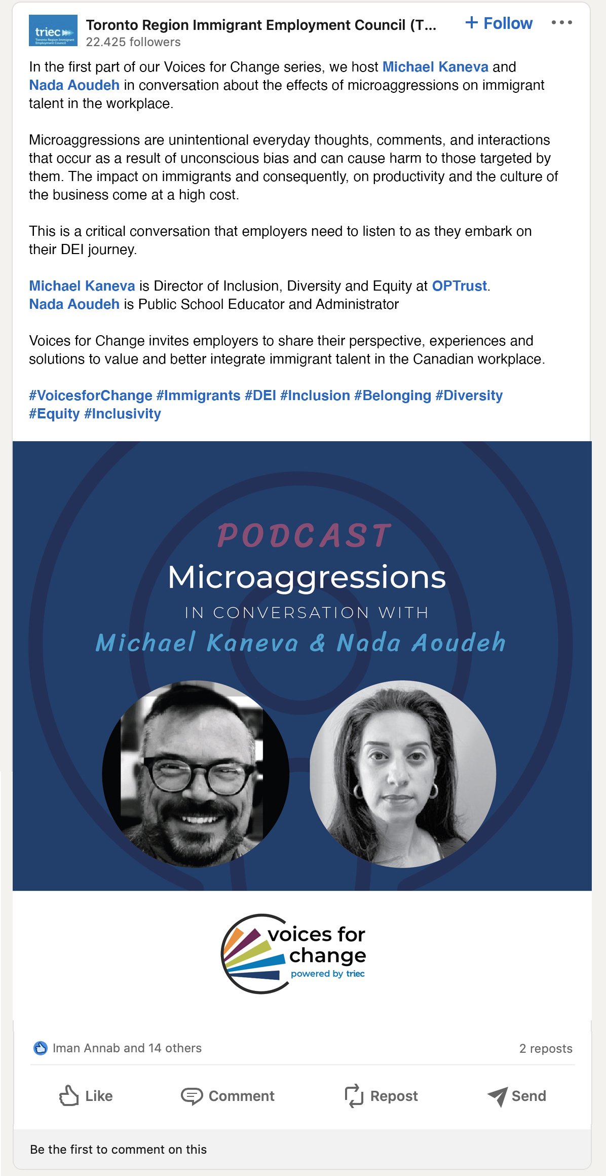
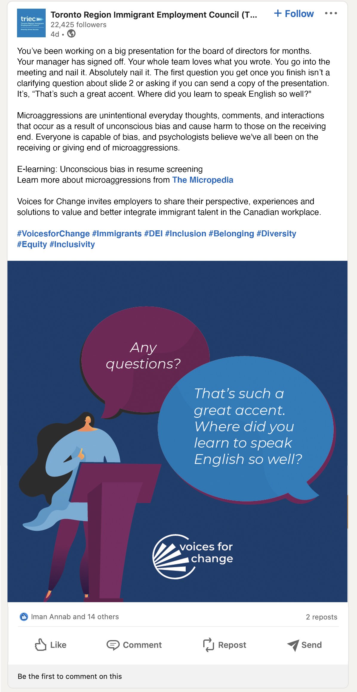
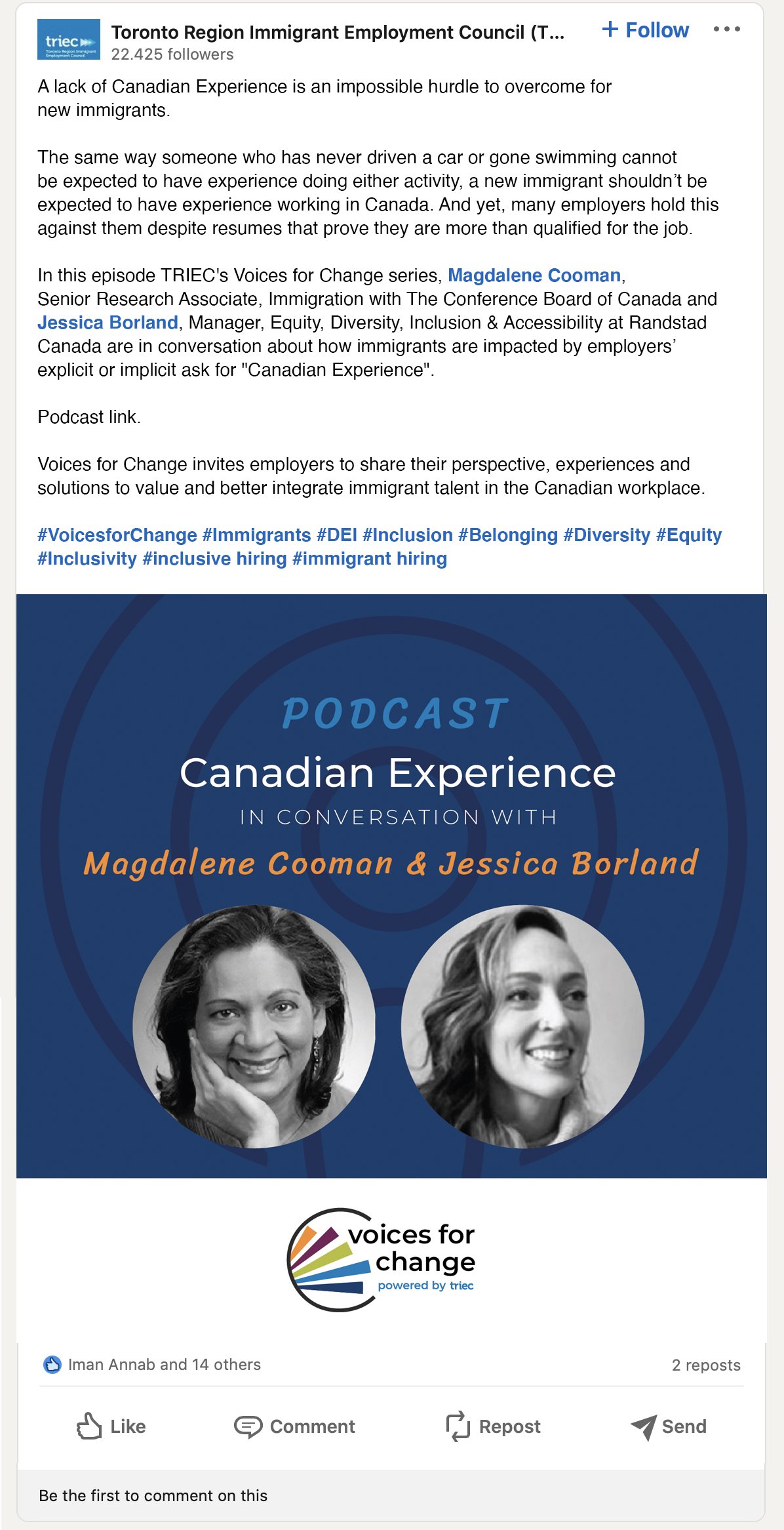
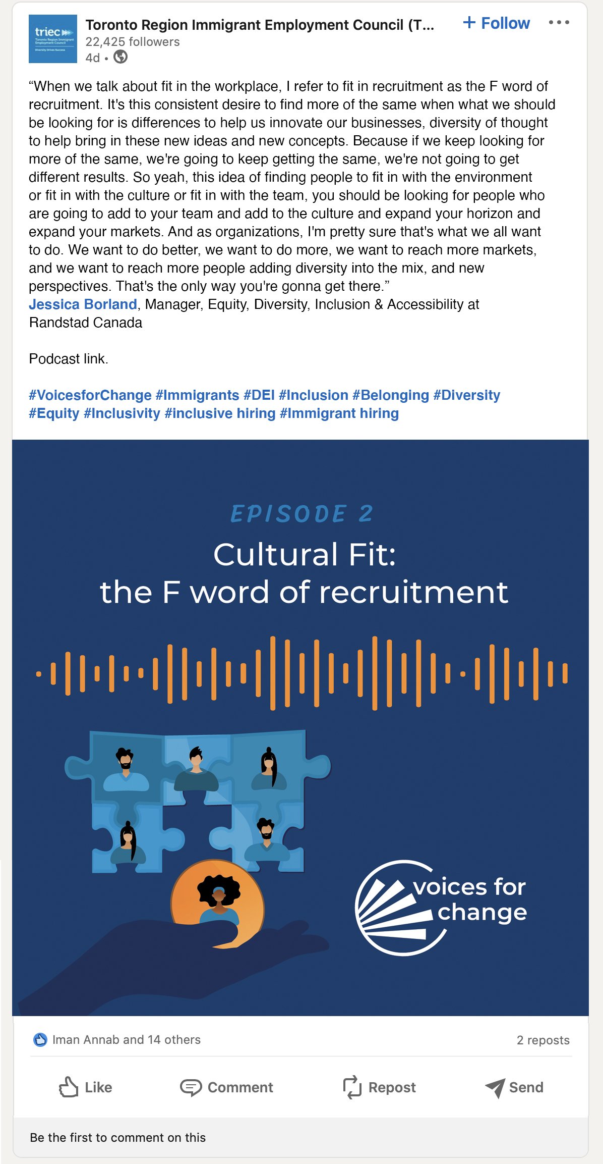
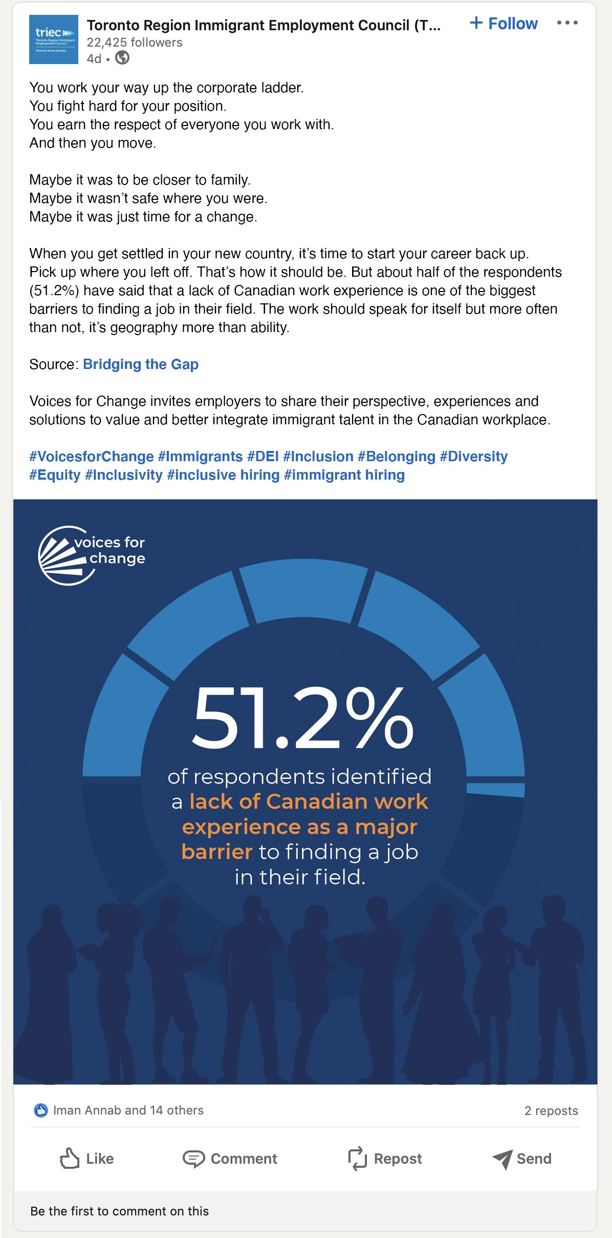
The first chapter in the campaign was inspired by TRIEC's 2022 Bridging The Gap report. The content for this campaign was enriched by the addition of a podcast episode focusing on microaggressions in the workplace.
The focus of our engagement was on creating a distinctive brand, coming up with a name, and rolling out a marketing campaign with various communication vehicles all with a consistent look, feel, and tone for the first three chapters in the Voices for Change project.

ABOUT
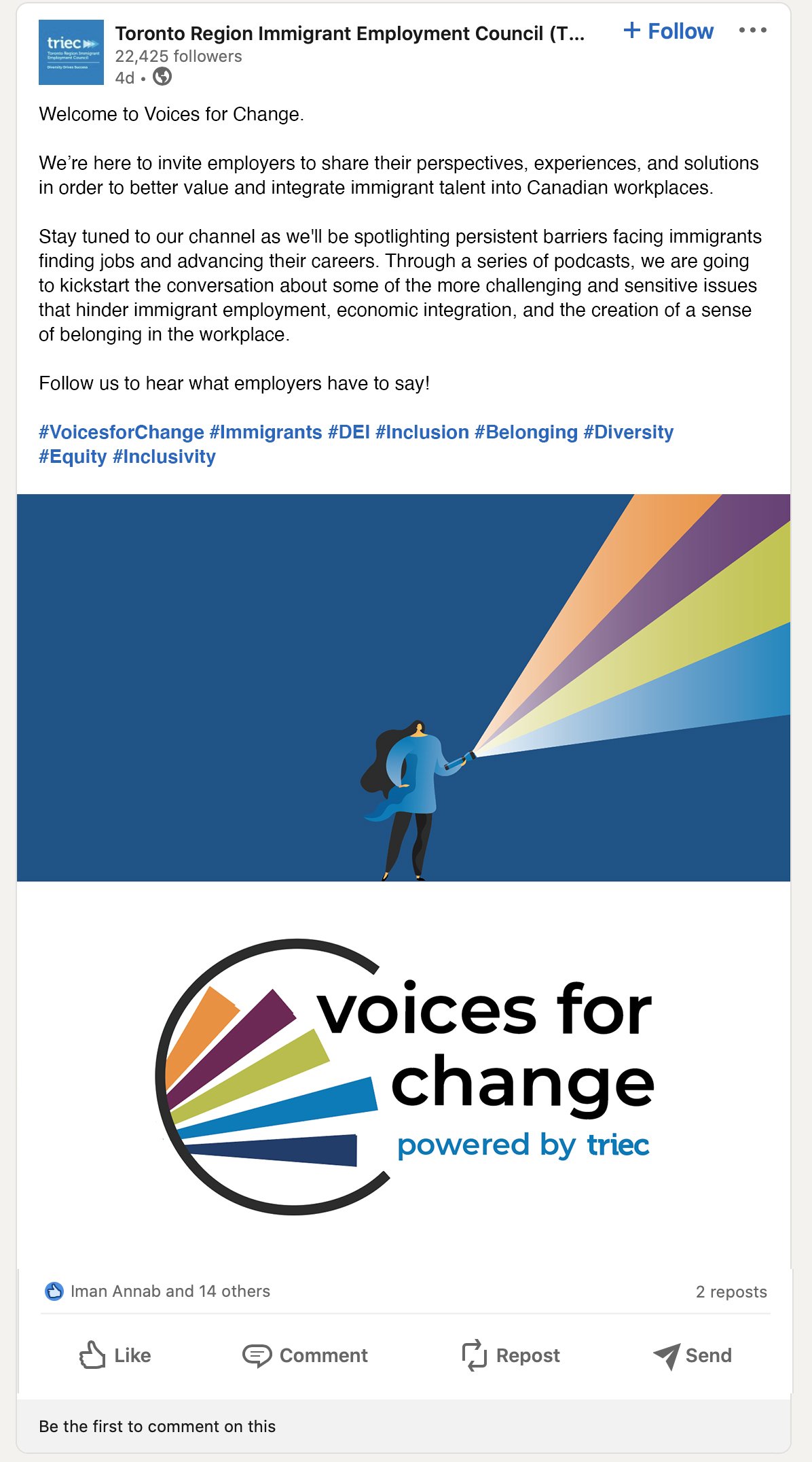
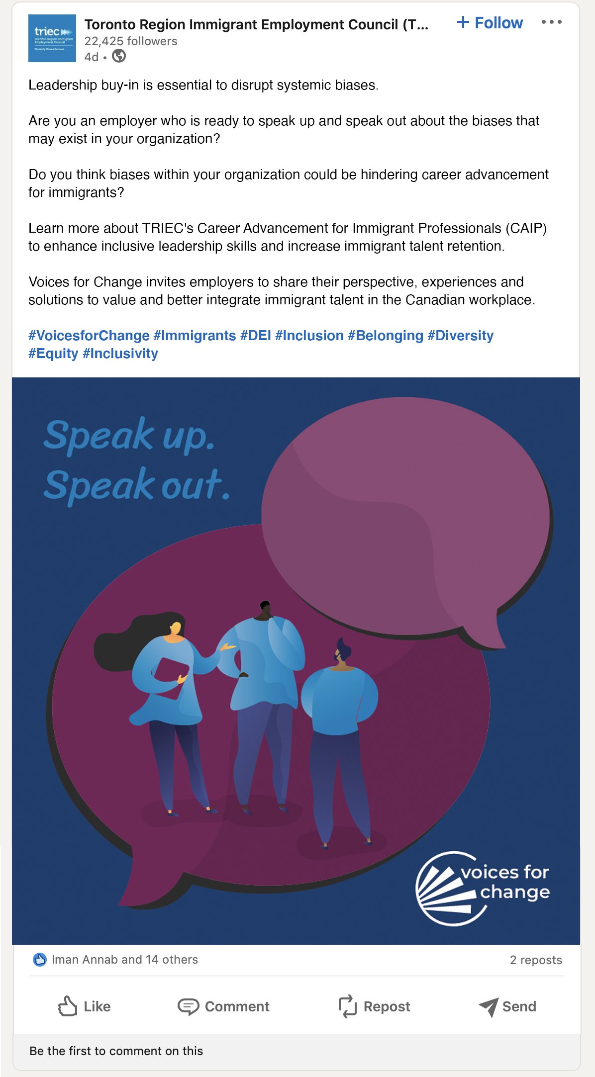
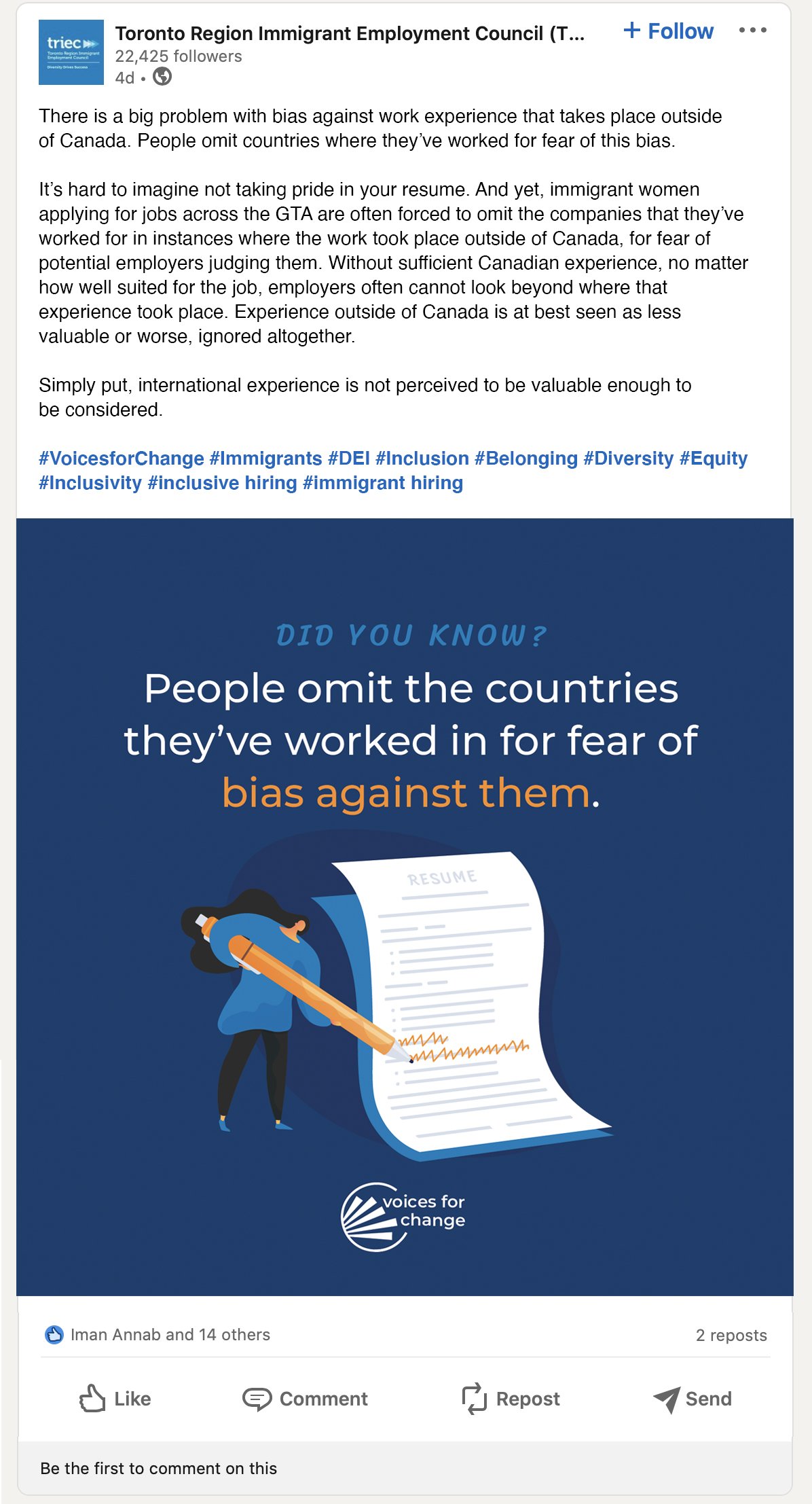
‘Voices For Change’ is a TRIEC project that invites employers to share their perspectives on valuing and better integrating immigrant talent in the Canadian workplace. Through data, stories, a series of podcasts and other activities, Voices for Change aims to kickstart a conversation about some of the more challenging issues that hinder immigrant professionals from finding skills-commensurate employment, advancing in their careers and having a sense of belonging in the workplace.
Brand Identity and Brand Standards
Our first task was to create a unique brand which still related to the parent company TRIEC. The visual identity leads with a circle, a shape known to symbolize unity and infinity. Yet, this circle is not a closed loop, not a done-deal. This symbolically represents that there is space for change and inclusion. The circle’s opening looks like the letter “c” for change. Inside the circle shootout dynamic rays of colour, representing the many topics that will be discussed. The wordmark interrupts the circle, with the writing set in TRIEC’s sub-headline font, the clean and simple Montserrat is a blank slate. Furthermore, all letters are lowercase to make this initiative more easily approachable.
Colour is a key component of the Voices for Change visual identity, and the colour palette help tie this brand back to its parent company - TRIEC. Led by honesty, trust and care, the palette is accented by optimism and empathy.

Marketing Campaign Visuals
The campaign vehicles’ focus was social media as well as a press release. To reach employers and hiring mangers we focussed on LinkedIn but also used the content for Instagram and Facebook. Posts included interesting statistics, anecdotes, podcast sound bites, quotes and other engaging content pieces.