
Qunubu Cannabis Franchise
Concept Design, Brand Design, Brand Standards
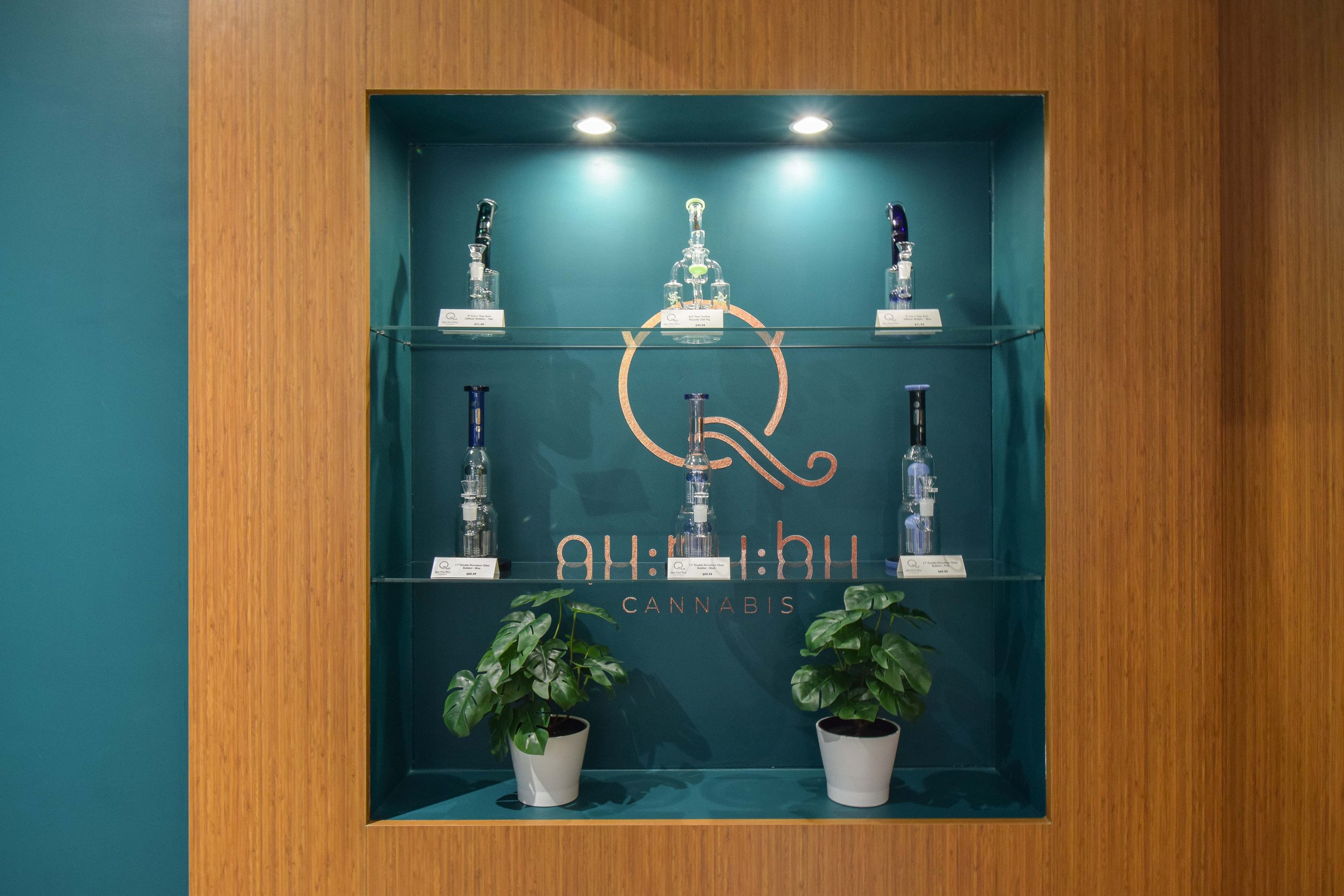
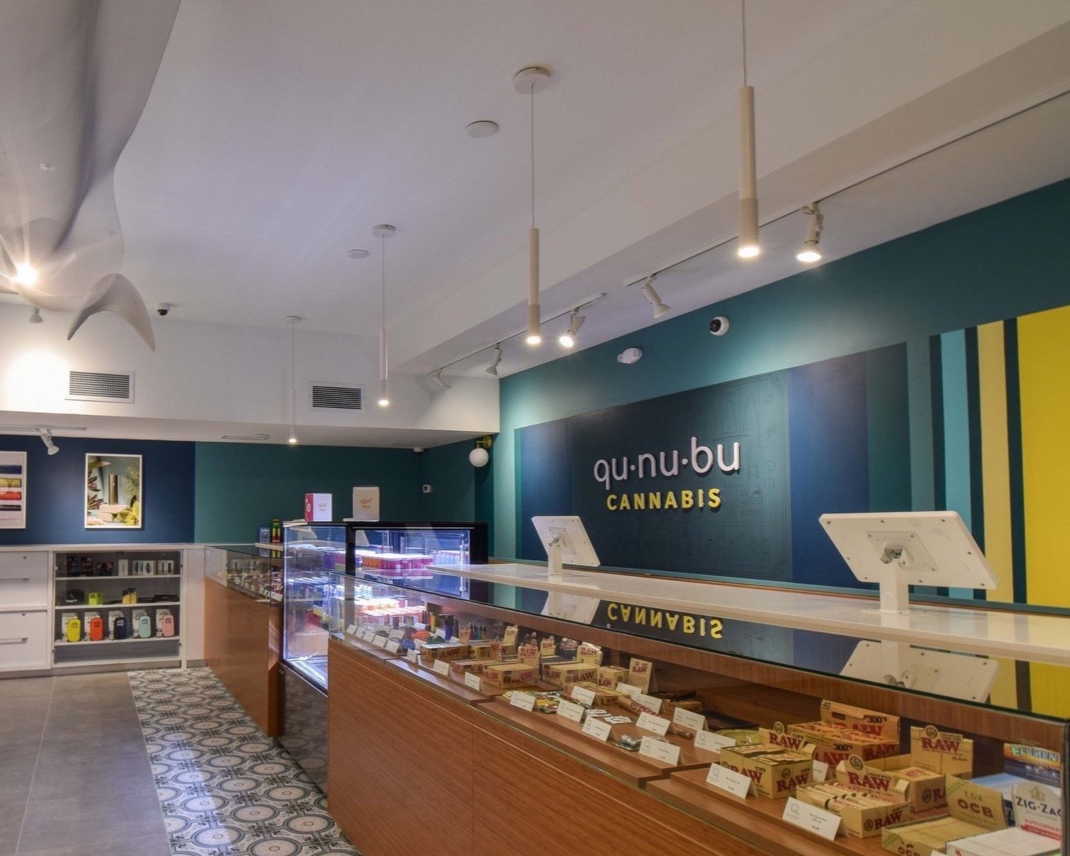
Environmental Graphics, Signage, & Art
Gold Winner of Indigo Design Award 2021 - Branding of CBD & Hemp

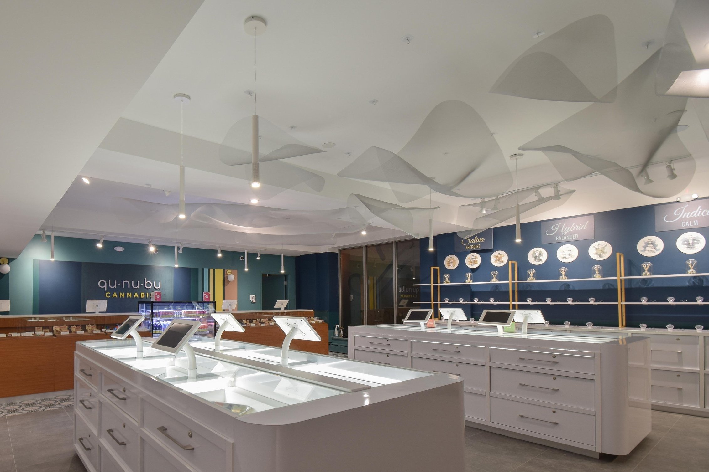
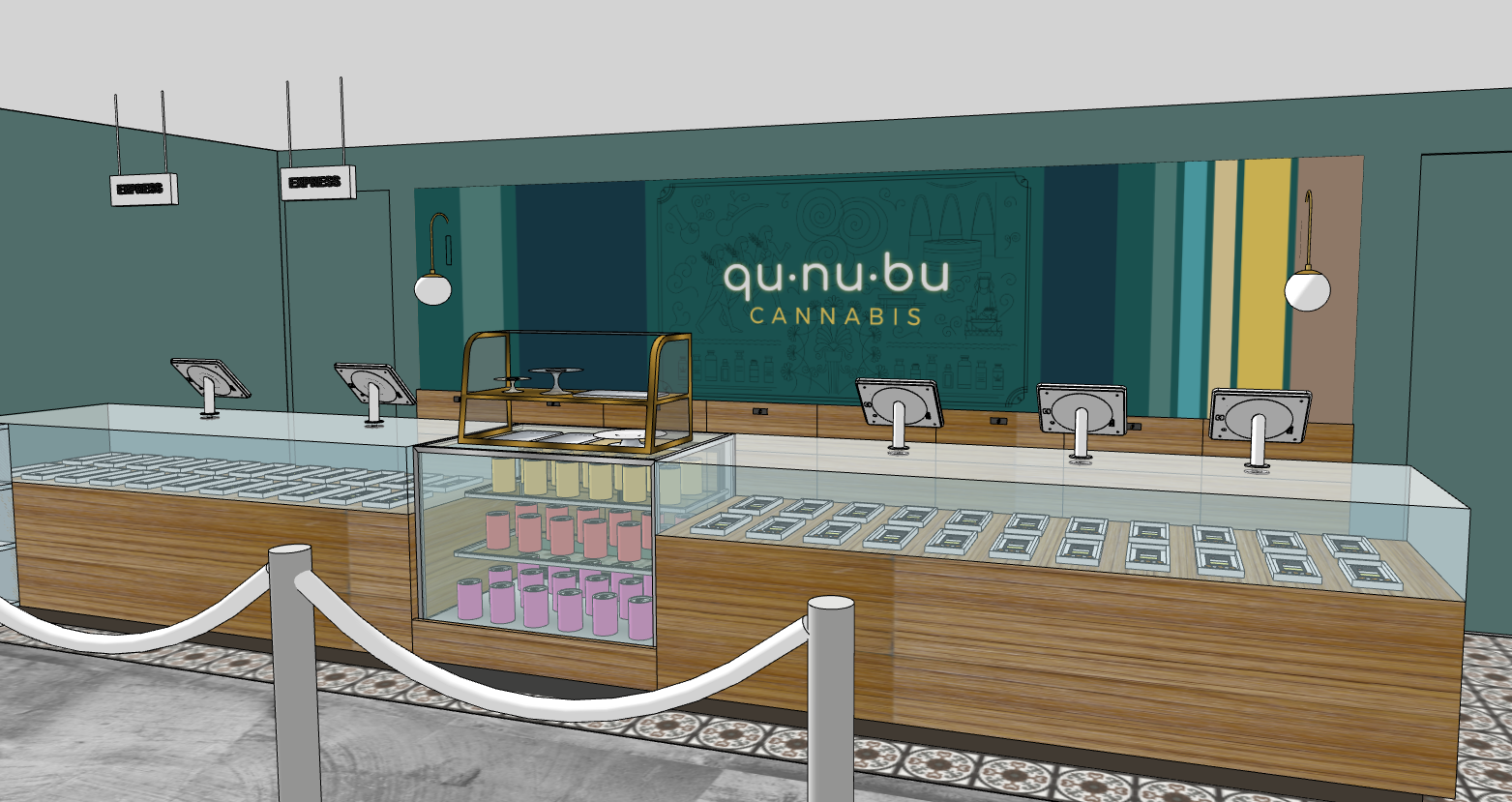
Qunubu, the origin of the word cannabis, in ancient Assyrian means “way to produce smoke.” Following the name, the brand was positioned as embedded in history and knowledge. Symbolizing the self, wholeness, and perfection, the visual identity is based on a circular shape. The flowing smoke swirls signify moments of recreation and a break from the daily hassle. The welcoming and rounded wordmark of Qunubu Cannabis is laid out in an organized way with syllable breaks to ensure ease of pronunciation while displaying a sense of education. Furthermore, through the use of balanced colors, modern design elements, environmental graphics and an earth palette of finishes, the store radiates comfort and inclusivity. Along with that, it also serves to educate patrons about the plant through its interactive kiosks and displays. Qunubu; a brand designed for individuals who value professionalism with expert services within a practical cafe-inspired setting.
Watch a summary video here.
IS Design Labs combined design powers with Black Bloom Studio for interior design and GTA General Contractors for construction.

Brand Applications


Environmental Graphics, Signage and Art

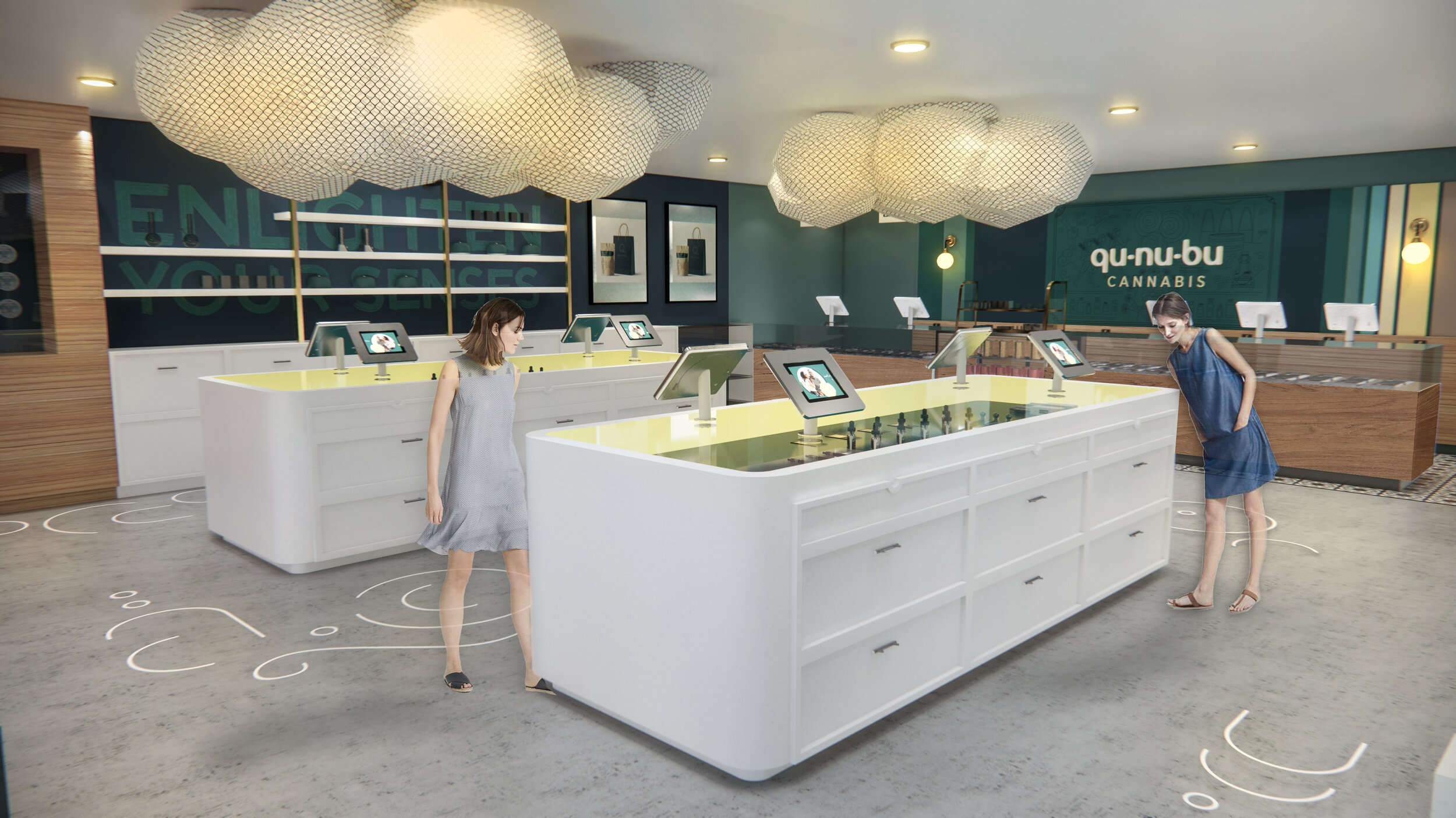

Space Design (Elevations)

Statement Wall Graphics & Signage

Interior Elevation