OrgBalance
Basic Visual Identity & Applications Package
December 2021
We worked with a business consultant to create a visual identity package for OrgBalance - an educational community training leaders.
After establishing a basic brand strategy, a statement of differentiation was crafted and we defined the following key guiding principles: community, journey, simplicity, experiment.

About the Visual Identity
With a friendly, communal, fun style, this visual identity symbolizes the coming together of separate wholes to create new ideas. The rounder corners and friendly demeanour help attract people and speaks of teamwork and community. A modern, simple, sans-serif font is used for the wordmark to reinforce the concepts of clarity and ease of understanding.
The colour palette is lead my creative, friendly orange, energetic and optimistic yellow as well as two blues. The lighter blue evokes a free, light and youthful vibe, while the deeper blue gives a truth worthy and strong backbone.
Basic Brand Standards
Below is a the basic, one-pager brand standards document created for OrgBalance.

Website Flow & Visuals
Below is a simple website UI - with on-brand flow and visuals ensuring the brand grows with consistent visual language around it.

Additional
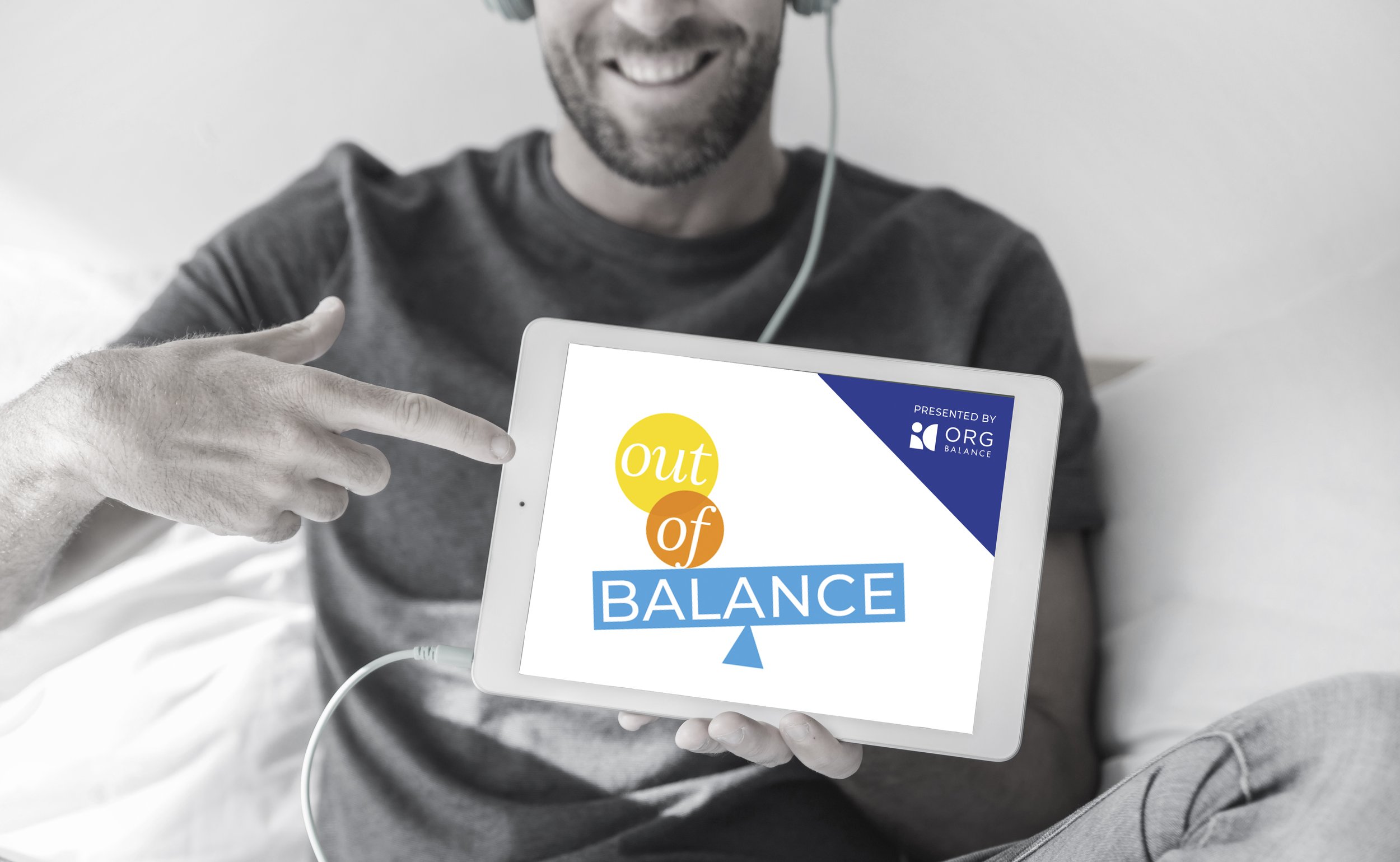
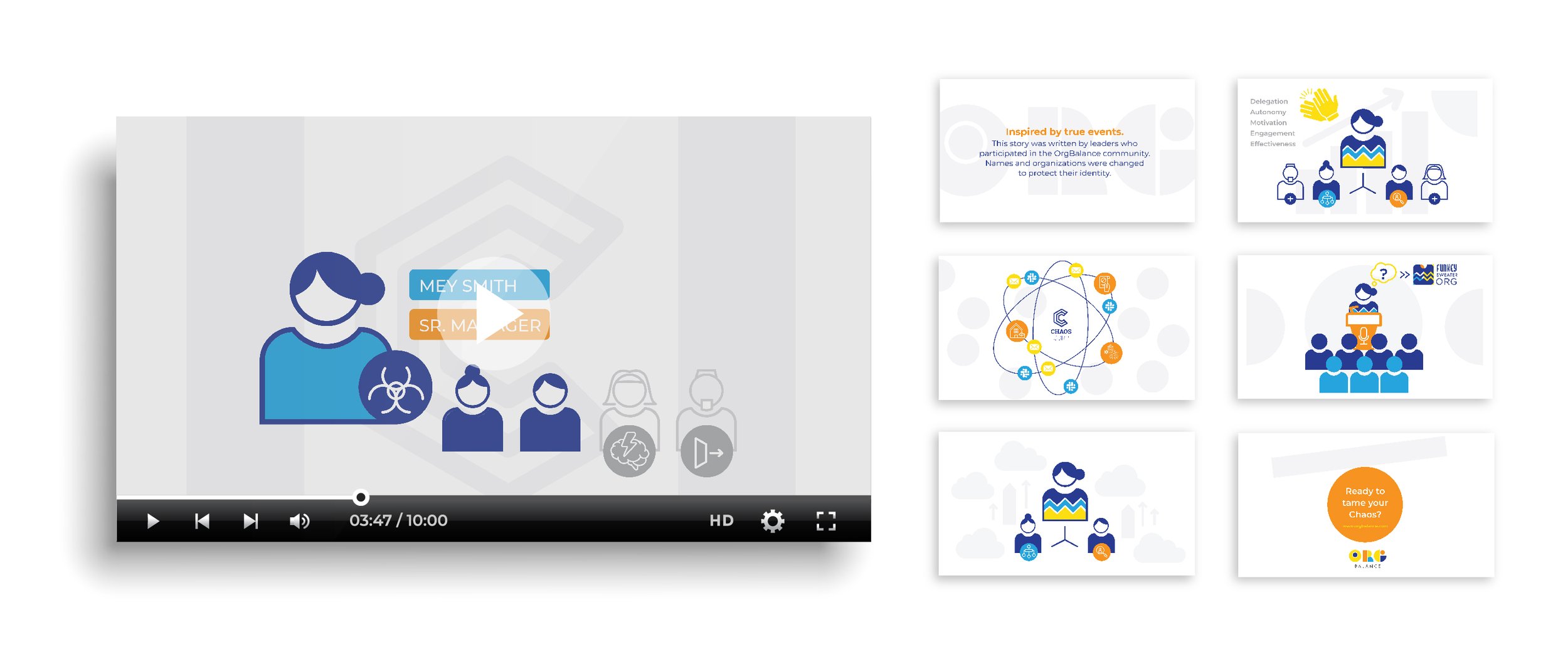
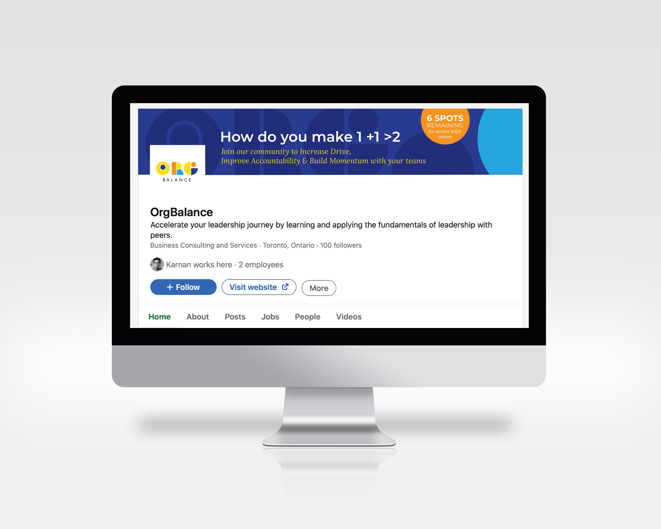
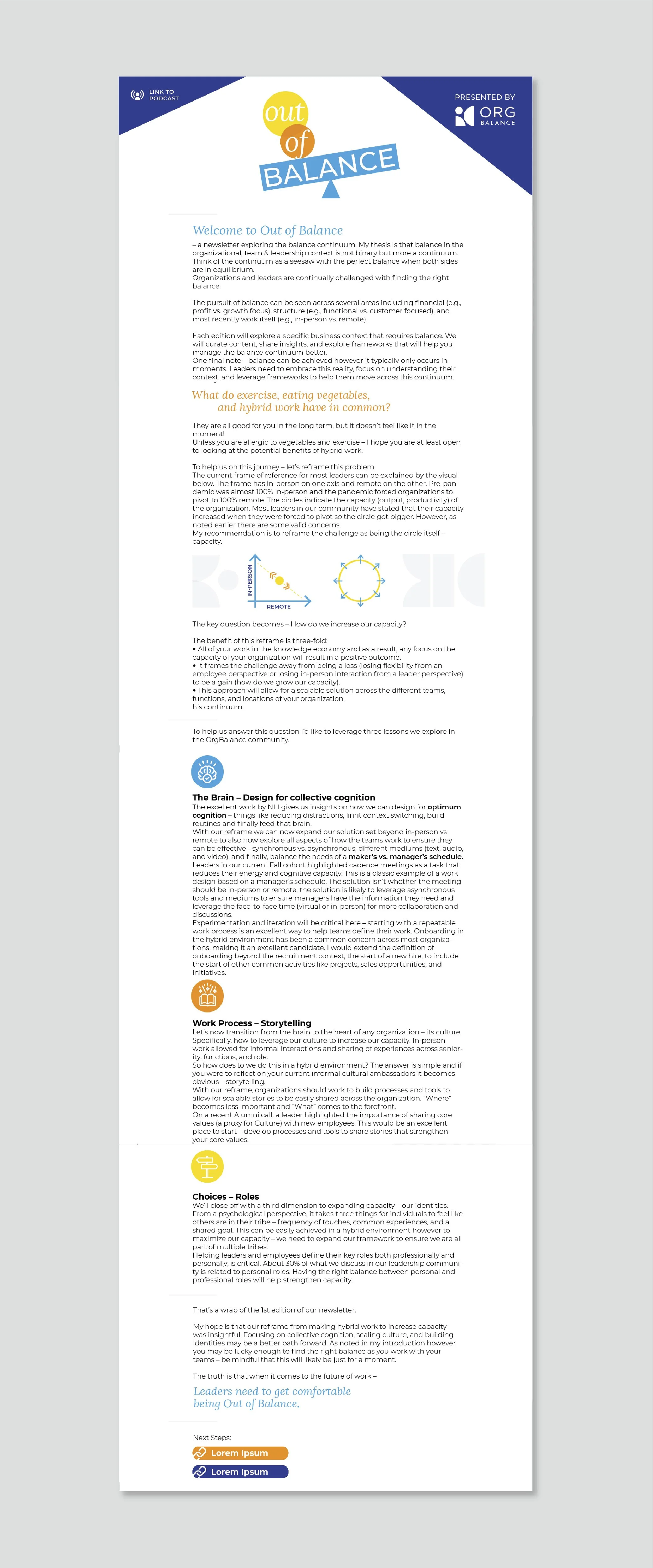
Since the brand development and launch, we have worked with OrgBalance on an on-going basis to grow the brand visuals - working with them on their presentation template, social media visuals, lesson video visuals (click to see), podcast sub-brand (click to see) and more. See below.