Mirage Cannabis
Concept Design, Brand Design, Brand Standards
Environmental Graphics, Signage & Art
Sept 2021
Silver Winner of Indigo Design Award 2023 - Branding of CBD & Hemp
Mirage Cannabis was chosen for its reference to the effect of an optical illusion - evoking an idea of magic, creation and the impossible. It speaks to the brand archetype and sets a precedent for surprise and awe, while touching on the ideas of tranquility and oasis. We positioned the brand to be sensitive, outspoken, progressive, fluid, and dynamic - to draw in middle aged people looking for relaxation, with a curious and open mind. The owners wanted to create a safe environment, which is easy to access, with organic, craft, safe, quality products. Mirage’s purpose is to help bring magic into your everyday life.
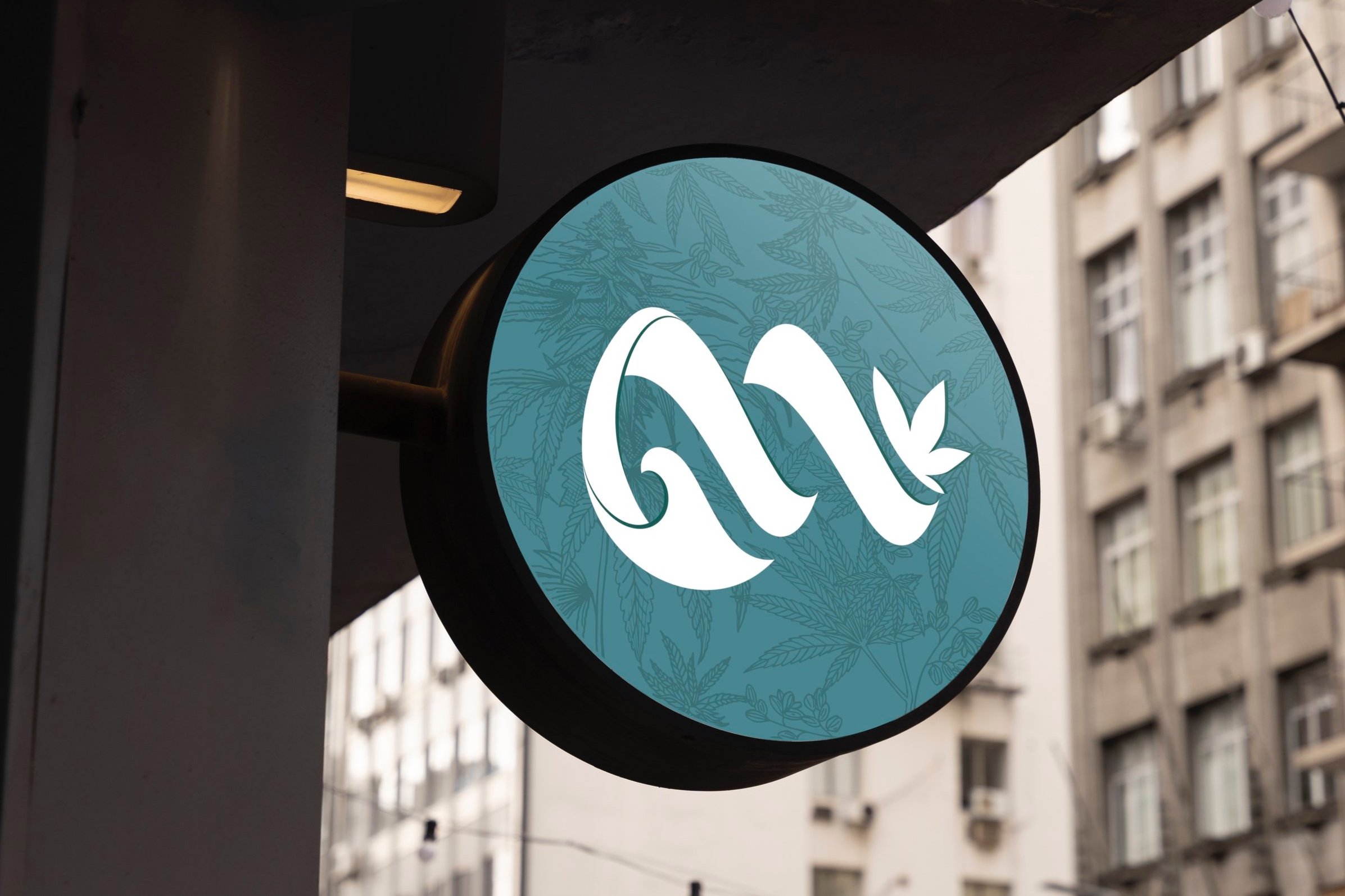
The Mirage Cannabis visual identity consists of a unique logo - with a wave-like flow, it touches on the customer experience in the retail space, effortless and organic, as it leads to the cannabis plant products. With imagination at play, a sense of smoke plumes are also suggested through the abstract shapes. The logo symbol artfully forms a letter “m” with an uplift at the end, leading to the non-typical cannabis leaf symbol. Secondly, the wordmark is set in an elegant, transitional serif font. The wordmark’s smoke like letter spaces and unique characters give it a creative, unexpected persona, to tie the visual to the brand archetype.
Watch a summary video here.
IS Design Labs combined powers with Black Bloom Studio for interior design.
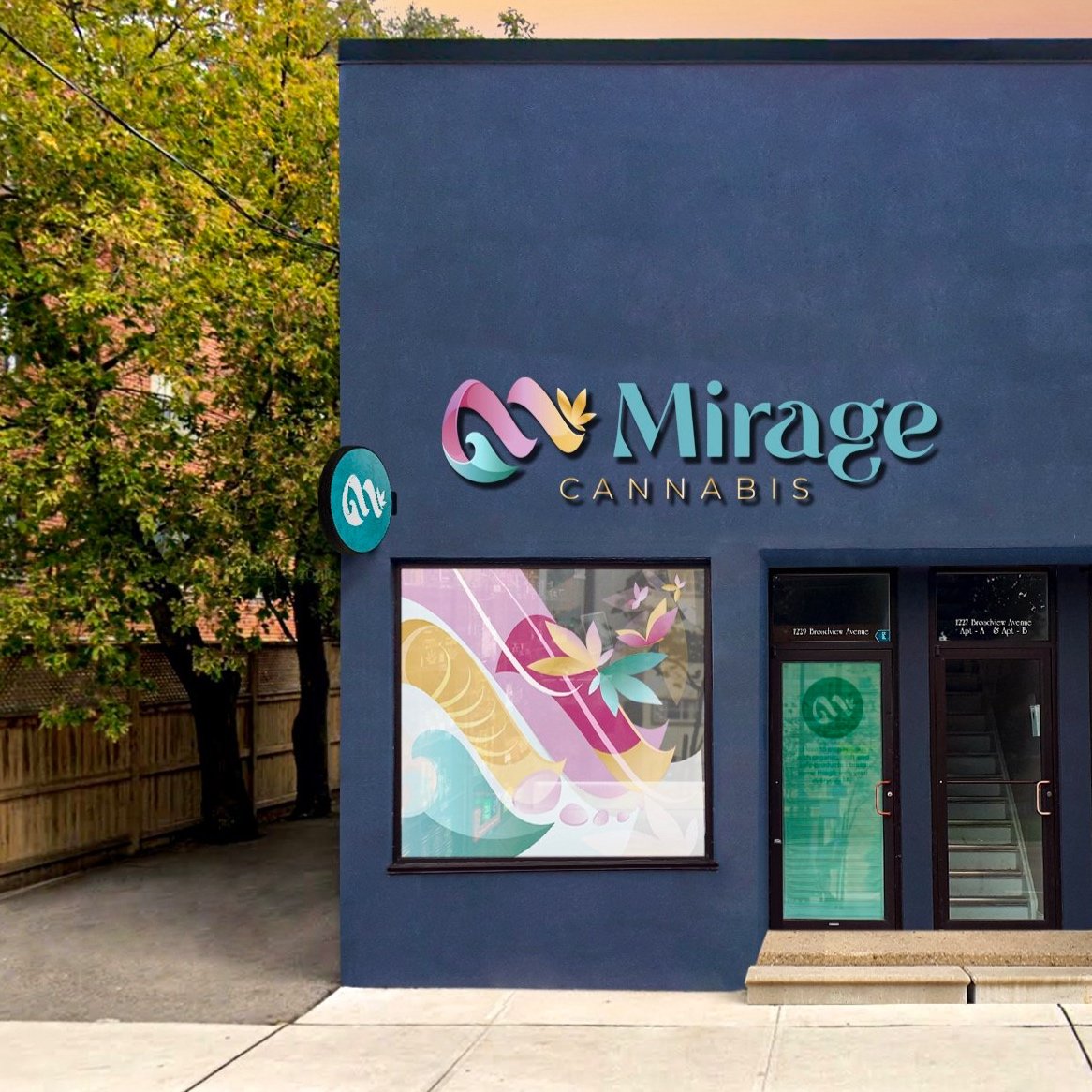
Storefront Signage & Window Art
From the outside, the store’s unique colour palette and art draws people in.
Colour is a key component of the Mirage Cannabis visual identity, and the colours of the palette are inspired by the purple budding of cannabis, as well as other floral blooms and surprising colour combinations. Led by creativity, mystery, care and professionalism, the palette is accented by optimism and empathy.
The window vinyl art introduces the plethora of colours in an abstract art piece based on the logo’s curves and elements. With a whimsical sense of movement it alludes to transforming butterfly shapes and bloom waves.

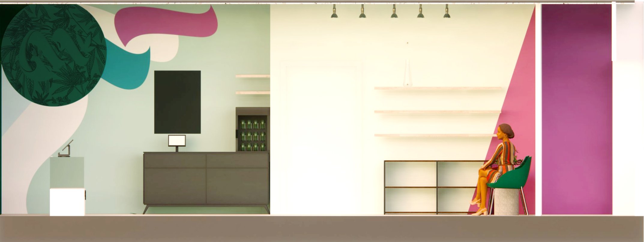
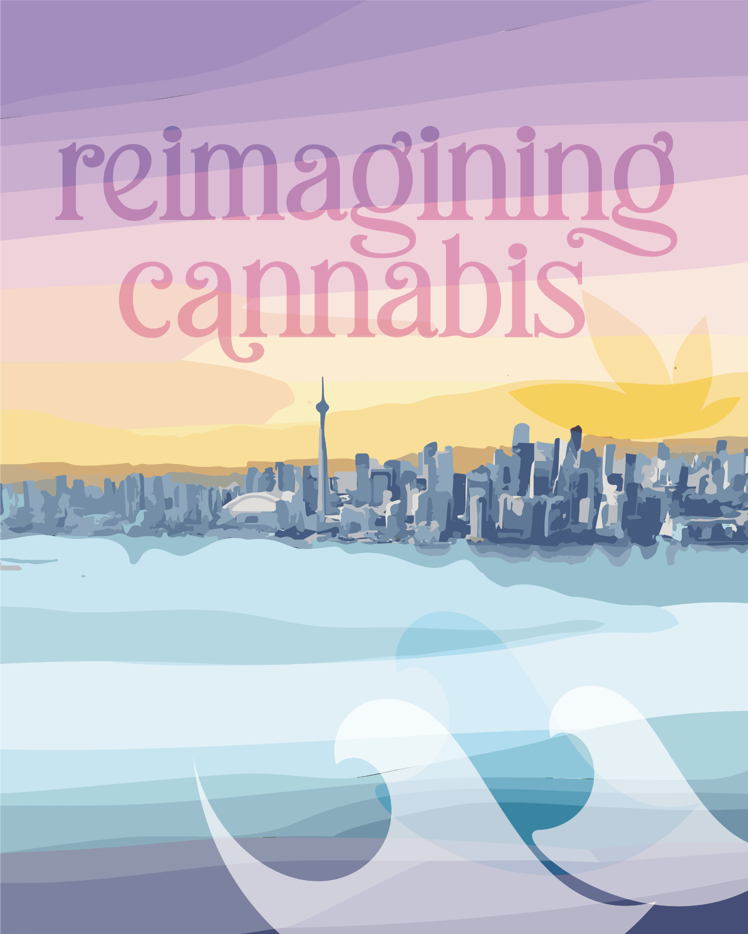
Interior Graphics and Art
To create a seamless experience, focus was placed on various areas in the store.
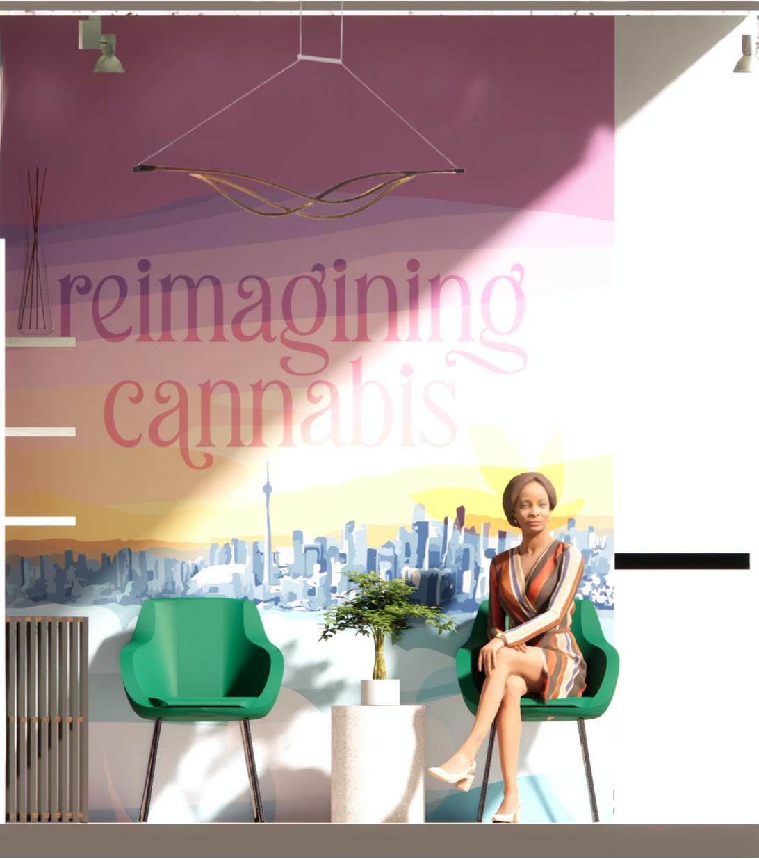
The hero is a tagline art piece in the store’s mini lounge area. Leading with the brand motto “Reimagining Cannabis” the piece illustrates the sunset with the city skyline. Waves of colour and brand elements are seen throughout, as the art aims to inspire and relax.
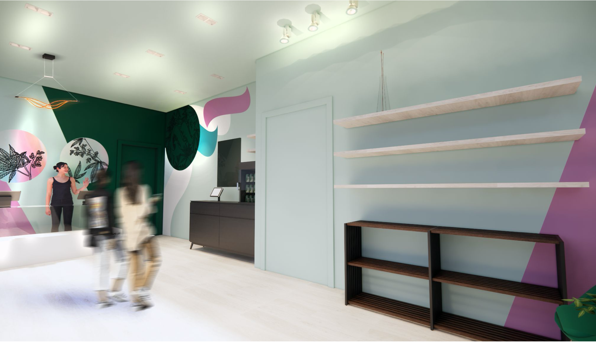
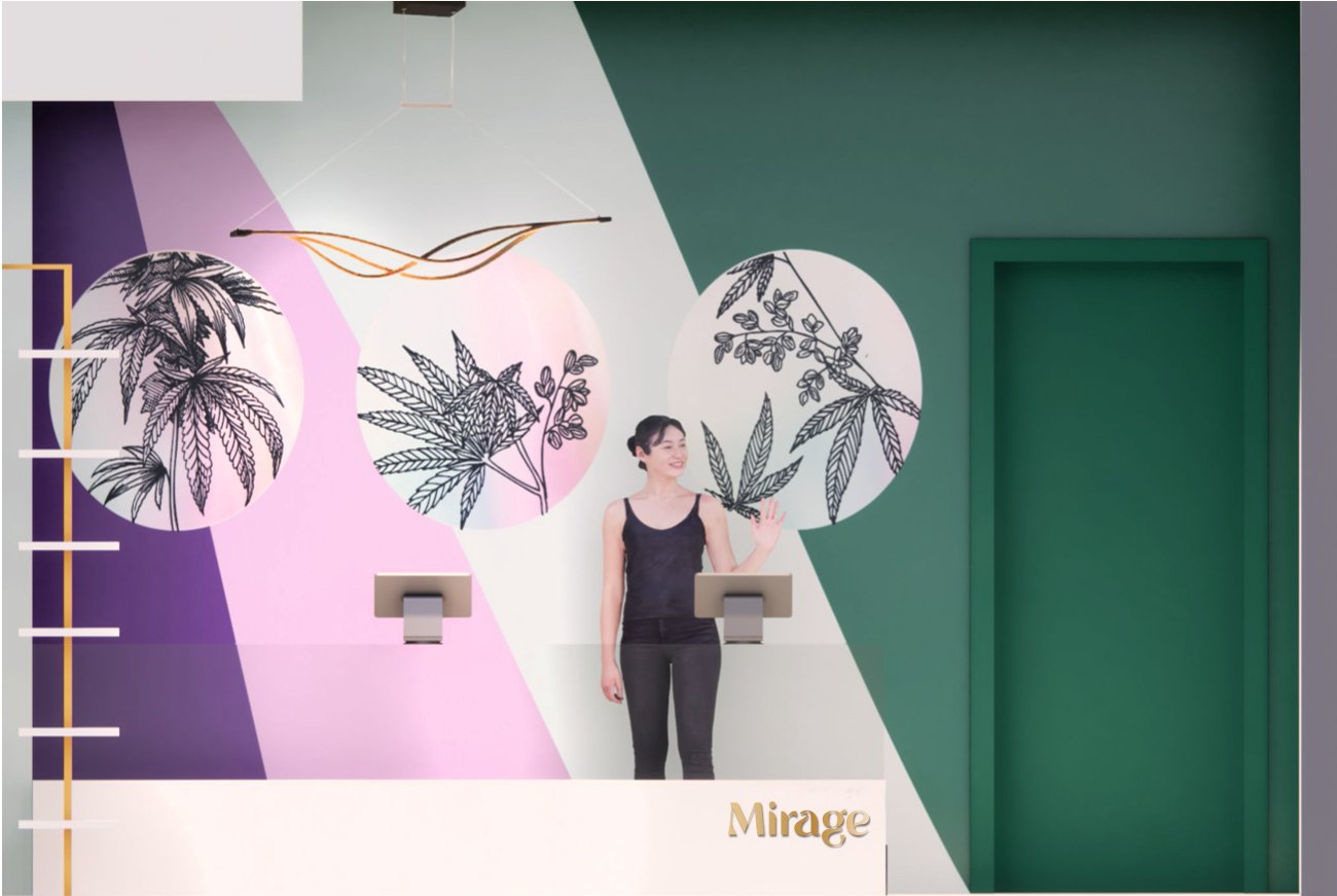
Another important area addressed is the retail display and cash desk area. With 3 simple mirror art pieces, it uses iridescent holographic film and botanical cannabis art to intrigue and bring in secondary brand elements.