Levitate Cannabis
Concept Design, Brand Design, Brand Standards
Environmental Graphics, Signage & Art
March 2021

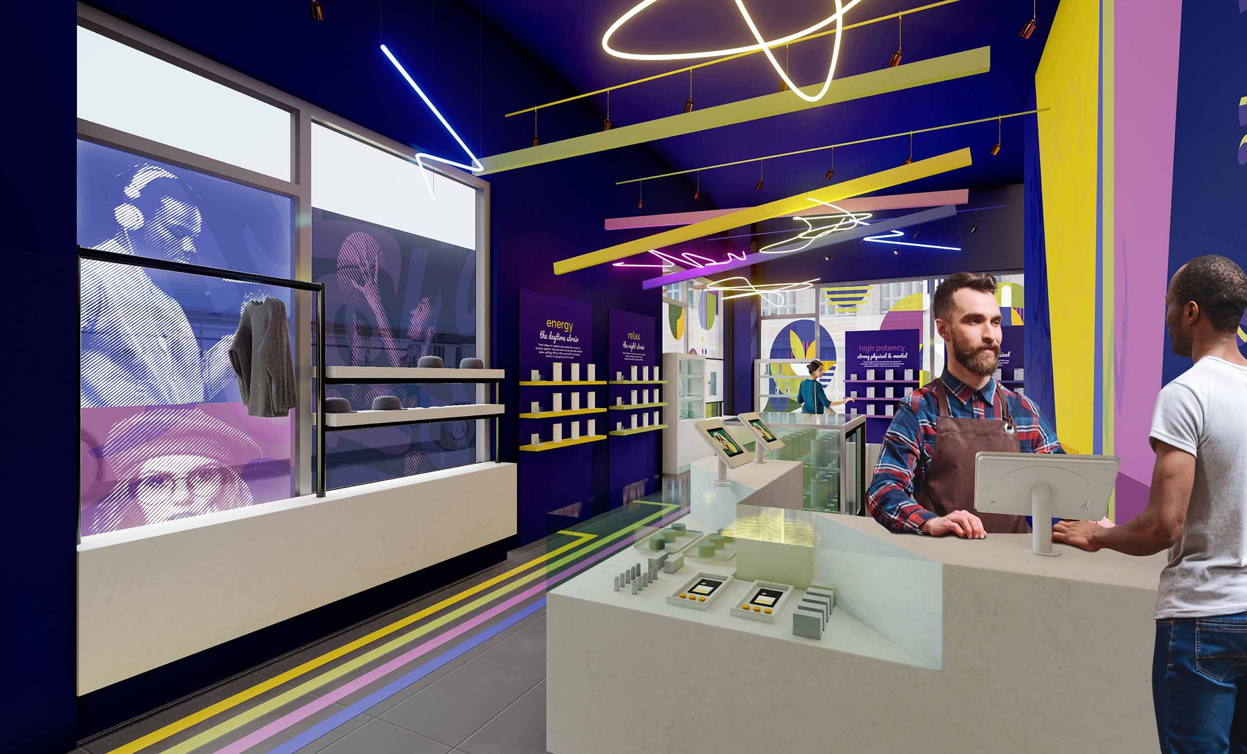
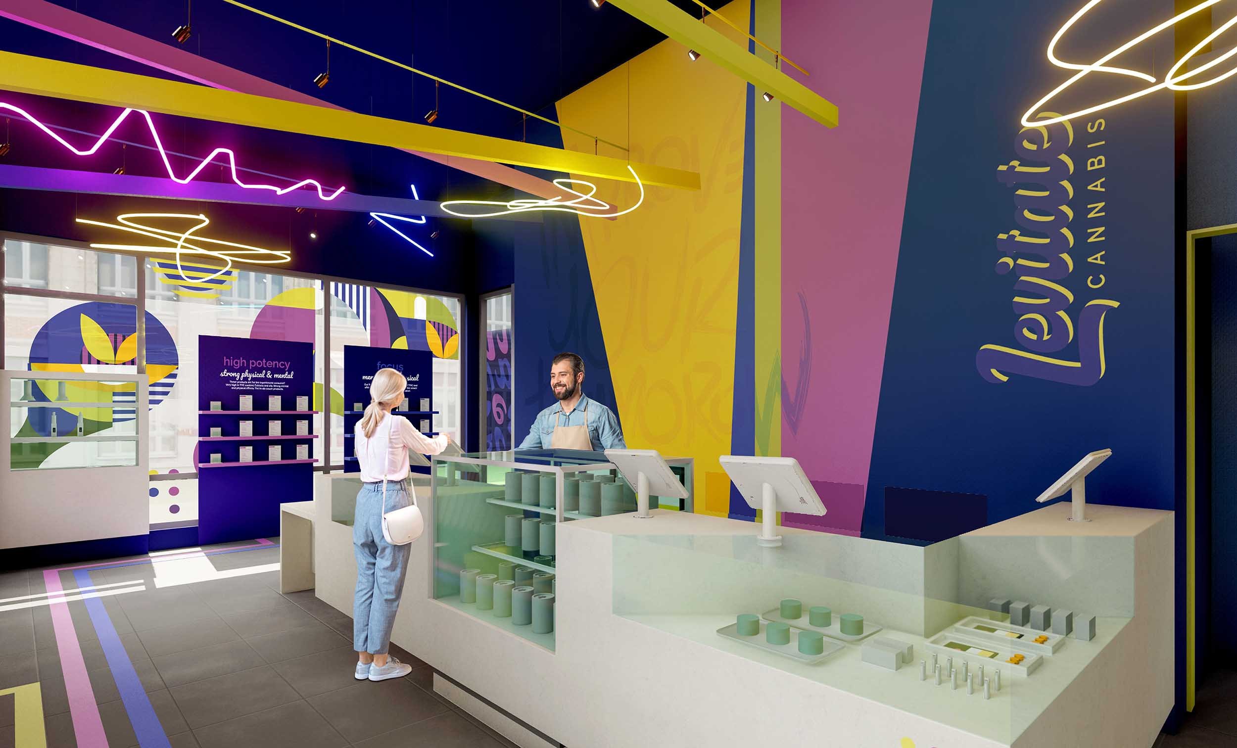
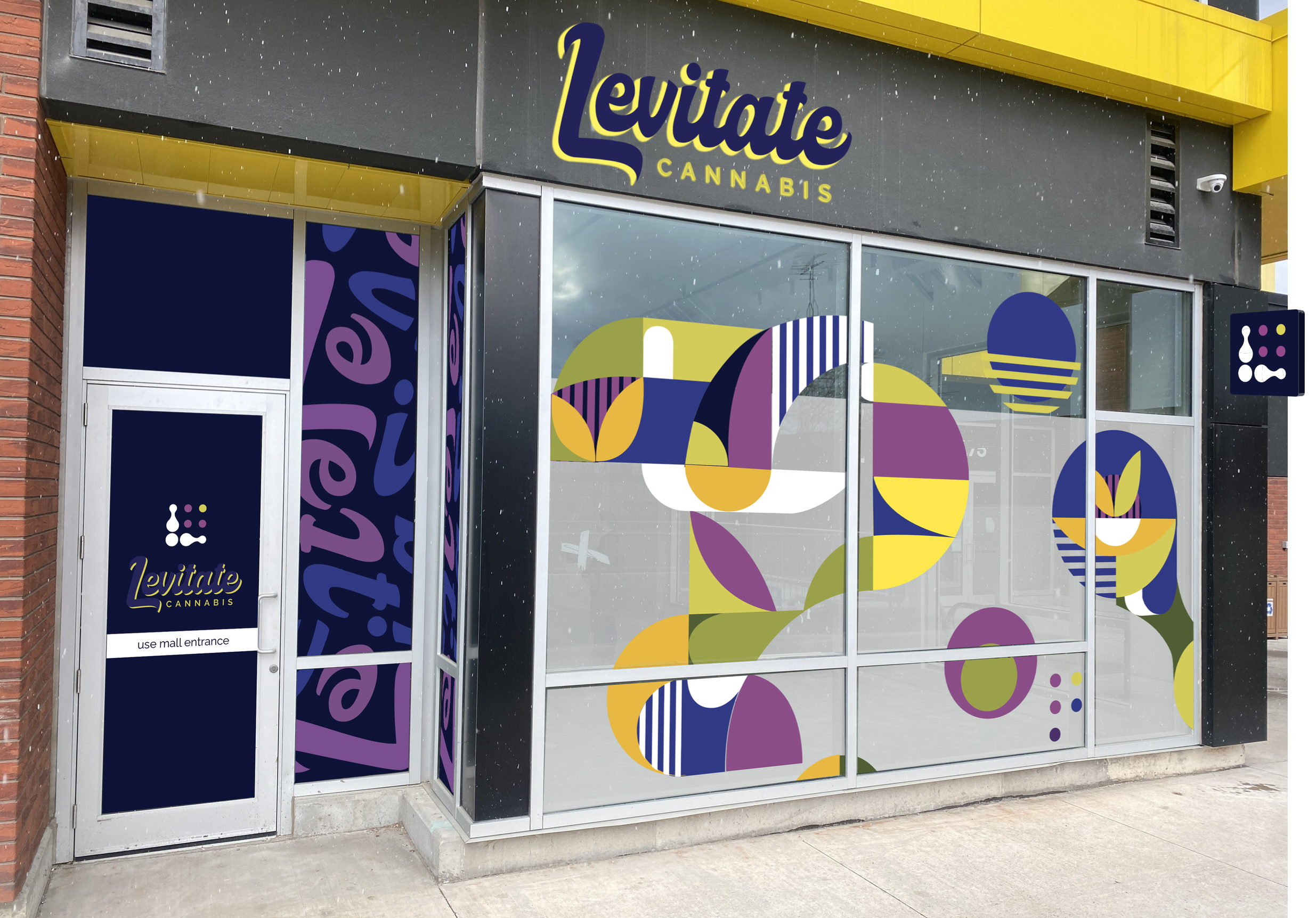
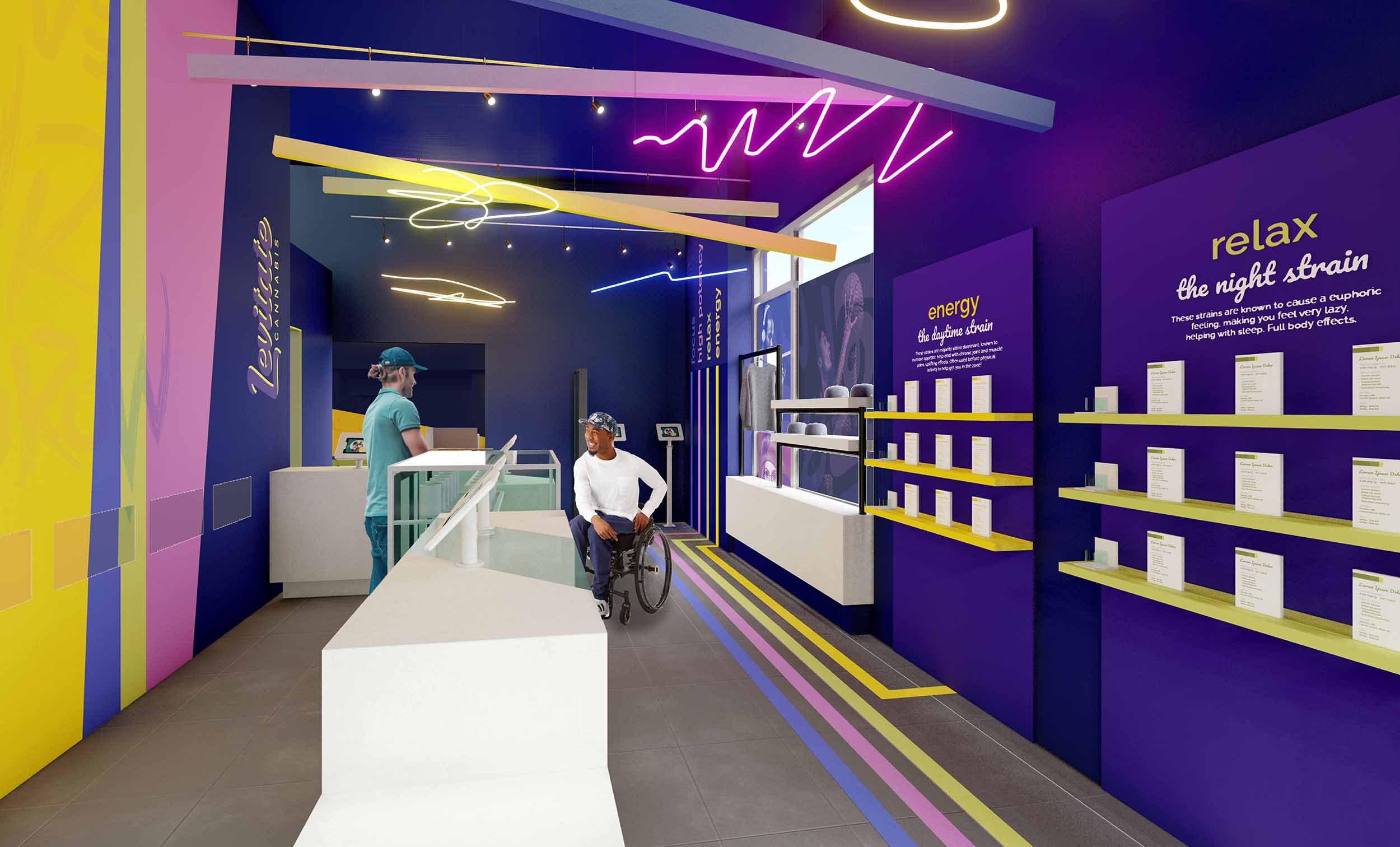
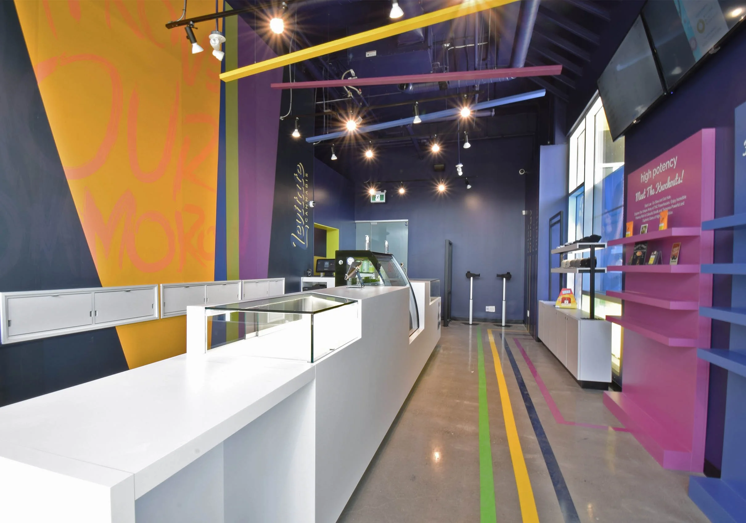
Levitate, referencing the effect of cannabis - uplifting and liberating, is the name of this new retail store located near York University. We positioned the brand to be edgy, progressive, and dynamic - to draw the younger demographic in. The owners believe that the best cannabis products take away pain and sorrow to elevate people to a different place, a happier one. This is why the ideal customers come in looking for a way to improve their night sleep, relieve the pain for a sport injury, or aid in personal satisfaction. To answer their call, Levitate Cannabis is focused on delivering the best products in a fast, efficient way, with great customer service.
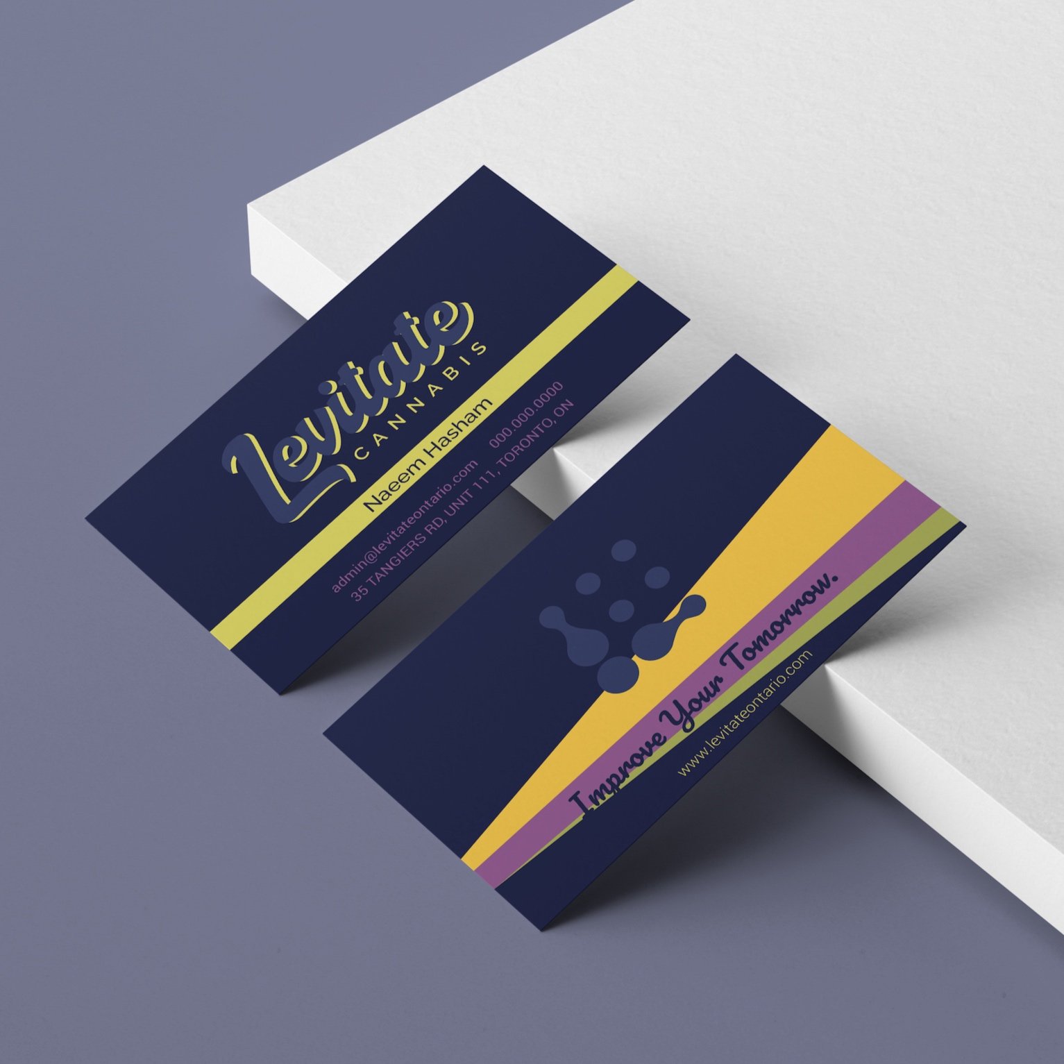
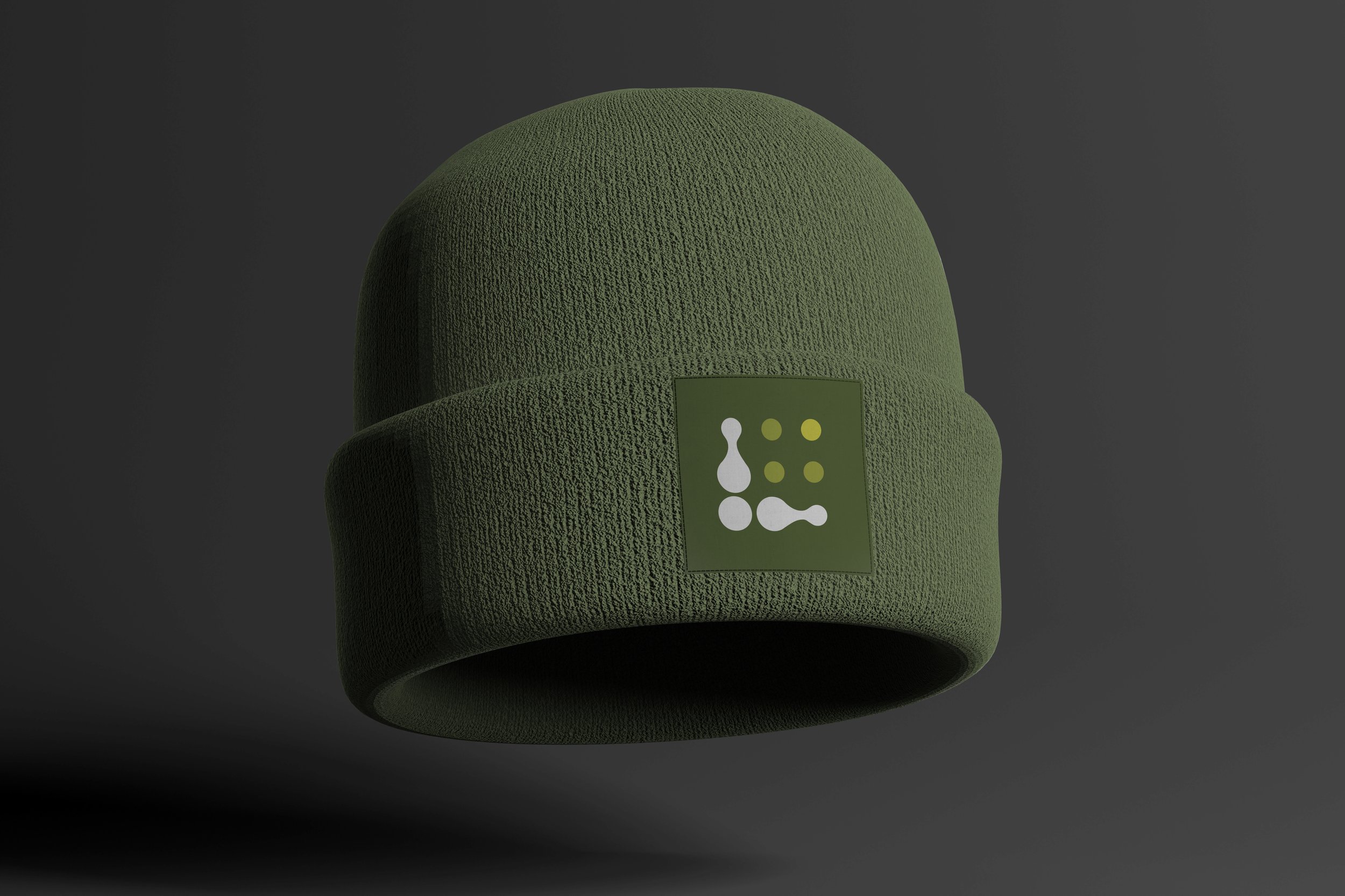
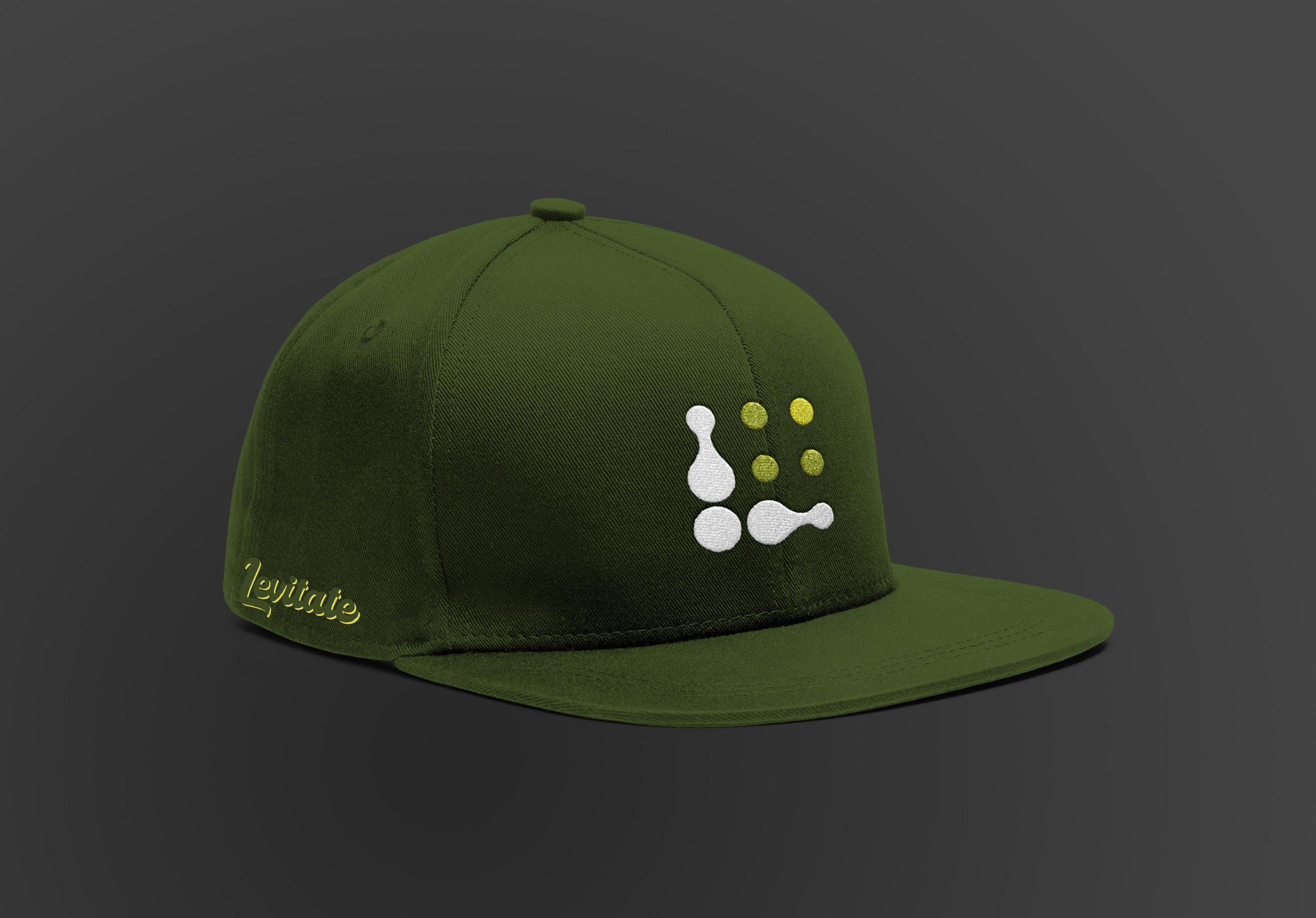
The Levitate Cannabis visual identity consists of a unique logo - it has a flowing, organized, communal feel, with a sense of connectedness and reliability. It alludes to the brand’s purpose - making sense of products and the staff’s role in connecting customers to the right products. The logo symbol artfully forms a letter “L”, while keeping a bright light coming from the top right - signifying a better tomorrow. The wordmark part of the visual identity uses a script typography to embody a fluid, friendly, and casual look. The wordmark’s fluidity speaks of a well-oiled machine - referring to the efficient and reliable approach. Furthermore the script wordmark’s handwritten nature provides a sense of friendliness and an artful personal craft - with the idea that at Levitate we stand behind our product.
IS Design Labs combined design powers with Black Bloom Studio for interior design and GTA General Contractors for construction.
Brand Identity & On-Brand Materials
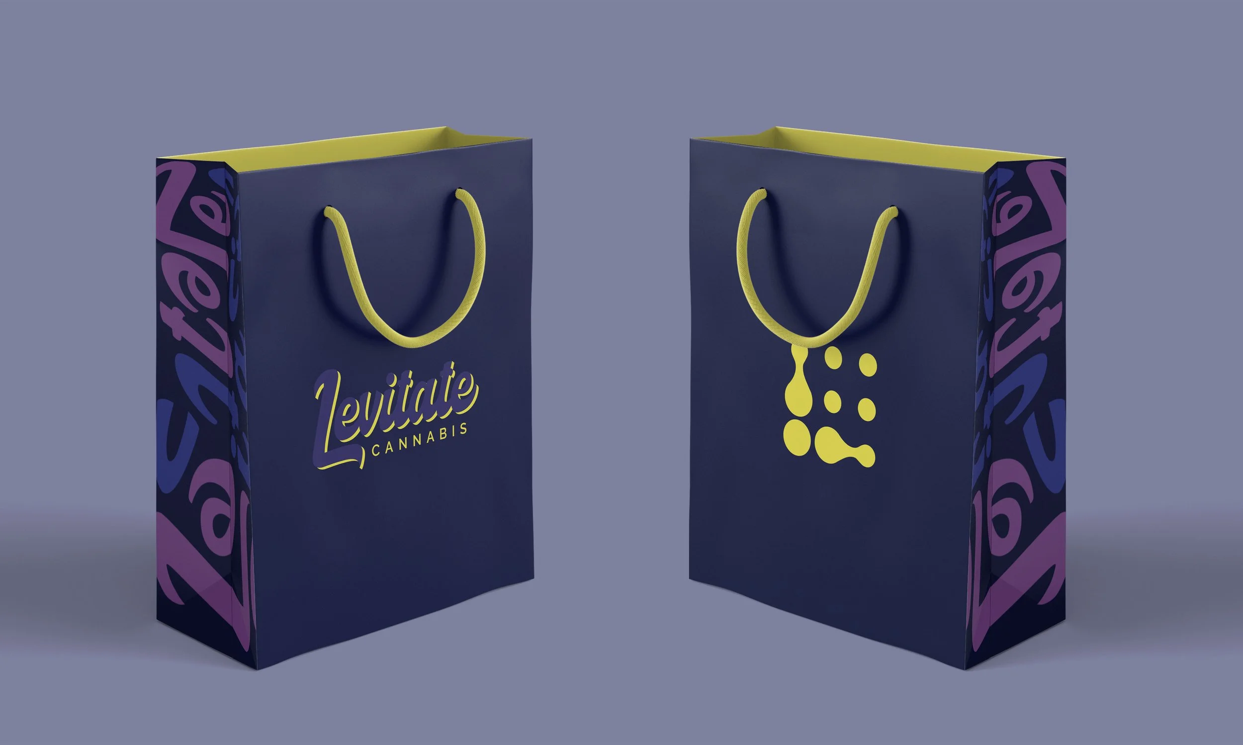
The Levitate Cannabis bags have a Pistachio bold hue inside and at the straps. These elements give a sense of surprise, delight, and positivity to the Deep Navy hue. The wordmark’s letters blend in a subtle elegant way, while the Pistachio dimension gives them a casual, energizing twist. The sides have a fluid letter pattern for some playful, on-brand visual interest.

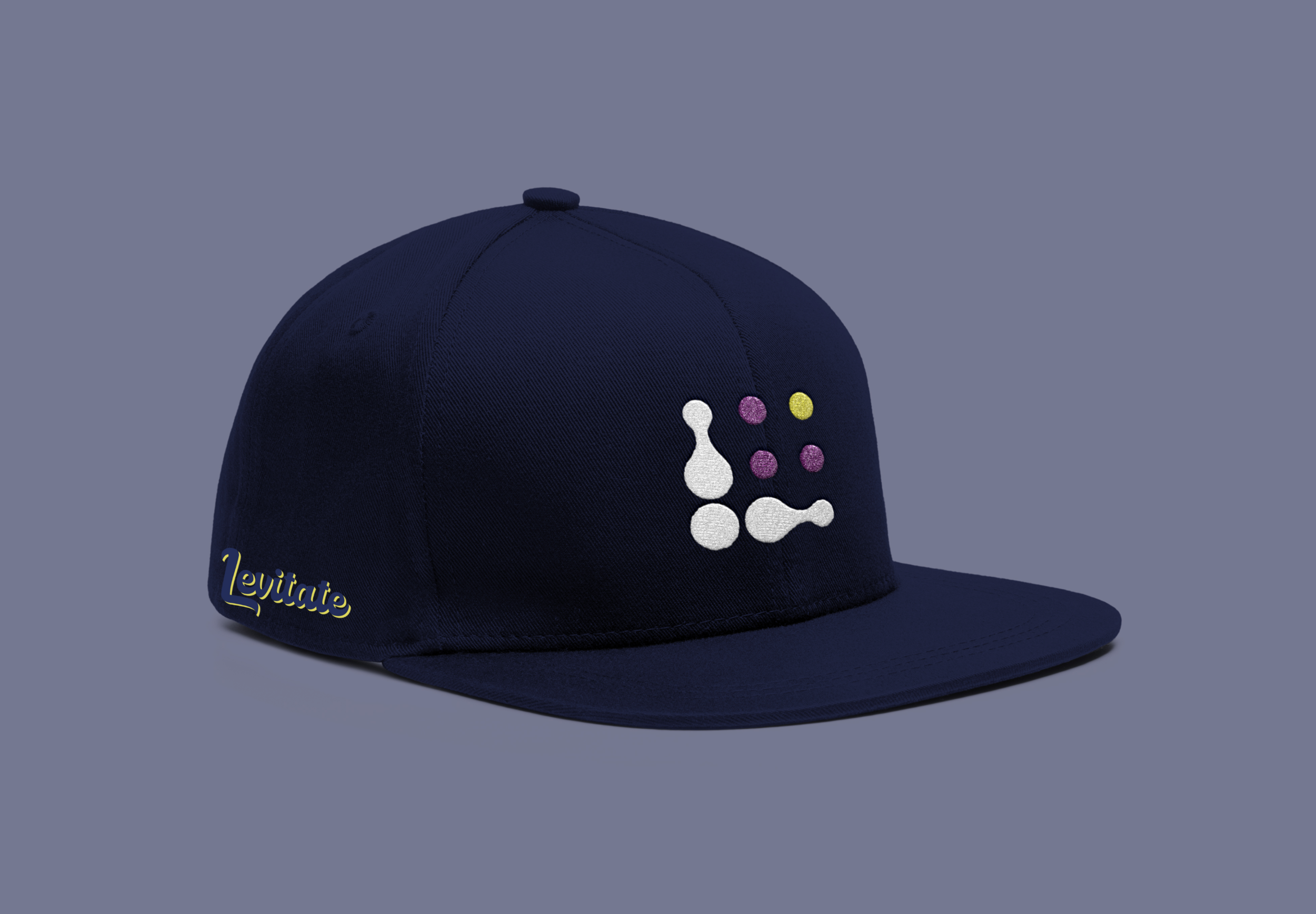
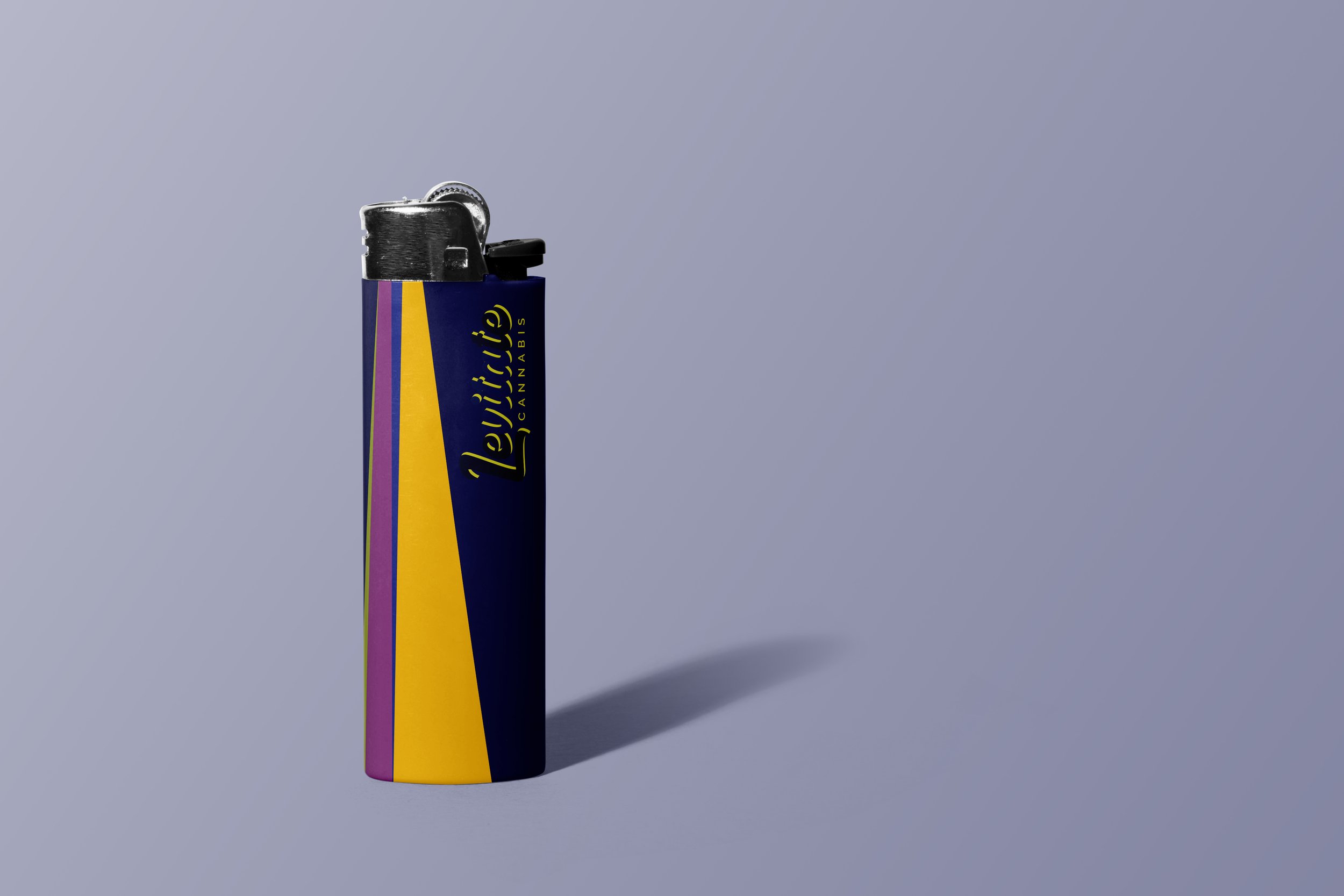
Colour is a key component of the Levitate Cannabis visual identity, and the colours of palette are inspired by the cannabis plant’s natural beauty. Led by approachability, warmth, and dependability from the base colours, the palette is accented by boldness, surprise and positivity.
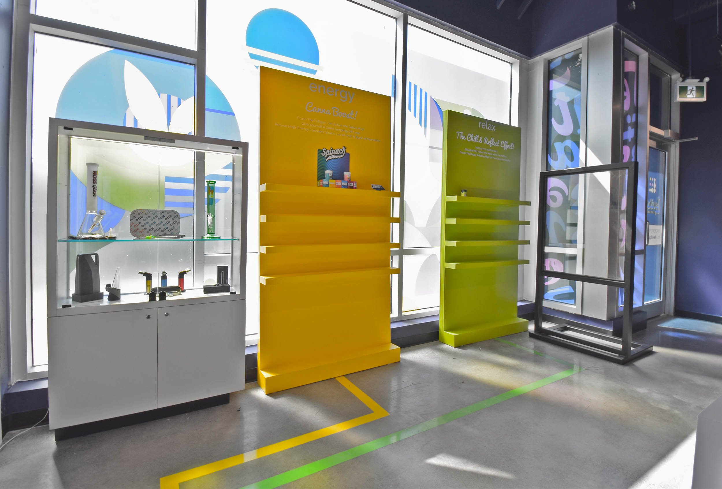
One of the brand’s secondary visual elements is the use of colours. The approach is to show a light beam split into colours, as Levitate will shine light and add colour to people’s lives. The idea of breaking down the light into a spectrum speaks of the organized, educational approach of the brand and, at the same time, introduces the 4 strains.
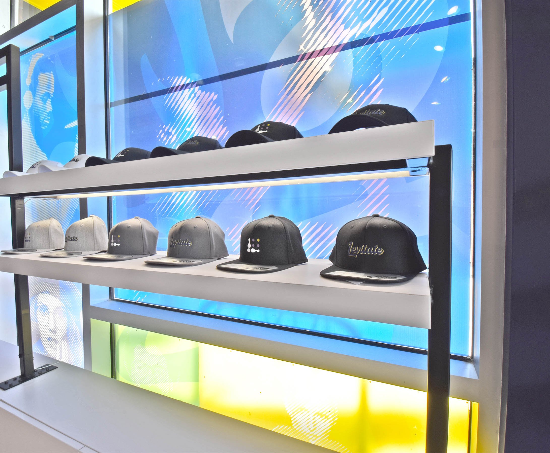
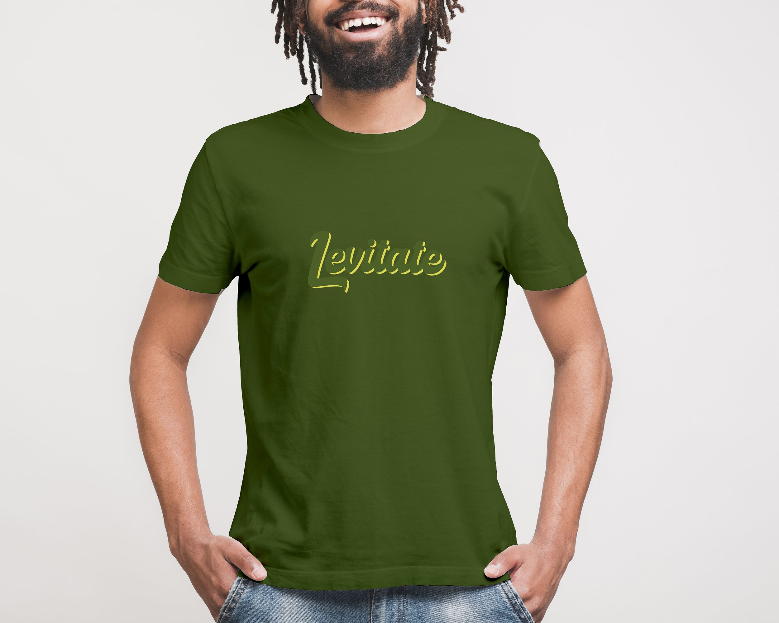
Apparel Design
Levitate Cannabis has 4 main strains of cannabis: relax, high potency, energy, and focus. They all have different coloured apparel to let customers choose based on their preference.
The main colour of each strain is to be used to blend in the wordmark with the main fabric, creating a sense of surprise. Furthermore, the word cannabis is not to appear on there in any obvious way. This is to ensure that the merchandise can be wearable anywhere without judgement, as we are cognizant of the stigma around cannabis.
As per the below examples for the “relax” strain, the wordmark’s colour is very subtly differentiated from the background, to create a hidden, secretive narrative to the Levitate brand.
![1373 [Converted]-01.png](https://images.squarespace-cdn.com/content/v1/574365235559862ff404a3a9/1636303906898-H9YKXO0EYJ3UDM03IOVT/1373+%5BConverted%5D-01.png)
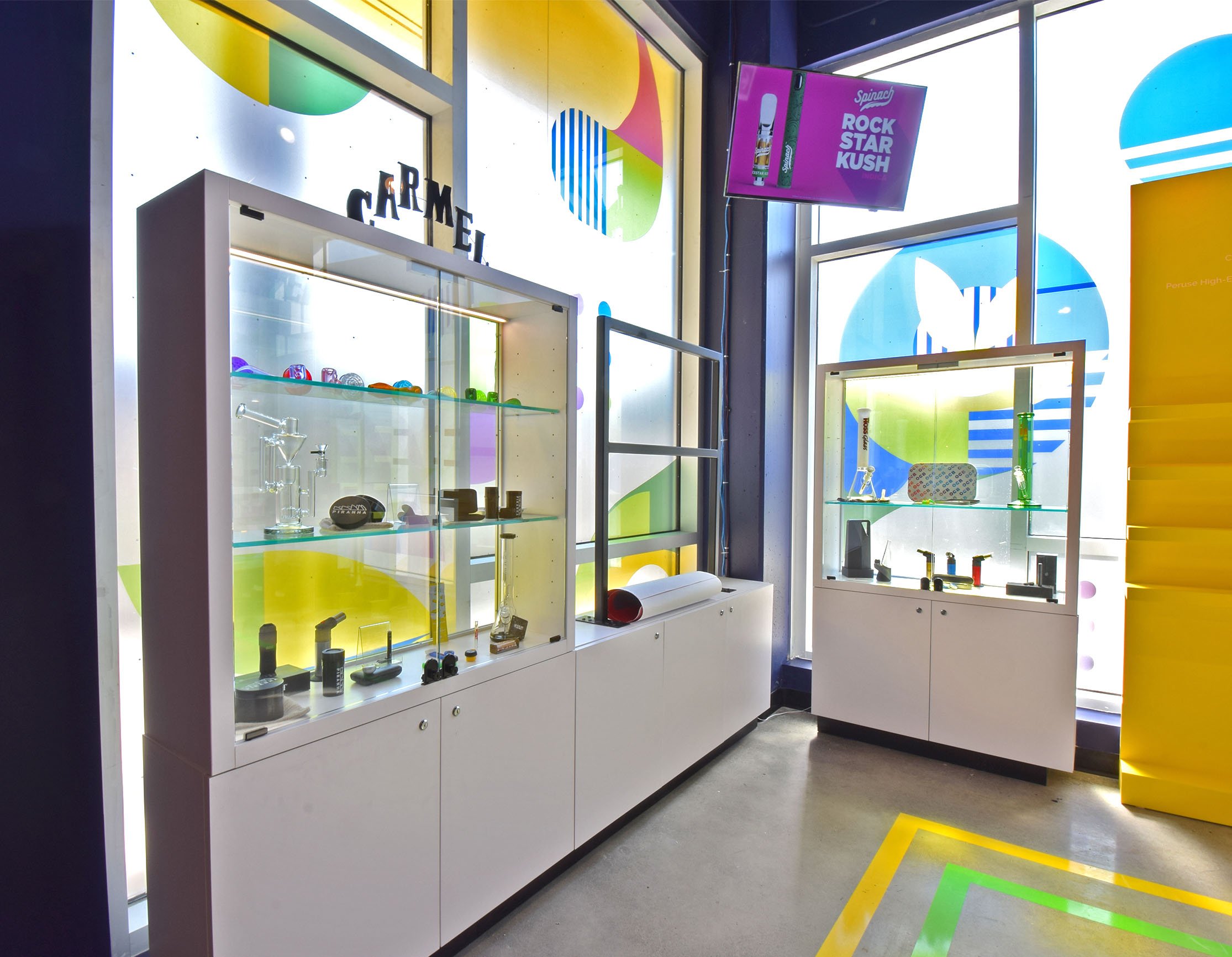
Environmental Graphics, Signage and Art