

The 3 Aspects of a Powerhouse Cannabis Brand
Did you know that there are 300 cannabis stores operating in Toronto already, with hundreds of AGCO applications waiting in line? This is twice as many as the number of bakeries we have in our city. Is cannabis becoming our new bread? It seems that way, at least in the convenience of getting it. There is even a city block boasting 6 cannabis stores lined up all in under one km distance in our office neighbourhood in Toronto. Just imagine the fierce competition!
But, in reality, what differentiates one from the rest? Most stores buy supplies from one of the approved sellers, therefore, the exact array of the selected products can give a store a bit of an edge, but, in essence, it comes down to branding. And by that, we want to emphasize 3 main aspects: the culture, the physical ambiance, and, yes, of course ,the logo and visuals all over the swag, paraphernalia, and storefront.

THE CULTURE
Retail brand culture comes in many forms: starting with bigger, strategic brand values and trickling down to minuscule everyday interactions and details, such as workplace attire. There are many niches to touch on when building a full customer experience, and, often times, it can seem like that intangible factor that is hard to put a finger on.
The work always starts with finding the right positioning for the nascent brand. We dive into defining and understanding the marketplace and competition as we look for gaps and find opportunities. We next work on the ideal client avatar, honing in on their desires, as we also define their brand values. That’s right, the culture is decided on in this early phase when we begin thinking about the brand truths. Sometimes we call these the brand values or guiding principles. They are a belief system we build with the purpose to define what the company stands for. Brand values serve as a compass to guide the firm’s actions and decision-making process, unite employees and shape their behaviour, define the brand and build a story. For example, a brand positioned to educate, distill myths, and find truth is quite different than a brand which is there to enable people to live life to the fullest, seek joy and entertainment. Brand values tie into the brand personality and create a potent ground in growing a successful company; one rooted in meaning and one customers and employees can embrace, connect and develop a long-lasting relationship with.
Upon crafting this brand strategy, the brand visual and verbal language are developed. The multi-sensory systems and experiences grow as does the brand personality - hearing the greeting of the staff, sensing their attitude and approach, reading the marketing and advertising materials, seeing and touching the many visual aspects of the company.
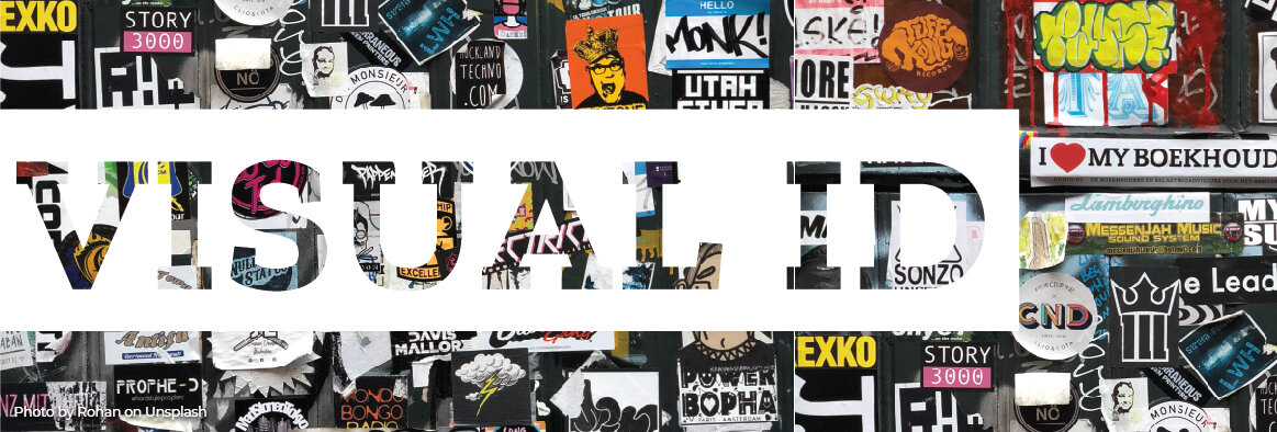
THE VISUAL IDENTITY
We have written on multiple occasions about the meaning and importance of the visual identity. To highlight, the main visual identity can be a logo, wordmark, or a lock-up combination of the two.
For more information, take a read to our Logo vs Brand post.
From the website, online listings, or just a street entrance, your logo/wordmark is that silent handshake presenting your company within seconds and setting up the first impression. The shapes, the colours, the fonts, and all the visual elements radiate a certain personality and connect with people differently. For example, a circular, rounded, symmetric visual identity can evoke a holistic, caring, stable feel, while an angular one with many elements coming together can give a sense of organized, even chaotic, speak of an experimentation, being different and edgy. Our visual senses are very perceptive which is why we intuitively feel a certain way or are drawn to certain designs and brands. It comes down to creating that perfect recipe to attract the right audience, evoke the right emotion, and communicate the brand essence. This is why our work is rooted in psychology - with the customer desires and universal archetypes at heart, leading the way.
In essence, a company’s visual identity communicates its brand culture.

Once the visual identity is developed, many elements follow to build the brand. The colour palette adds in a layer of emotion, the fonts add a layer of personality, but then comes the wild card of: “What else is part of this brand?” What else enhances the brand personality and adds depth? Patterns, illustrations, iconography, photography treatments, graphic elements: all come into play for a unique package where every element adds to the brand story. Based off your logo, patterns can appear on the shopping bag as a unique texture, your photo treatments will play a big role on the website, your iconography might make its way onto the apparel, and what about the rolling paper or the interior graphics? What happens is that these elements become just as memorable as the main visual identity (logo) when used together in a system. They build on each another as they create the brand’s visual language, creating consistency while adding a visual interest.
Too many companies out there just focus on the cannabis leaf, which is an ‘on-the-nose’ visual to ensure the brand’s industry is apparent. In reality, many people are turned off by that symbol, and, for others, it is just too forgettable. So don’t let that leaf define your brand, instead come up with the smart visuals.

THE PHYSICAL AMBIANCE
From the welcoming storefront signage to the interior look, feel, smell and sound, the ambiance of a store is a client’s first physical interaction with the brand.
There are a few key elements that an on-brand space needs. We work with our interior design team to ensure we are on the same page for the brand vision, and trust them to create a good flow, pick out finishes and paints that make sense holistically, place lights well and create beautiful millwork solutions - ensuring the brand image is enhanced and grows with an intention.

The brand culture and visual language come into life with many elements as part of the environmental graphics, art, and signage package we create. Let’s review, some of the common ones:
Window Vinyls: as you might know, by law cannabis stores need to ensure no products are visible from the exterior, therefore both signage and window decor play a big role in presenting the brand. Covering up windows can be off-putting if done without consideration of how it influences the customer experience - how it plays with the light inside the space. It is easy to intimidate potential customers, as the cannabis industry already has a lot of stigma around it. Therefore we see this first visual impression as a priceless opportunity to stand out and entice people while introducing the brand’s visual language.
Statement Wall: this is often the wall right behind the cash register, where people will spend a few minutes while they wait in line to make their purchase. It is a great opportunity to let their eyes wonder and give them some food for thought. They are making a purchase and putting their trust in the company, so it is up to the brand to connect with them and make sure they come back - join the tribe. Some examples of design we have created include an illustrated, modern history wall behind the logo. Another example is an unusual quote or tagline art piece with a materiality change for some visual interest.
Educational Elements: some stores organize their products in an educating, categorical way to help newcomers navigate the space, find areas of interest and discover others. Some elements like these can be dividing the wall into the many strains and their in-betweens, or, perhaps, organizing the products based on the feeling they evoke. Whether it is flip-boards with sniff jars, or category introduction panels and info cards per product, these are great ways to position the brand as an expert. No matter what, the more we help users understand, the more we inspire them and open their eyes to opportunities, the more enthusiasts and advocates will be created in the world - helping overcome the stigma around the industry.
Menu & Screen: many stores want a screen to place a kinetic menu. This is another key element for accessible, straight-forward information for clients who know what they want and are just looking to quickly go in and make a purchase.
Ambient Elements: the space is tied together by seemingly smaller pieces all around. Some of the elements we have created for clients include guiding floor decals, wall separator panels, hanging art installations, dimensional art pieces. All these seemingly small elements help tie the brand in a subtle way, they add that more human touch that makes one feel the that everything is working like a well-oiled machine.
So if you are starting a cannabis retail store, give it the chance to stand out and be heard. Use this strategic recipe for success. And if you are looking for a branding/design partner, don’t hesitate to get in touch.

