Vibha Charity Rebrand
Brand Evaluation, Brand Positioning, Visual Identity and Creative Direction
June 2025
Vibha is a visionary force in public education, a nonprofit charity acting as a catalyst to educate and inspire individuals to create lasting change. However, their visual identity was lagging behind their impact. During the initial Brand Evaluation, I identified that their existing ink-inspired logo appeared unpolished and lacked the scalability needed for a global organization. Scroll to the end, to see where it all began.
The Strategy & Visual Identity
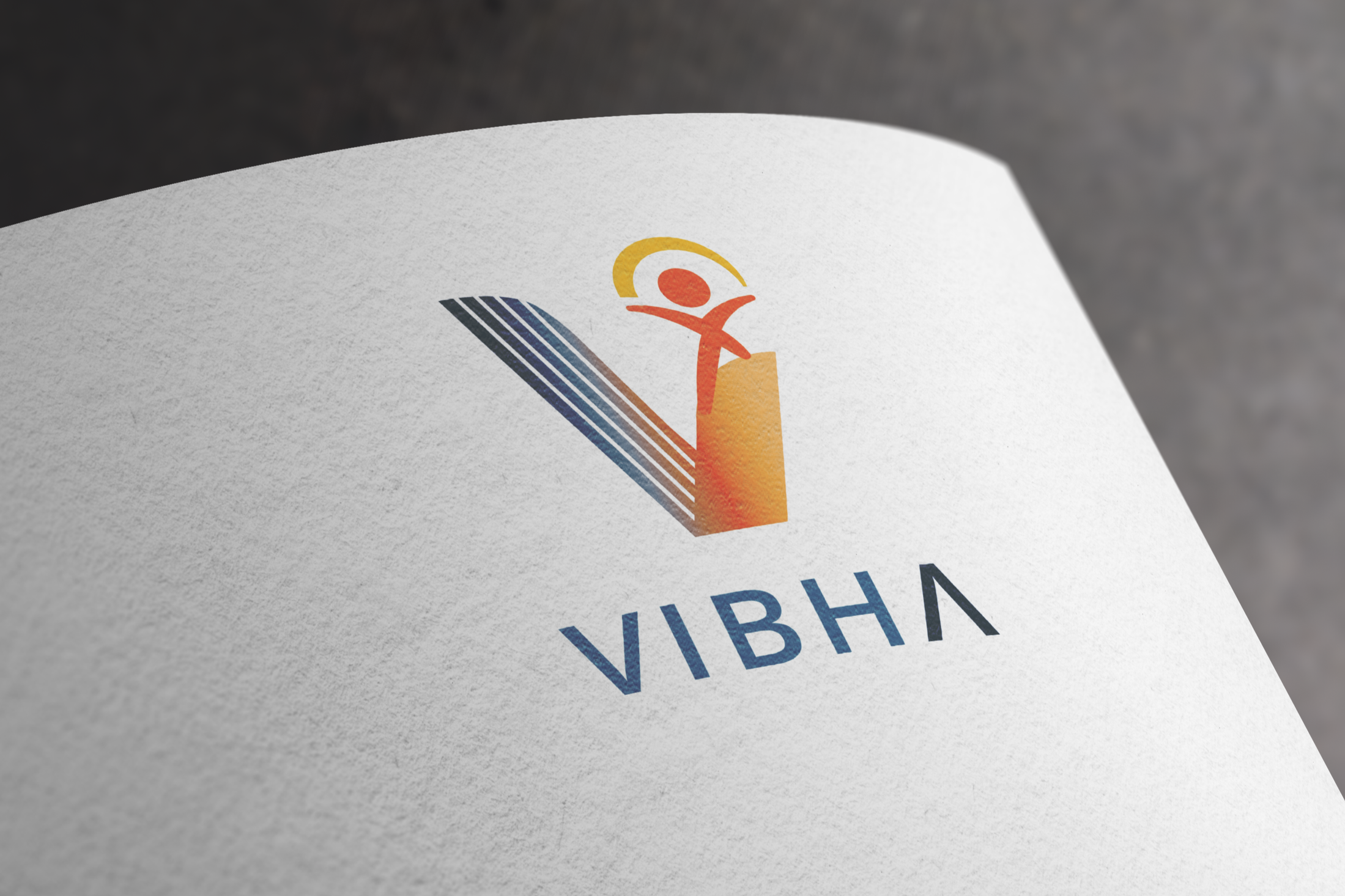
For their rebranding, I established a Sage/Hero brand persona—positioning the organization as a practical, progressive, and humble leader. This identity was designed to resonate with their ideal donors: established professionals who value transparency, structure, and a measurable legacy. It was important for the client to retain the spirit of their previous mark, so I evolved the personified human and sun elements into a more professional, integrated symbol.
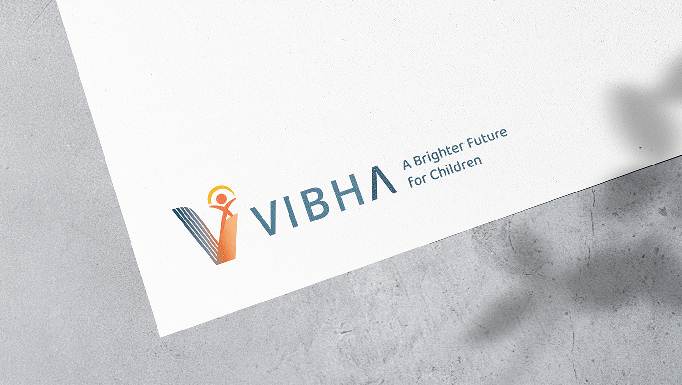
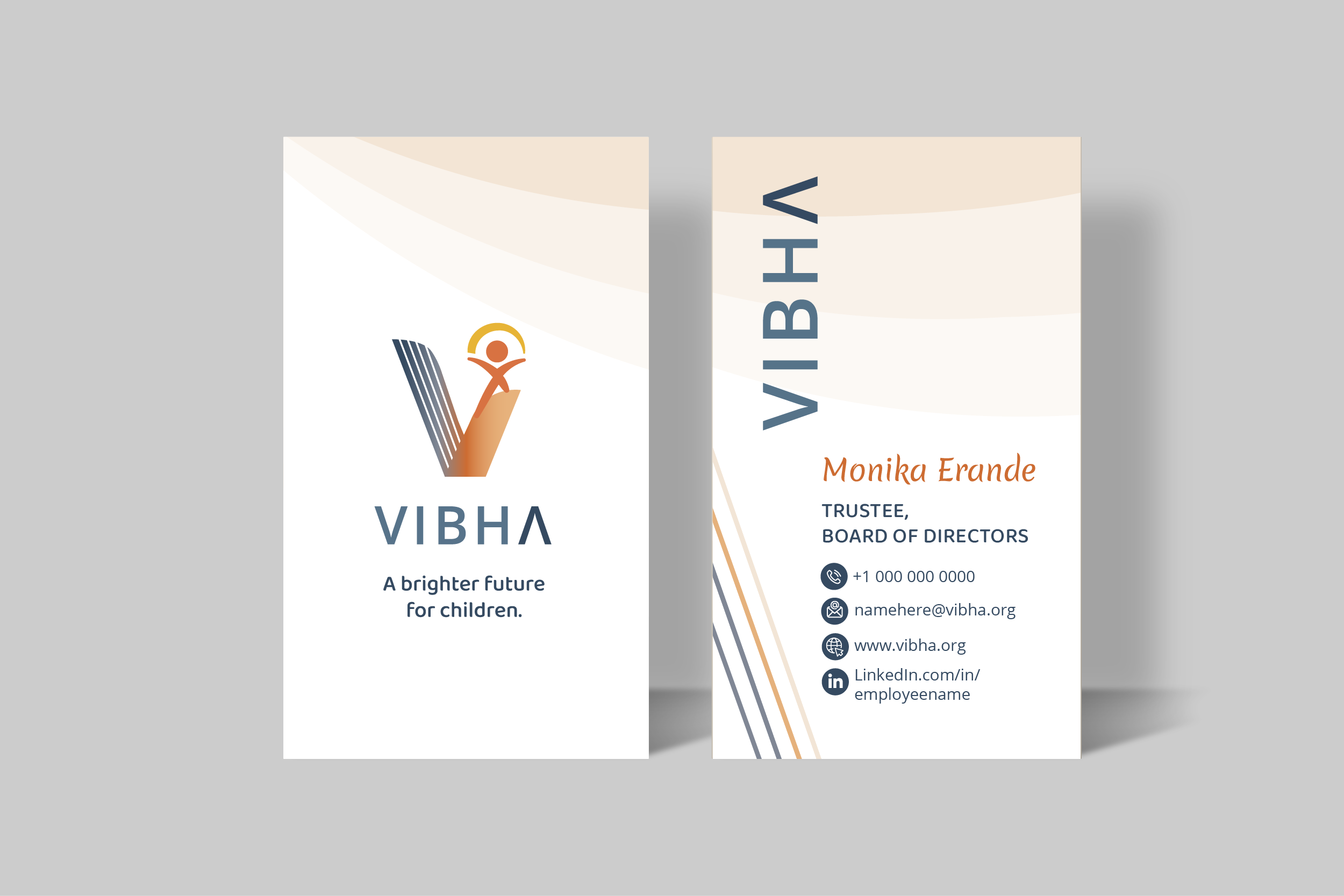
The new brand is centred on a distinctive "V" logo that serves as a dual symbol for the foundation of upward growth and the pages of an open book, reflecting Vibha’s core commitment to education. At its heart, a human figure with open arms embodies hope and bravery. I replaced their previous high-contrast palette with an intelligent and grounded system: Steel Blue for trust, Terracotta for earthiness, and Butterscotch Yellow for optimistic energy.
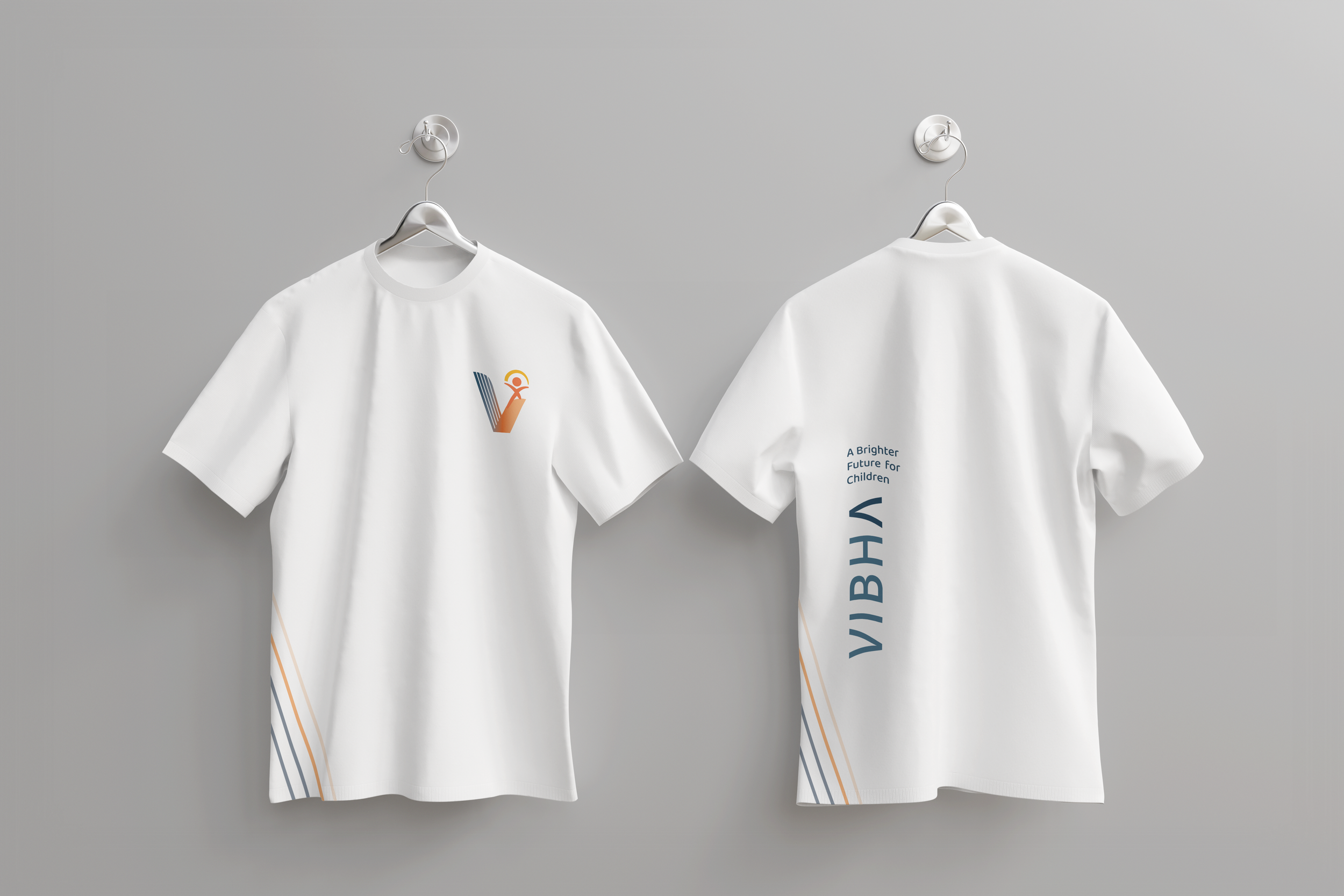
Brand Applications
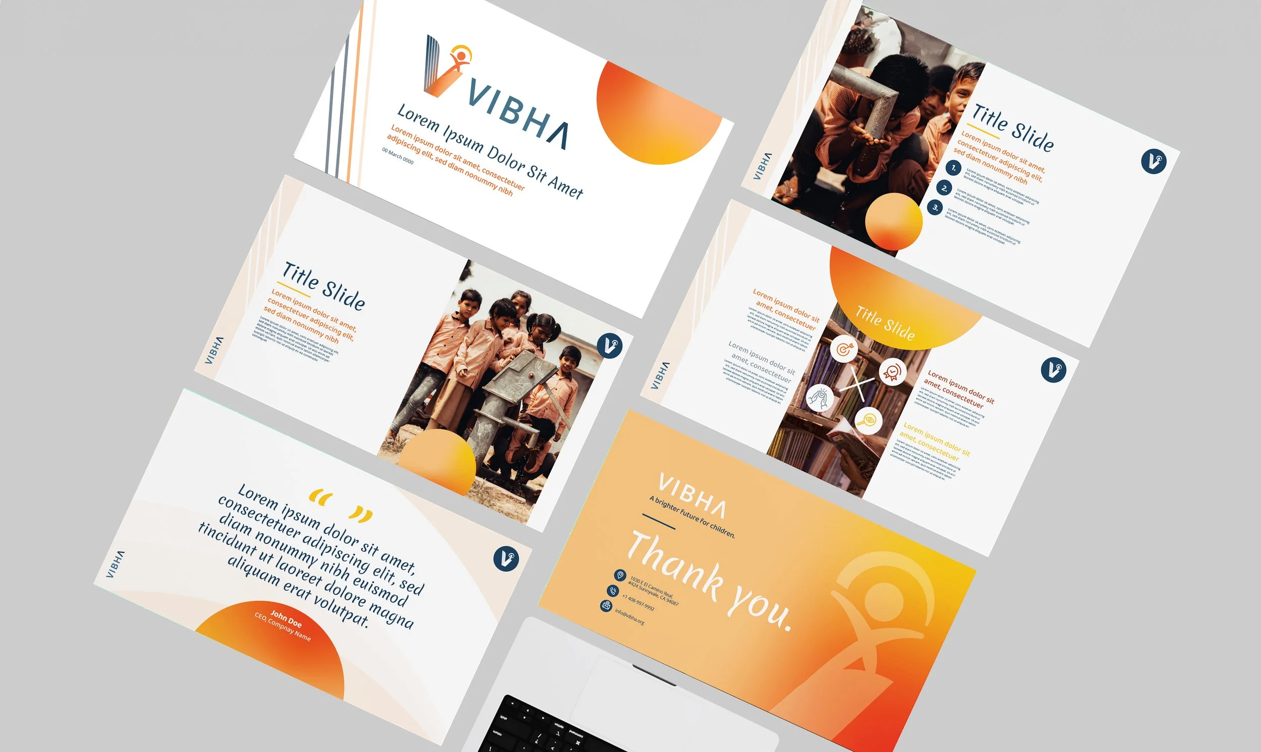
We built a comprehensive visual language around the new identity to ensure the brand scales effectively across global chapters. From brochures and presentation templates to landing pages and apparel, I developed a system of secondary visuals:
- The Wordmark: Rooted in a humanist sans-serif for clarity, featuring a modified "A" that forms an upward arrow to symbolize momentum.
- The 4 Angled Lines: A recurring graphic element tying back to the "book pages" of the logo, representing streams of effort converging for a single cause.
- Soft Gradient Waves: Derived from the logo's arc, these elements add texture and a sense of adaptability to digital and print layouts.
- Warm Photography Treatments: A standardized terracotta filter ensures an emotional connection and visual unity across all communication channels.
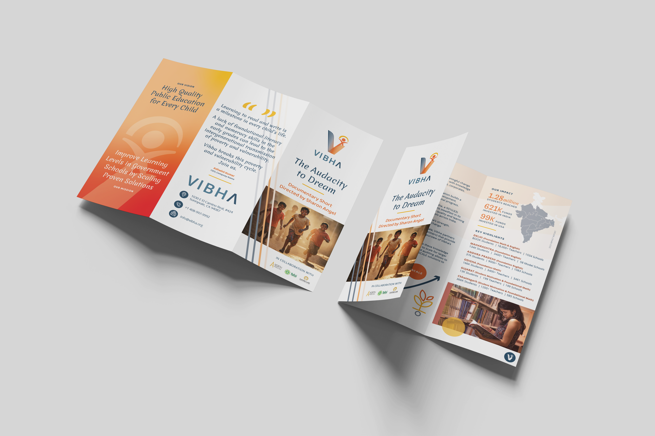
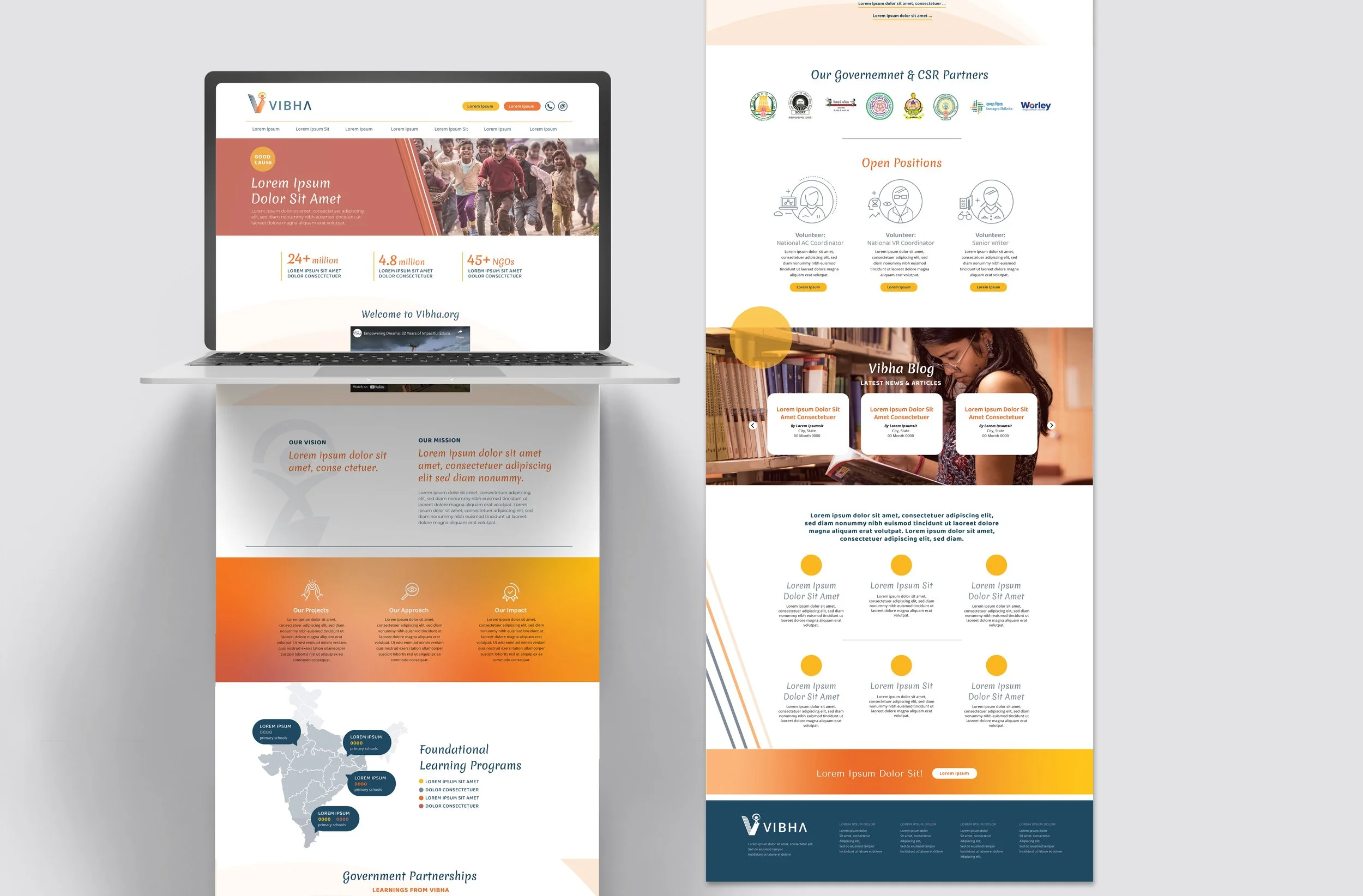
On-brand Landing Page
The website is a critical touchpoint for high-impact donors who value professionalism and verified credibility. I developed this branding-led layout as a strategic creative direction to demonstrate how the new identity translates into a digital space. By applying the new visual standards to the landing page, I provided a blueprint for consistency that ensures every digital interaction reinforces the organization’s global mission and long-term legacy.
The Result
The final Brand Standards empower Vibha with a "visual handshake" that is professional, cohesive, and intentional. By aligning their visual language with their core values of integrity and stewardship, the organization is now equipped to present itself with the confidence and authority required to inspire a new generation of change-makers.
Before and After
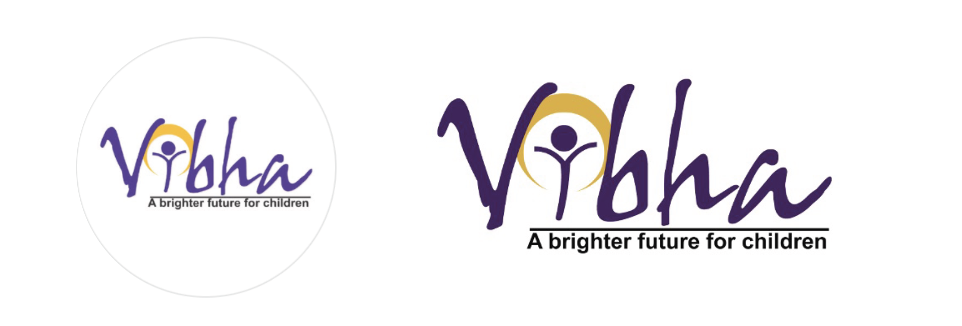
Identifying the Need for Change
Before the redesign, Vibha's brand lacked the professional "visual handshake" required to instill immediate trust in high-level donors. My evaluation revealed that while the organization’s heart was evident, the execution was unpolished.
We moved away from a "rushed" aesthetic—characterized by inconsistent linework and jarring colour contrasts - toward a unified visual language built for a global stage. Key shifts included: refining the typography, improving the composition, balancing the palette, unifying the visuals.