Splitsville Bowling Facilities
Environmental Graphic Design & Brand Integration
2023 - 2025
Scope: Environmental Graphics, Custom Carpet & Wallcovering Design, Laneway Graphics, Feature Signage
Architecture & Interior Design: Revelhouse
Visualization: 3D renderings courtesy of Revelhouse
Splitsville is a premier family-friendly bowling and entertainment destination expanding across Canada. Working alongside the architecture team at Revelhouse, the objective was to interpret Splitsville’s established brand guidelines and translate them into a dynamic, multi-zone physical environment. My scope encompassed developing standardized environmental art, large-scale laneway graphics, custom-manufactured flooring surfaces, and specialized feature walls that integrate seamlessly with Revelhouse’s architectural framework.



Lane Masking Units: standard & VIP lanes
The bowling masking units serve as the visual anchor of the venue.
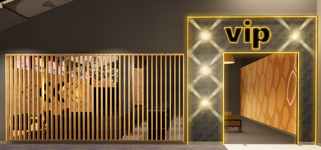
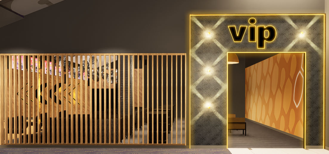
For the standard bowling lanes, we incorporated warm wood textures into the masking units to keep the expansive interior feeling light, friendly, and welcoming. For the VIP masking units, the objective was to create a more upscale atmosphere while retaining core brand shapes. To achieve this, I developed a geometric triangular pattern finished with a rich gold gradient on a dark grey background.


Laneway Environmental Graphics
Bowling environments are high-energy, elongated spaces requiring intentional visual pacing.
Visual Momentum: utilizing Splitsville’s core brand elements (bold chevron arrows and dynamic bowling ball with motion lines) I designed expansive wall graphics that draw the eye down the length of the lanes toward the pins.
Typographic Impact: high-contrast, punchy brand messaging was paired with signature crimson and deep-tone color blocking to inject modern energy into the space while maintaining crisp legibility from across the concourse.


On-brand Carpet Tile Design
Arcade Area Specific
The arcade area is an intensely active zone with substantial sensory input, bright neon screens, and moving lights.
The Concept: I developed an original creative direction combining 8-bit arcade graphics (inspired by retro pixel games like Pac-Man) with the rolling circular momentum of bowling balls.
Palette & Balance: To ground the high visual noise without overwhelming guests, the pattern utilizes multiple tonal values and tints of the brand’s signature purple and grey.
Manufacturing & Rollout: The RevelHouse team and I collaborated through technical rounds with the carpet manufacturer to calibrate precise dye matches and test repeat seams. The final modular tile creates a continuous, directional flow that was subsequently rolled out across arcade areas and multi-purpose rooms in a few facilities.


Restroom Wallcovering Design
Restrooms in entertainment venues are frequently overlooked utilitarian zones.
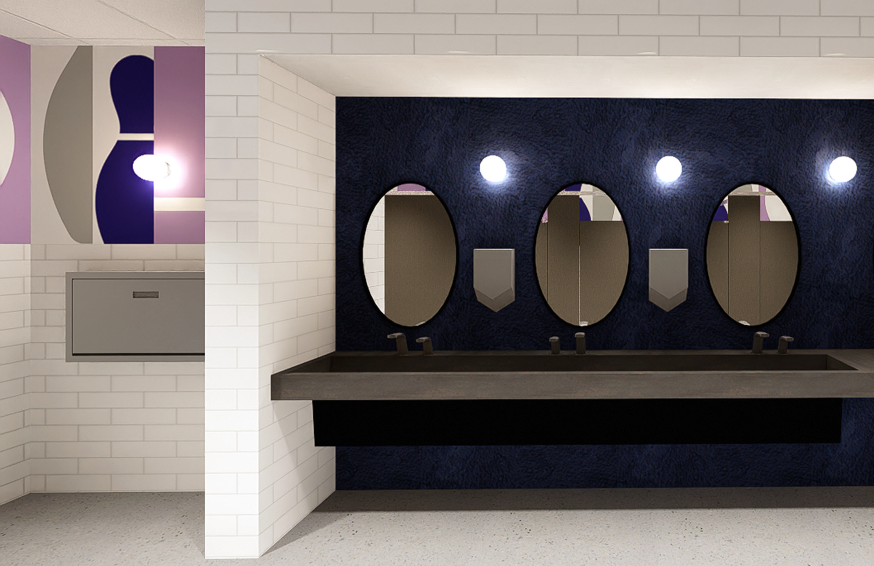
Pattern Strategy: Rather than a generic finish, I spearheaded an original wall-covering pattern derived directly from the primary brand identity.
Execution: By deconstructing and playfully cropping bowling pin silhouettes and geometric spheres, the design creates an engaging, contemporary pattern. It reinforces the brand’s family-friendly persona in a clean, elevated format that withstands high-traffic commercial use.


Signage Architectural Integration & Lounge Feature Wall
For Various Locations
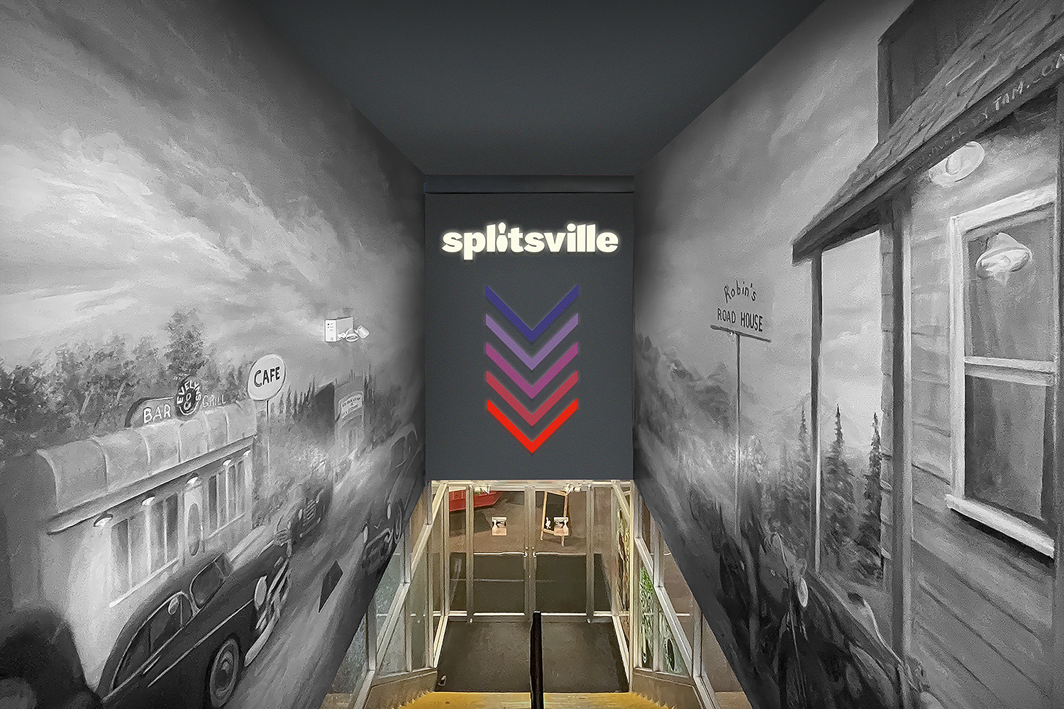
Exterior & Entrance Studies: Graphic studies were also developed to explore how brand typography, illuminated entry portals, and directional cues translate from the exterior façade of various locations. This included exploration of graphics transitioning into the primary interior stairwells and transition corridors.
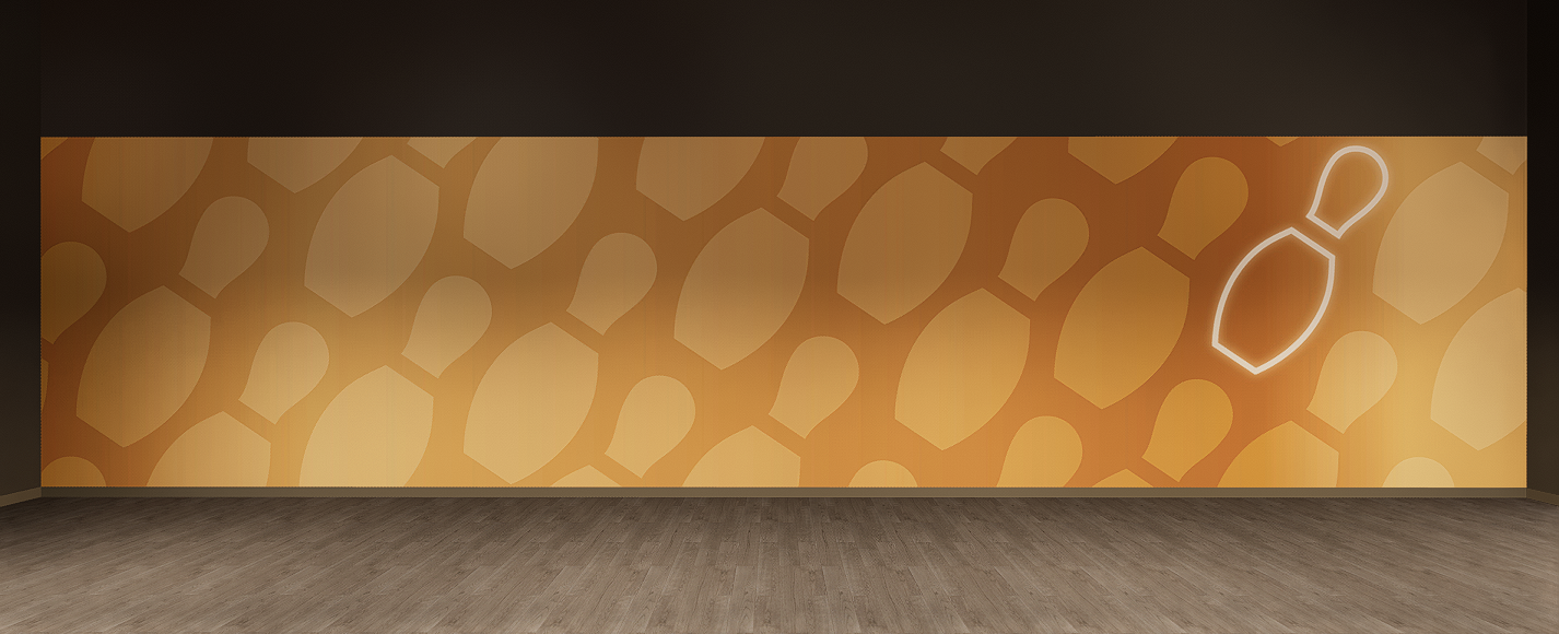
Hospitality Integration: For the private VIP lounge areas, I developed a refined tone-on-tone amber bowling pin pattern. This bespoke surface sits directly behind architectural vertical wood slats and frames the warm-lit VIP entrance, offering an intimate, hospitality-forward ambiance for corporate events and private parties.