ScissorsCut
Full Visual Identity Design and Standards
June 2019
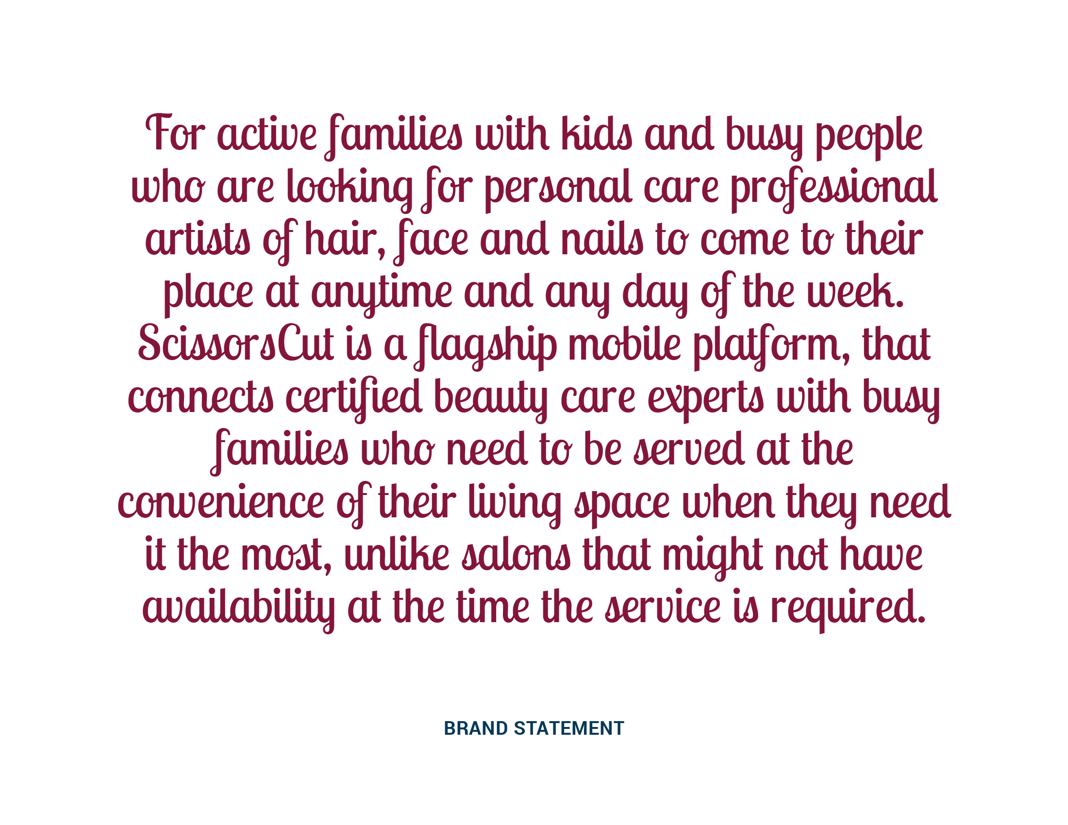
We created a full visual identity package for a flagship mobile platform connecting certified beauty care experts with busy families in need to be served at the convenience of their living space when they need it most.
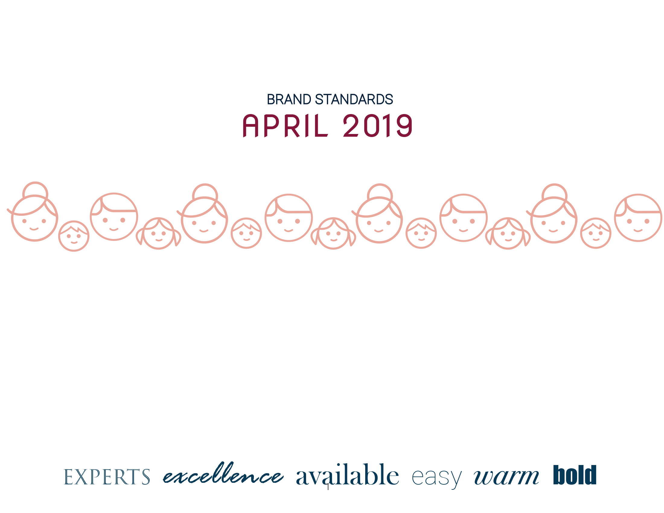
After a basic brand strategy exercise, a statement of differentiation was crafted and the following guiding principles were agreed upon: experts, excellence, available, easy, warm, bold.
Next, three creative directions were considered to set the feel and concept behind the brand.

About the Visual Identity
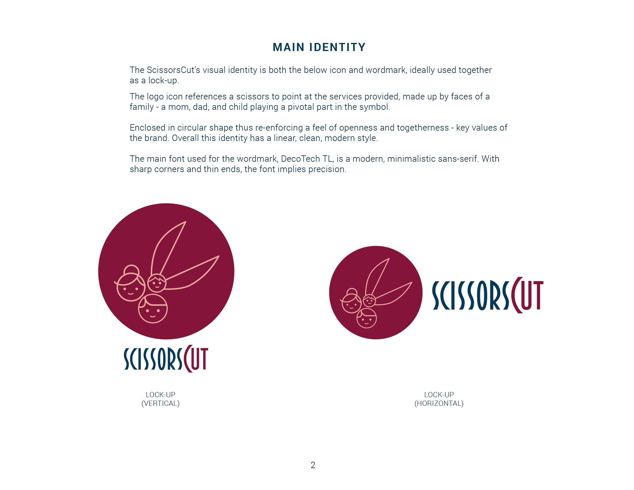
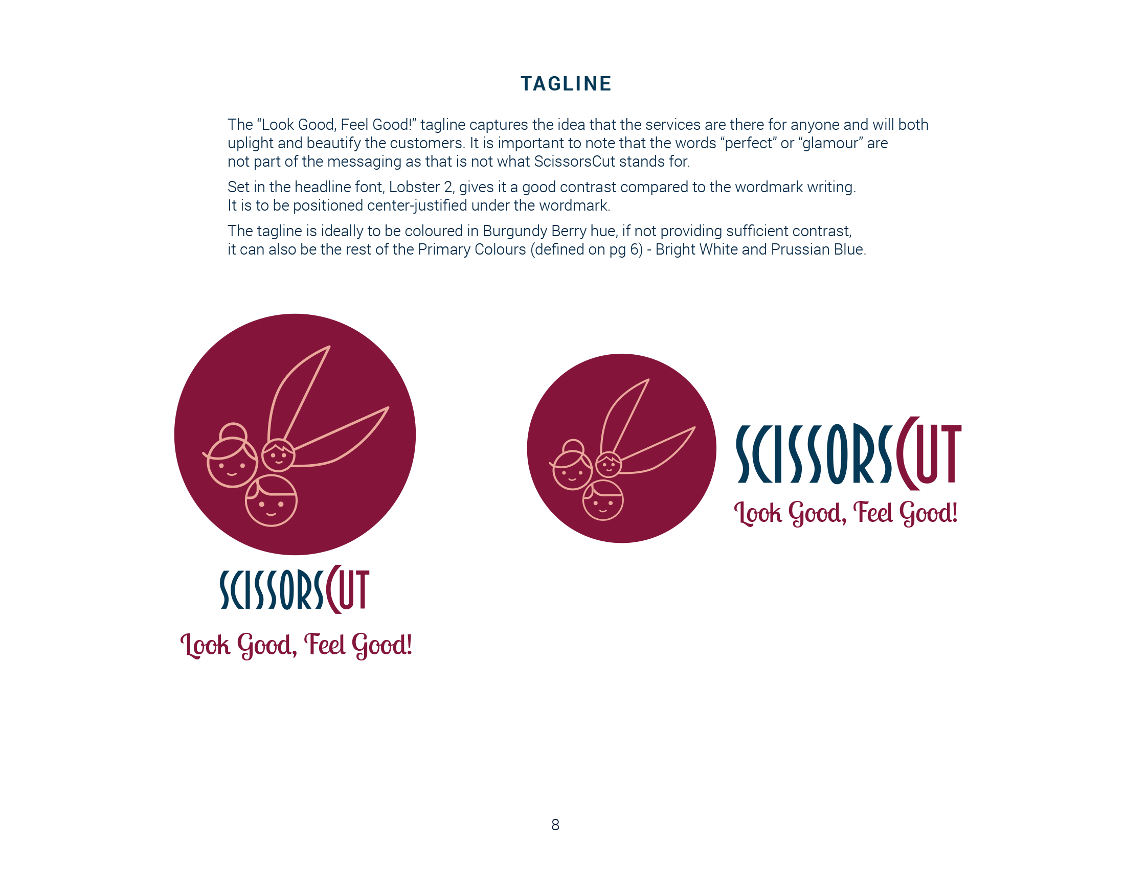
The logo icon references scissors to hint at the types of services provided. These scissors are made up by faces of a family - a mom, dad, and child with latter playing a pivotal part in the symbol. The logo is enclosed in the circular shape thus re-enforcing a feel of openness and togetherness - key values of the brand. Overall, this identity has a linear, clean, modern style.
The main font used for the wordmark, DecoTech TL, is a modern, minimalist sans-serif. It has sharp corners and thin ends, the font implies precision.
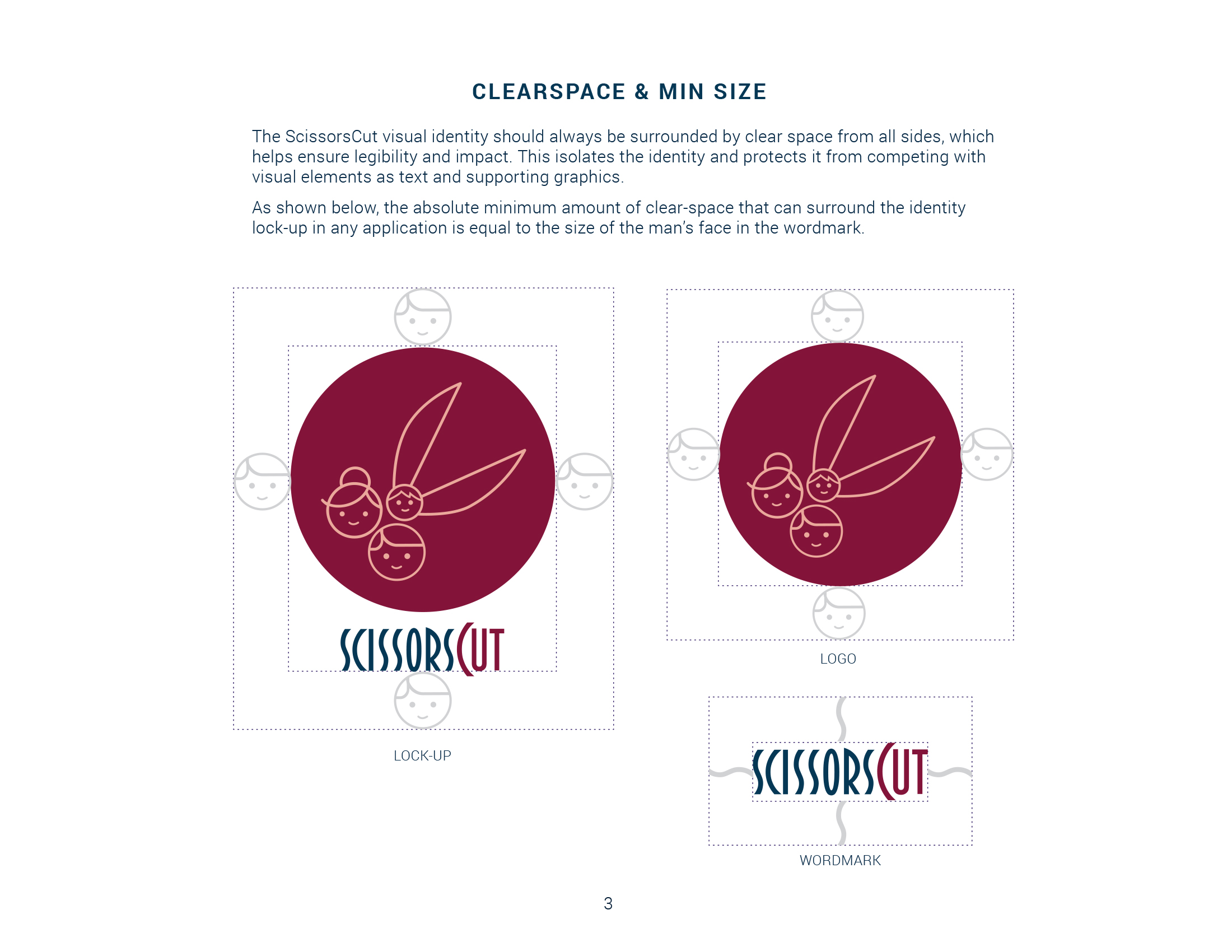
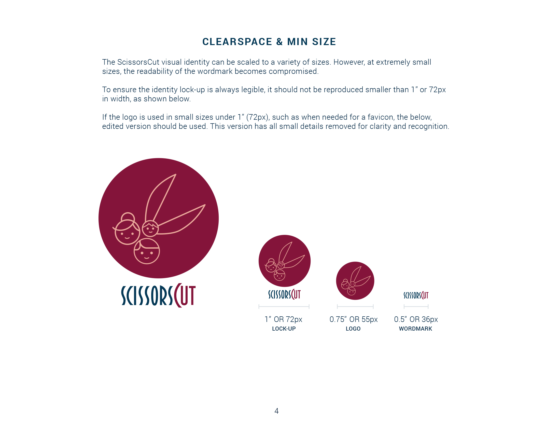
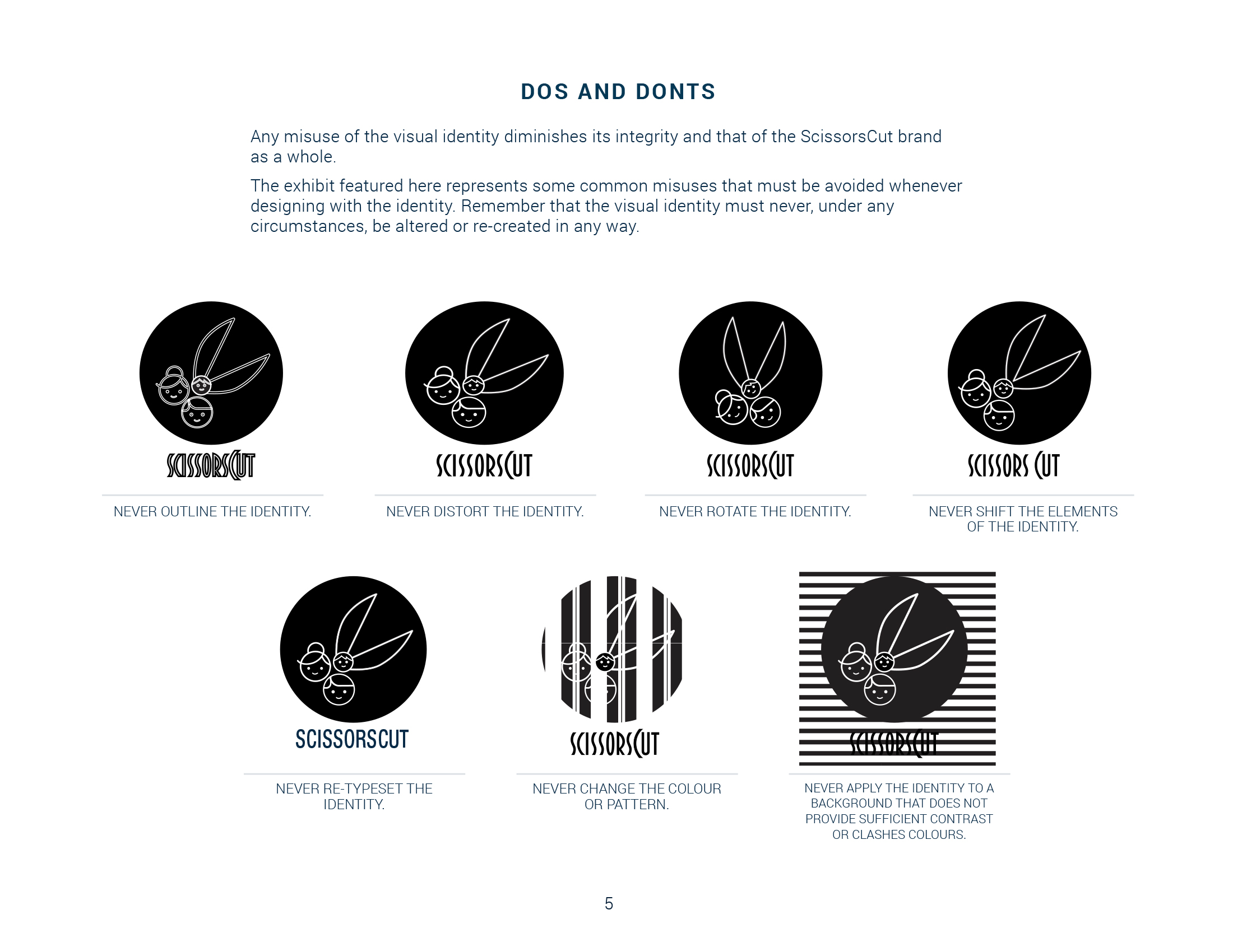
Full Brand Standards
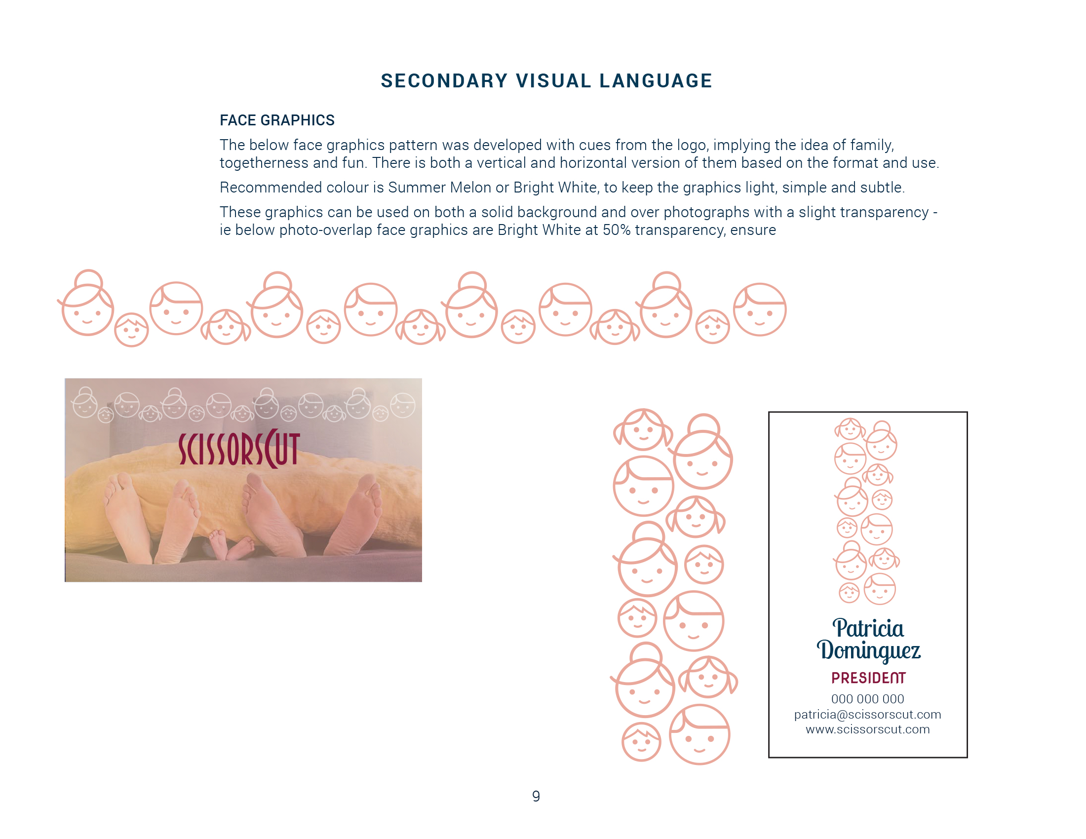
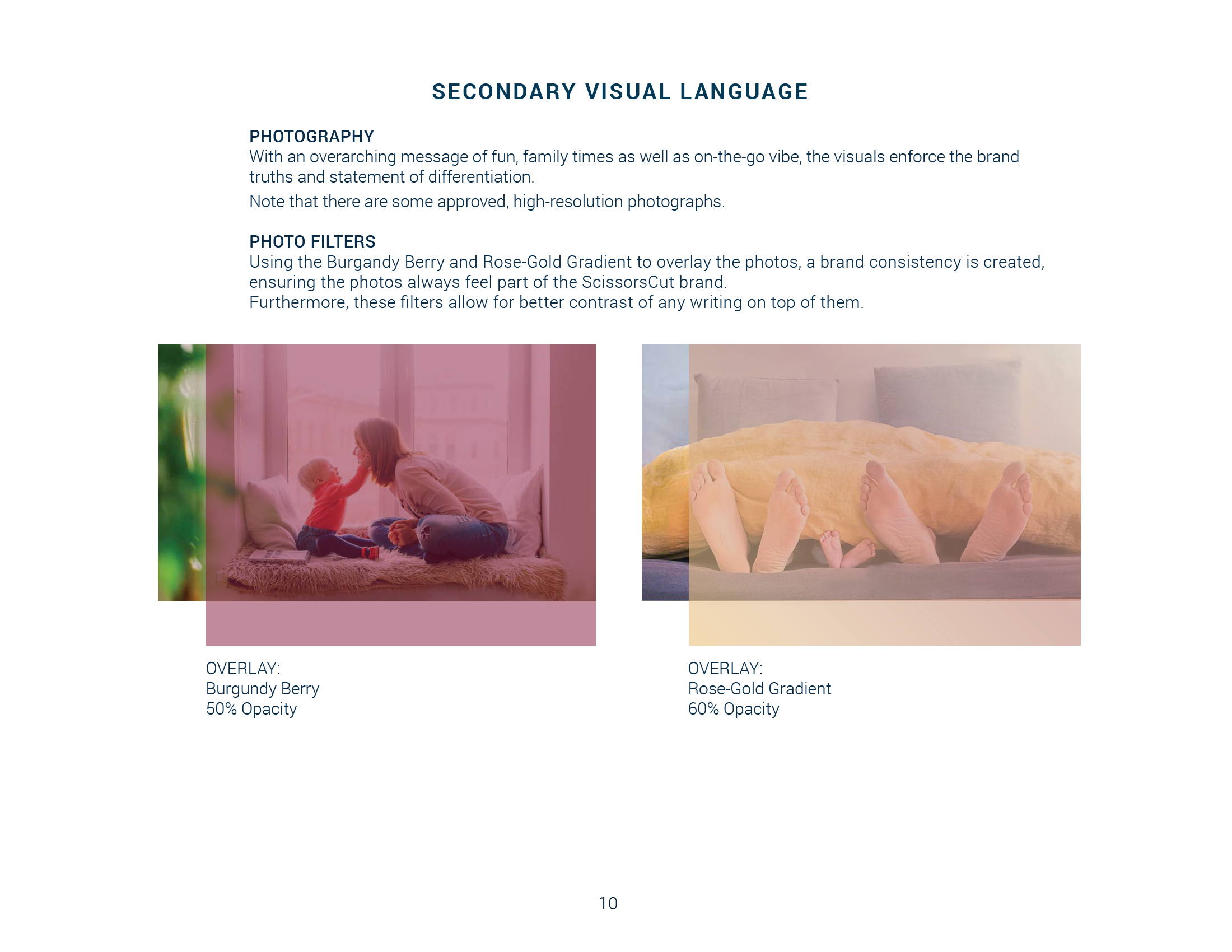
Find below full brand standards package developed, including secondary visual language (pattern, graphics elements, photography and photo treatment).
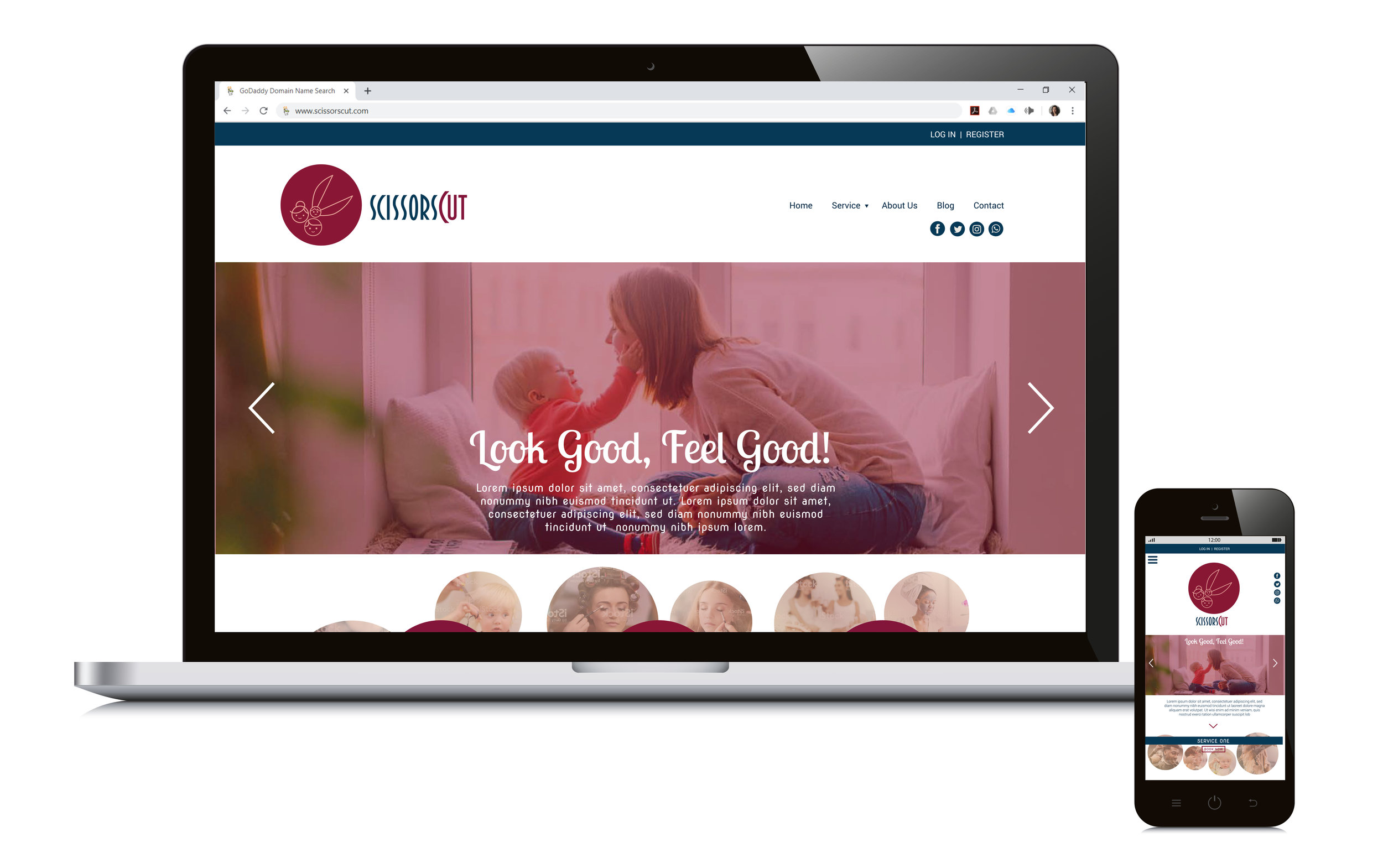
On-Brand Visuals & Communication Materials Design
Various communication pieces were put together to give the business a kick start -- business cards, social media visuals, and landing page mock-up.