Mega-Lab Works
Brand Positioning, Naming and Design
Mar 2025
This project is a comprehensive sub-brand strategy and visual identity for Mega-Lab Works. As an extension of the established Mega-Lab parent company, Mega-Lab Works was positioned as a trusted partner offering creative chemical manufacturing solutions - from concept to commercialization.
(A snapshot of the parent brand is included at the end to showcase the full visual connection).
ABOUT THE POSITIONING
The brand strategy required balancing the needs of two distinct audiences: a seasoned executive looking for a reliable, efficient manufacturing partner, and an idealistic entrepreneur seeking guidance to bring a passion project to life. To speak to both, we developed a brand persona anchored in the Creator and Caregiver archetypes.
This positions Mega-Lab Works as a dynamic, progressive leader that tackles challenges with creativity, while remaining a warm, accountable partner that guides clients through every step of the process.
ABOUT THE VISUAL IDENTITY
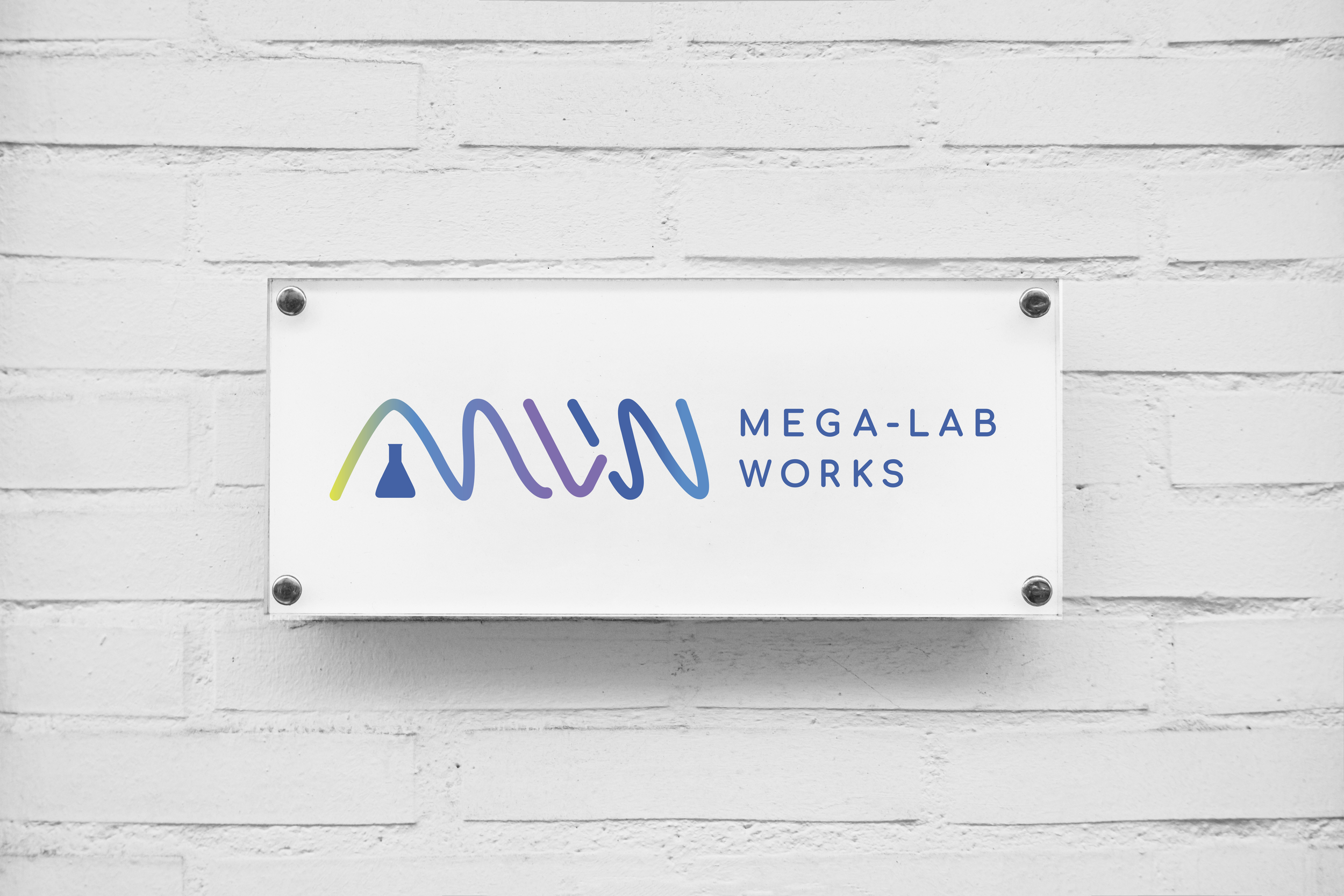
The Mega-Lab Works visual identity is built around a modern, fluid logo that reflects the brand’s innovation, adaptability, and customer commitment. The logo is shaped from the letters “MLW,” forming a flowing, mountain-like path - symbolizing the journey of overcoming challenges to reach new heights. This represents Mega-Lab Works' dedication to problem-solving, resilience, and continuous progress.
The flow culminates in the upward stroke of the “W,” signifying forward momentum and growth. At the foundation of this design is the Mega-Lab parent company flask icon, reinforcing the company’s deep industry expertise, reliability, and trusted reputation. This serves as a reminder that every breakthrough is supported by a strong backbone of knowledge and experience.
The subtle intersection between the “L” and “W” represents ideation and transformation, reflecting how true innovation is born at the crossroads of collaboration and change.
Brand Visuals & On-Brand Applications Design
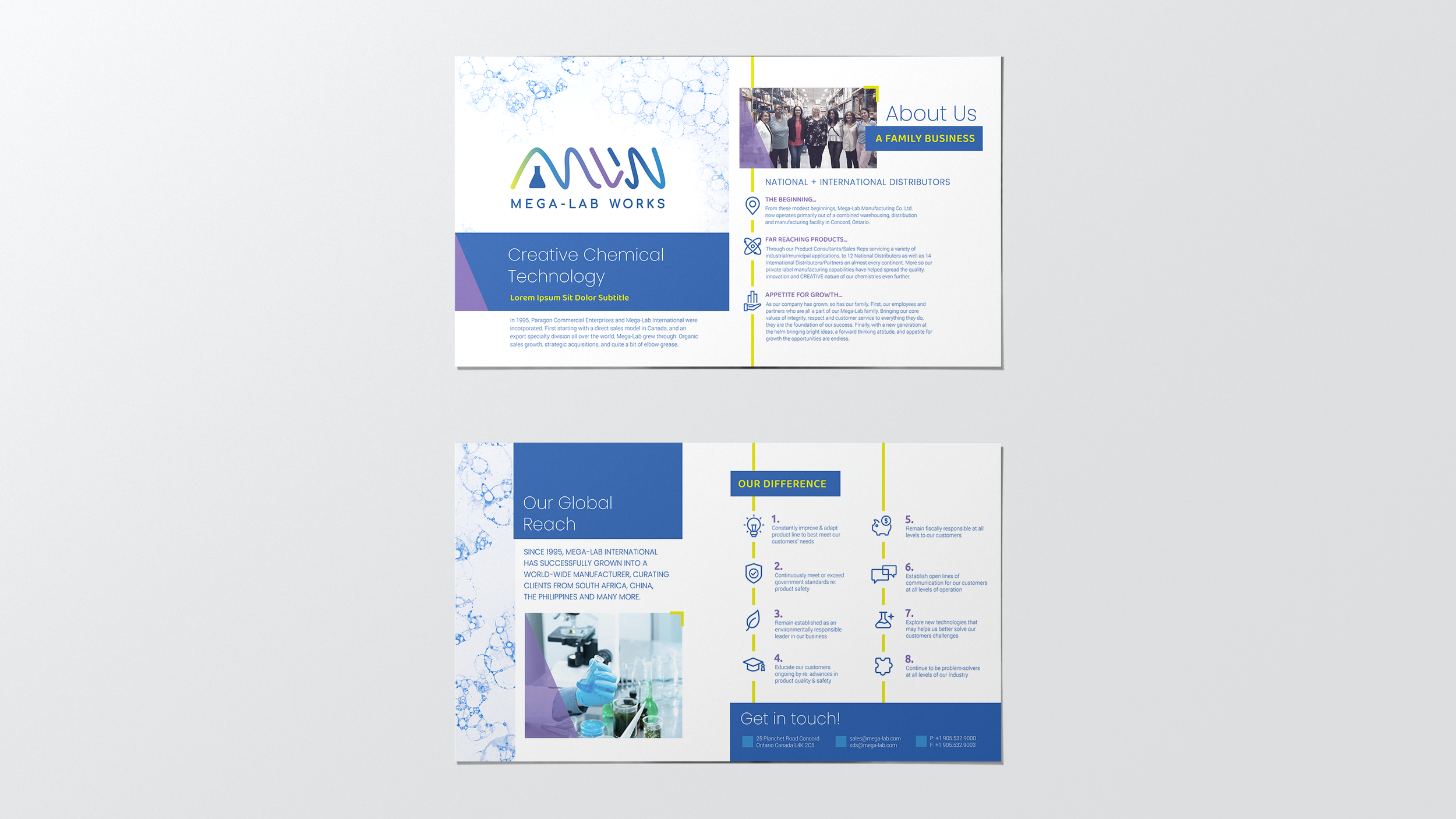
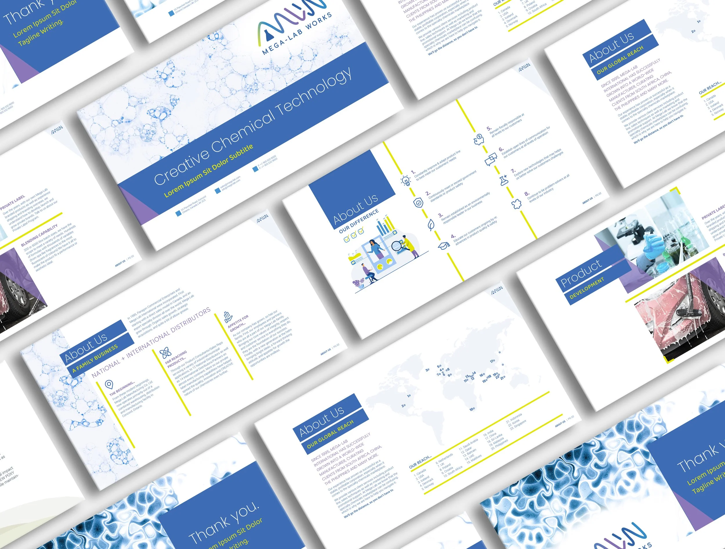
A cohesive system of secondary visuals - including unique photo frames, line-based iconography, and graphic shapes - was created to ensure brand consistency. The color palette is led by the trust and logic of the parent brand (Misty Blue and Cornflower Blue), accented by a creative Ultraviolet purple and an innovative Light Lime green.
To add a human touch to their technical offerings, we also developed a custom, minimalist illustration style. This comprehensive toolkit ensures that the brand's persona as a trusted, innovative partner is reinforced at every touchpoint, from sales sheets and presentation templates to a new website landing page.
Sales Sheet
Presentation Template Design
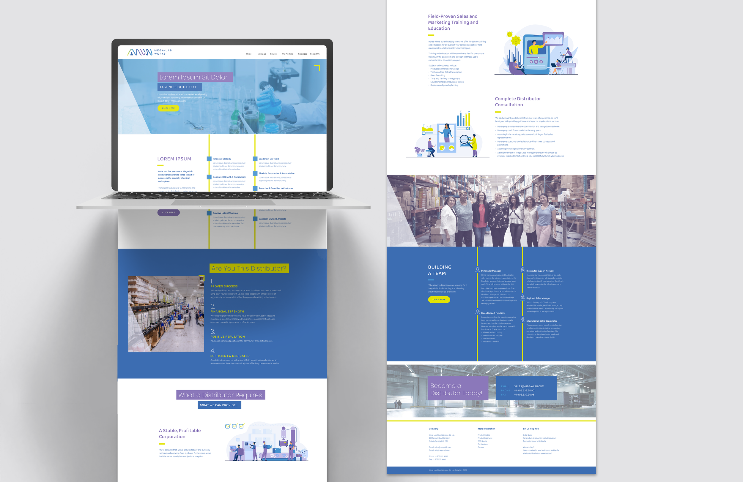
Website Landing Page UI Design
Mega-Lab Parent Brand Company

The name "Mega-Lab Works" was strategically chosen to maintain a strong connection to its parent company, Mega-Lab, while the addition of "Works" emphasizes their role in making things happen and bringing ideas to life.
To modernize the sub-brand for today's market, we evolved the parent company's legacy aesthetic into a more progressive design. We carried over the foundational flask icon and recognizable blue color, leaving behind the retro stylistic elements in favor of a clean, forward-thinking aesthetic. Ensuring Mega-Lab Works’ new identity feels fresh yet firmly rooted in the parent company's established industry trust.