LIFT by TRIEC
Brand Positioning and Design
Summer 2025
I worked with TRIEC (Toronto Region Immigrant Employment Council) on launching their latest program initiative - LIFT (Leadership for Integration of Future Talent).
The goal of the LIFT program is to maximize talent, unlock opportunities, and build future-ready teams by bridging cultural differences within the workplace. The program required a brand foundation that felt established and trusted, yet highly transformative and modern. To maximize the launch's impact, I created a cohesive brand ecosystem, designing on-brand materials that included a sales deck, website, and social media layouts.
ABOUT THE POSITIONING
Through extensive brand strategy, the target audience was segmented into three distinct decision-makers: HR professionals seeking structured programs with clear ROI, idealistic EDI leaders driving systemic change, and pragmatic executives focused on aligning these initiatives with high-level organizational goals.
To resonate with these distinct profiles, the LIFT brand persona was developed around "The Hero" (main personality) and "The Magician" (sub-personality). The resulting brand voice is grounded, empathetic, and inspiring—delivering practical solutions rather than passive instruction.
ABOUT THE VISUAL IDENTITY
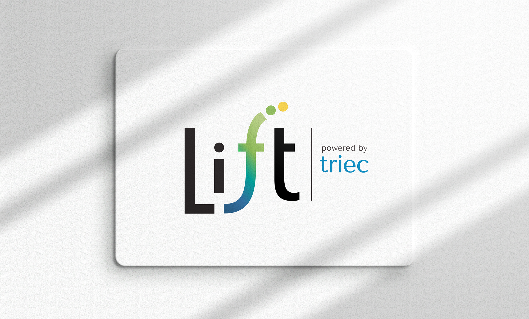
The LIFT visual identity embodies the spirit of upward momentum and inclusion at the heart of the program.
The uniquely designed “f” rises in a soft wave to elevate the “i”, symbolizing how LIFT raises the bar and helps level the playing field for immigrant talent. The curved form of the “f”, paired with its upward dots, suggests a trajectory of growth—one that is actionable, results-driven, and filled with purpose and joy. The curve also adds a subtle softness, reflecting the program’s people-centered approach.
The typography is a clean sans-serif with humanist qualities, striking a balance between clarity and warmth. The weight of the letters gives the logo a sense of confidence and presence, while the capital “L” brings structure and formality, anchoring the visual identity. The positioning of TRIEC, the parent organization, is intentionally close - stacked to the right to reflect its integral role in powering and supporting the LIFT initiative.

Building the Brand Ecosystem
A primary focus of this project was developing a robust secondary visual language to ensure LIFT felt like a complete, living brand ecosystem rather than just a logo on a page. These elements were intentionally designed to support the core visual identity and create an uplifting, diversity-promoting, and learning-focused feel for the brand.
Strategic Colour Palette: Anchored by the trust and balance of "TRIEC Blue" and Teal, the palette is injected with energy through Sunshine Yellow (representing optimism) and Orange (representing encouragement). Green shades were introduced to symbolize growth and harmony.
Brand Typography: A multi-layered typographic system utilizes Tenor Sans for welcoming, readable headlines, supported by Montserrat and Open Sans as clean, modern sans serifs that complement the more humanist headline choice.
Graphic Elements: The visual ecosystem heavily relies on organic, curved shapes that echo the LIFT logo, combined with custom iconography and subtle background patterns to create depth across digital and print touchpoints.

Sales Deck Presentation
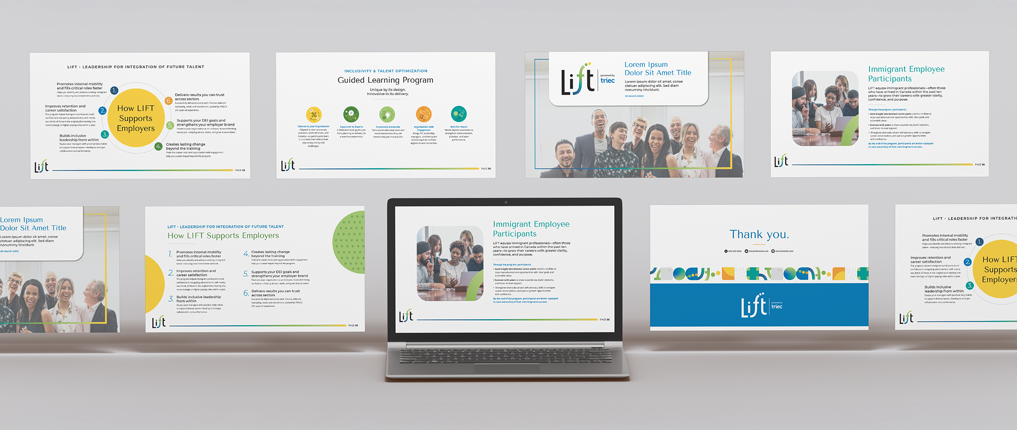
Designed specifically to help HR and EDI professionals pitch the LIFT program to executive decision-makers, the sales deck is clean, structured, and data-driven. It uses vibrant, multi-coloured framing elements and large, optimistic photography of diverse teams to keep the presentation engaging while delivering critical information about talent optimization and guided learning.
Sales Deck Presentation
Landing Page Mock-up
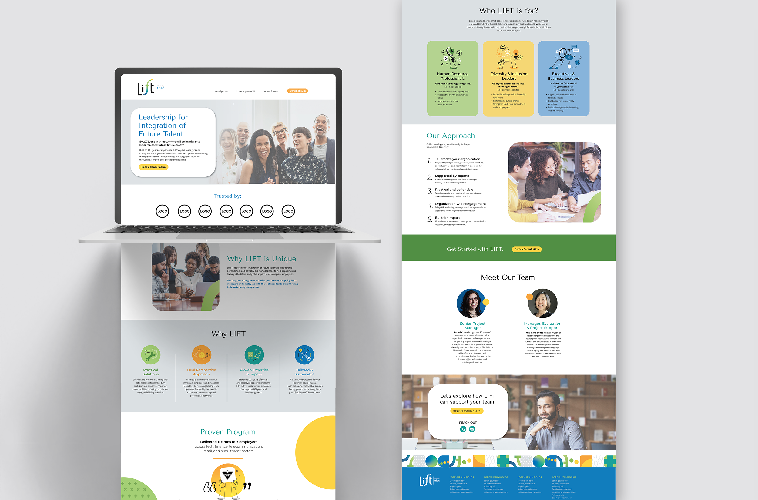
The landing page acts as the primary digital anchor for the program. It utilizes bold, compelling messaging in the hero section combined with secondary visual language through overlapping circular shapes, yellow highlight accents, pattern and custom bi-colour icons that visually communicate core pillars like inclusion, change, and active learning. Target audience pathways are clearly delineated with custom graphics for HR Professionals, D&I Leaders, and Executives.
Landing Page User Interface Design
Social Media Layouts
The social media strategy focuses on thought leadership and engagement. The templates include bold statistic call-outs, interactive swipe carousels designed for HR teams, and custom graphic illustrations that use the brand's secondary background patterns to stand out in crowded social feeds.
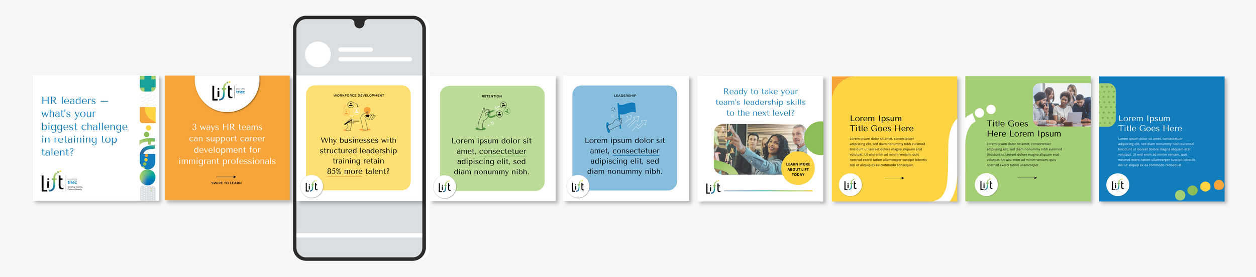
Social Media Tempalte Visuals