
Haven Wellness
Brand Strategy, Visual Identity, Creative Direction, Environmental Design
April 2024
Haven Wellness is a multidisciplinary clinic located in Toronto’s Liberty Village, dedicated to empowering individuals on their journey to optimal health. We were introduced to the project by SDI Design, who were leading the interior transformation of the space. The owners approached us with a selected name and a desire to create a clinic that felt like a true refuge for their community—specifically targeting stressed office workers seeking relief from anxiety and physical pain. They needed a brand identity that would resonate with this audience, offering them a true "haven" of safety and relaxation.
The Strategy & Visual Identity
We began by establishing a brand persona based on the Caregiver and the Sage archetypes, ensuring the voice felt nurturing yet expert. During our positioning workshops, we uncovered a core philosophy that became the foundation of the creative direction. As the owner articulated during our sessions: "Trees have long roots. We want to look at roots first as they spread to the branches—where the symptoms show".
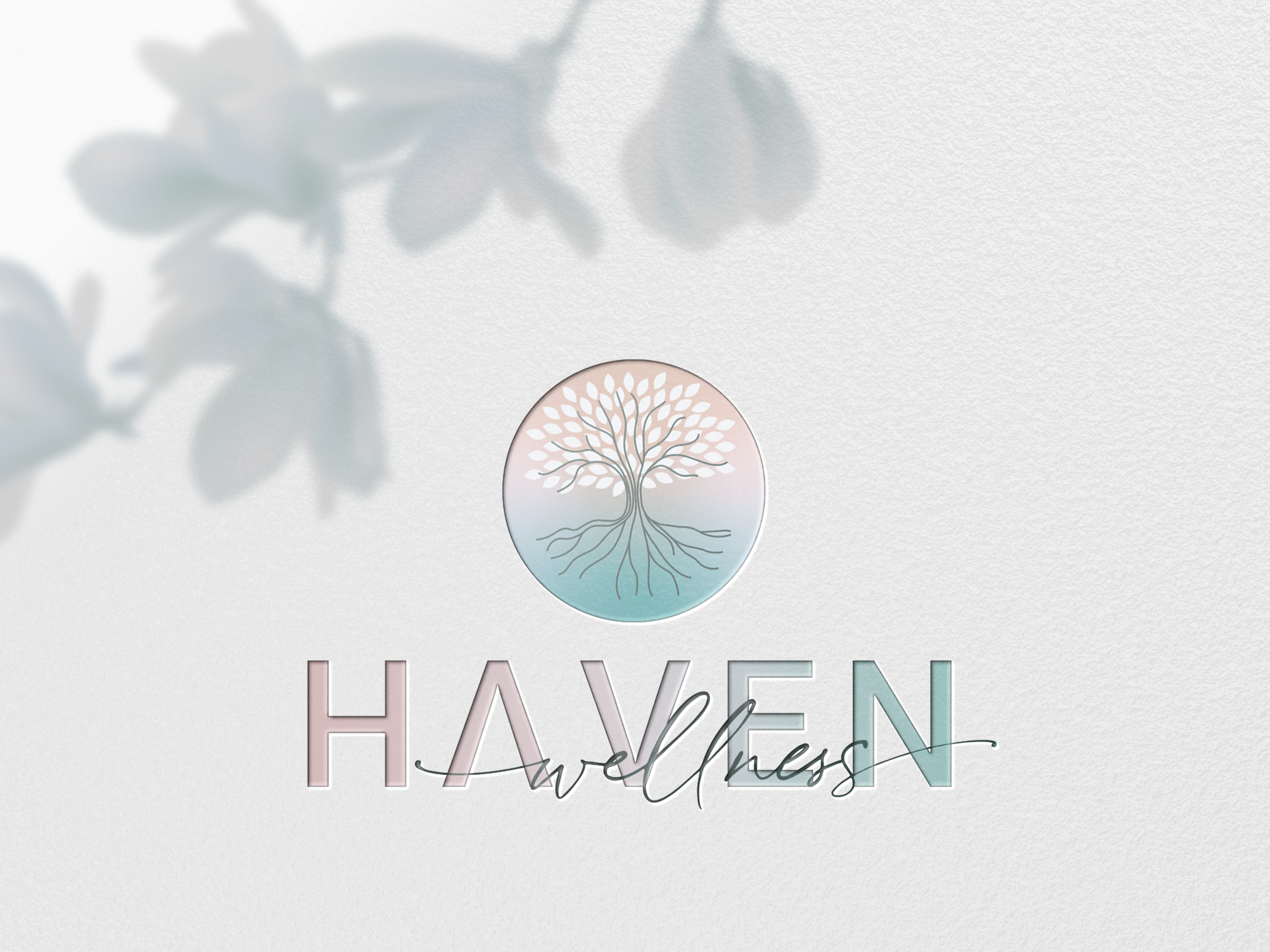
Upon exploring various creative directions that aligned with this insight, we collectively decided to focus on a line art direction featuring a tree. We developed a custom icon inspired by the Tree of Life, an ancient Celtic symbol representing balance and harmony. The resulting icon is intricate, with unique illustration lines that mimic a circulatory system to reflect the body's interconnectedness. To visualize the clinic's holistic approach, the roots and branches are given equal visual weight—the branches reaching high for growth while the roots provide stability.
This is balanced by a typographic system that pairs the confident, predictable sans-serif Gotham with the fluid, human feel of the Corinthia script, creating a look that is both progressive and approachable. The palette moved away from sterile clinical tones, utilizing soft sage, pine, and warm accents like primrose to evoke a sense of organic optimism.
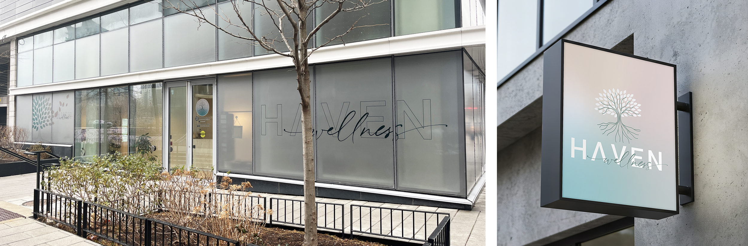
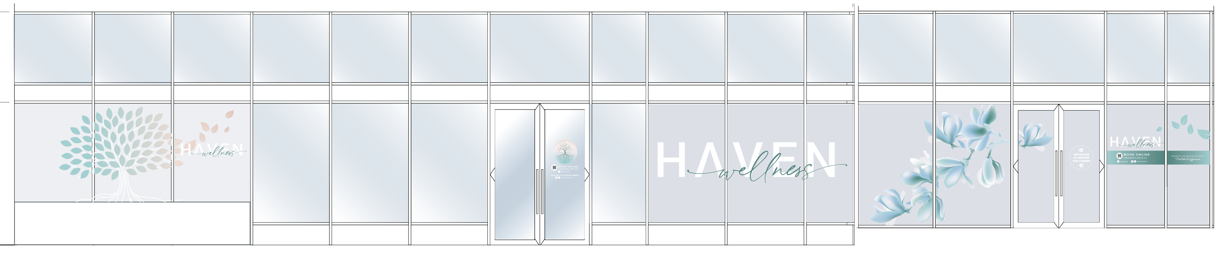
Environmental Graphics - Window Design
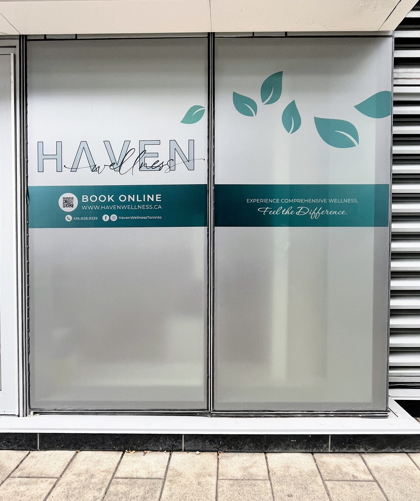
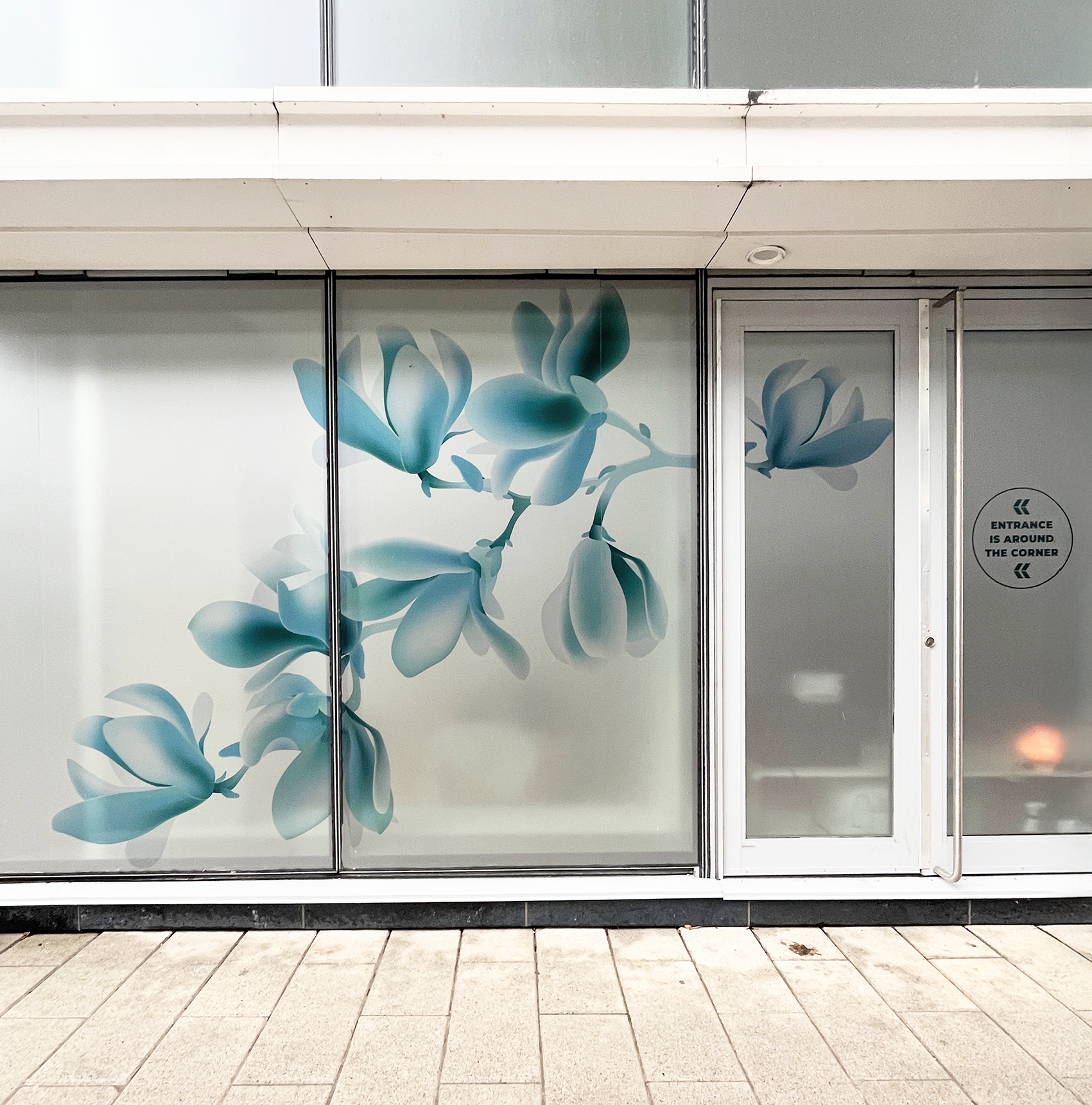
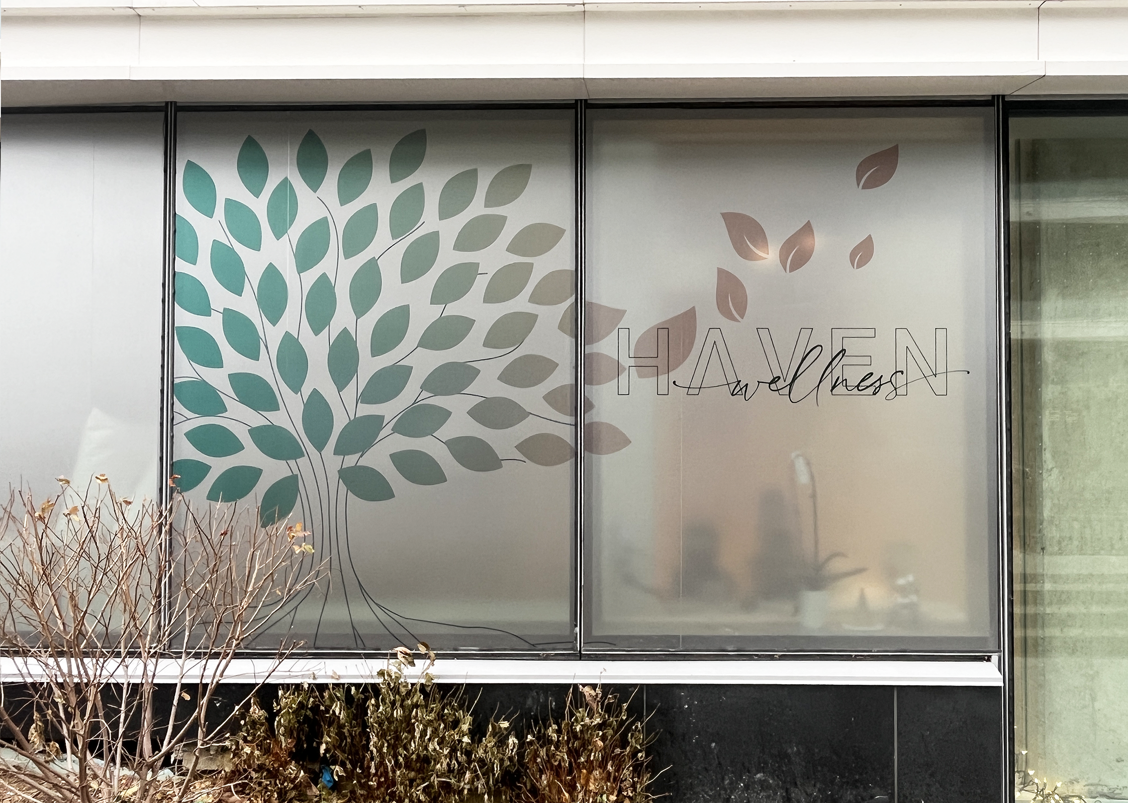
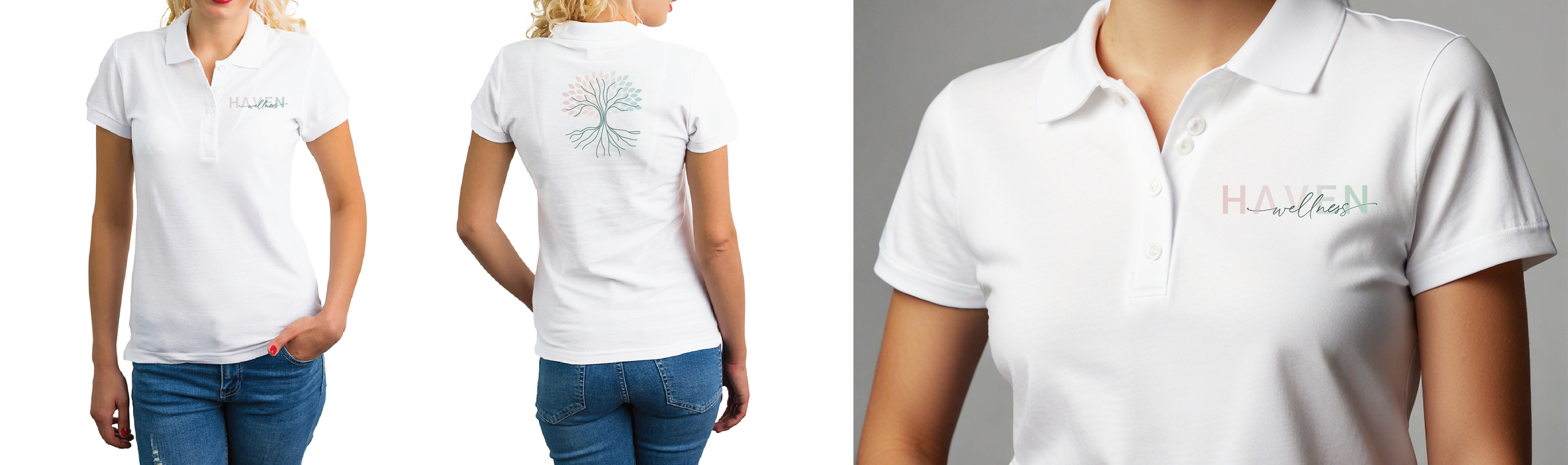
Translating the identity into the physical space was a priority to ensure it harmonized with the interior design. A critical challenge was the clinic’s location—a corner unit that required a delicate balance between allowing natural light into service rooms and maintaining patient privacy. We designed custom privacy window graphics printed on frosted vinyl, transforming a functional necessity into a beautiful, on-brand art feature that attracts passersby while shielding clients. We further extended the physical branding by exploring designs for blade signage and staff uniforms, ensuring a professional consistency throughout the client experience.
Digital Brand Applications
Finally, to ensure the brand could grow sustainably, I developed the creative direction for their social media and website design (the ‘look and feel’). Recognizing that the owners intended to manage these channels themselves, I provided a flexible visual system and pointers that allow them to execute professional, high-quality creative using simple tools.
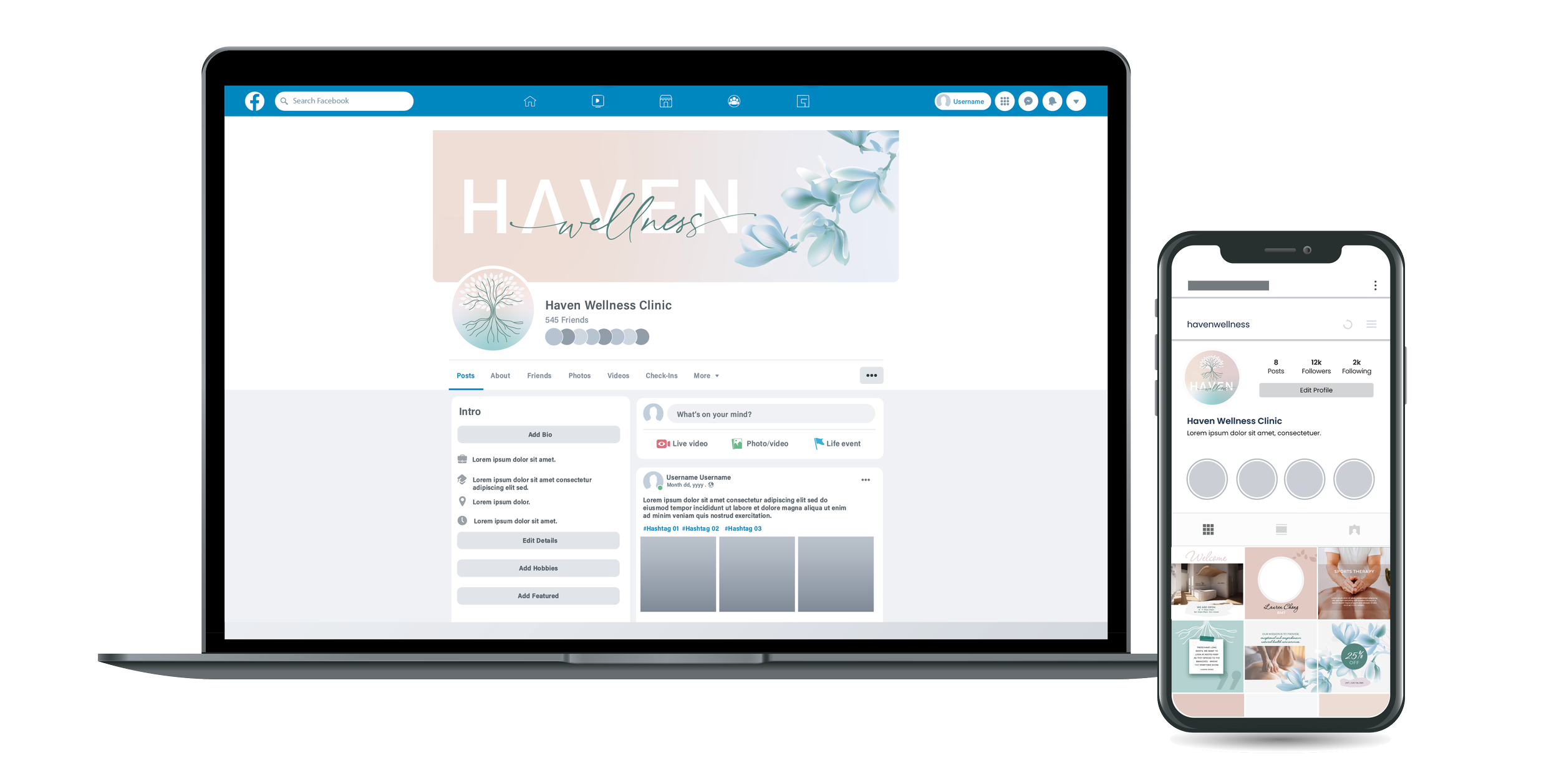
Social Media Visuals
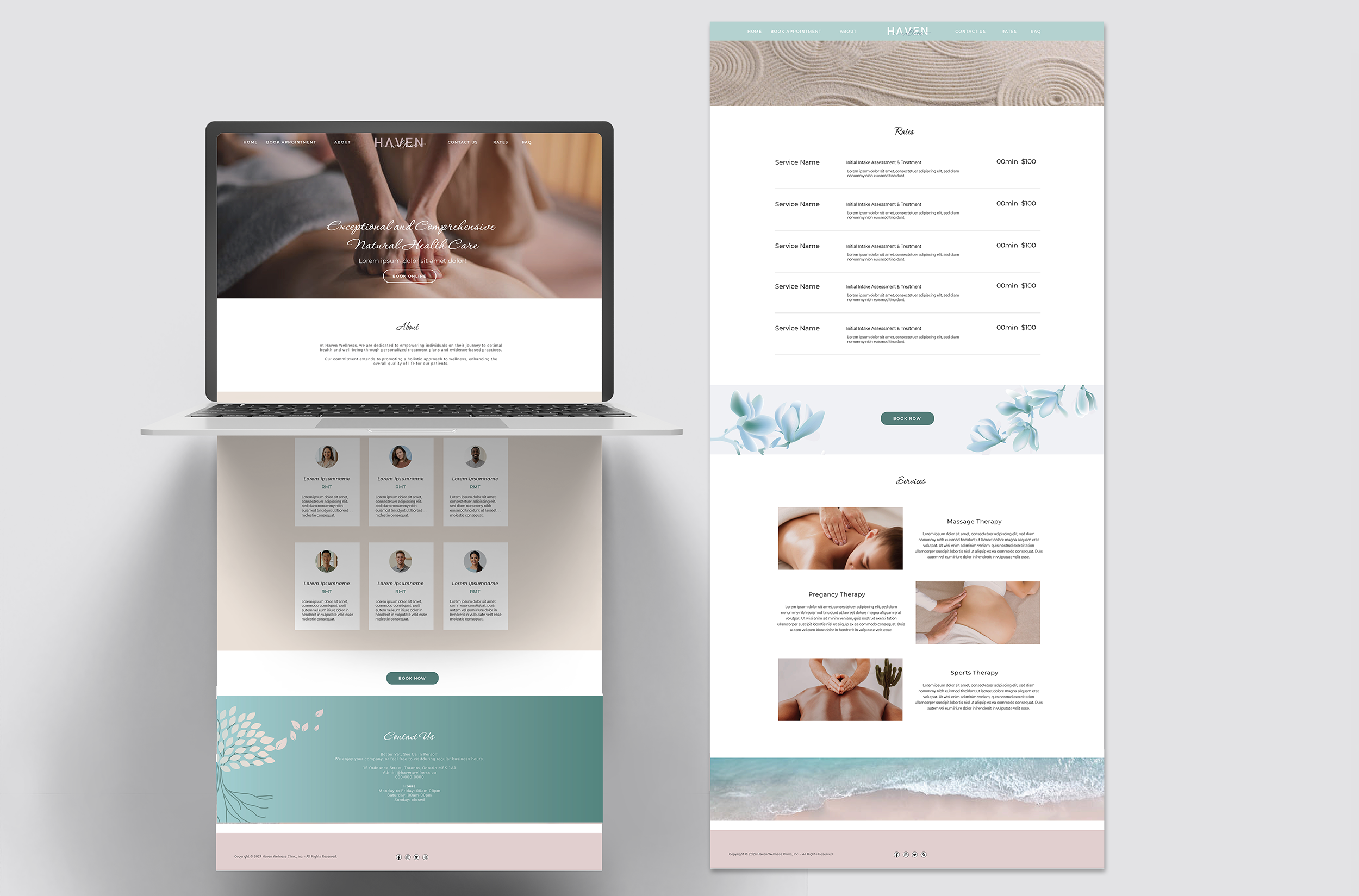
Simple Website Look & Feel
(as requested - owner to execute using GoDaddy platform)