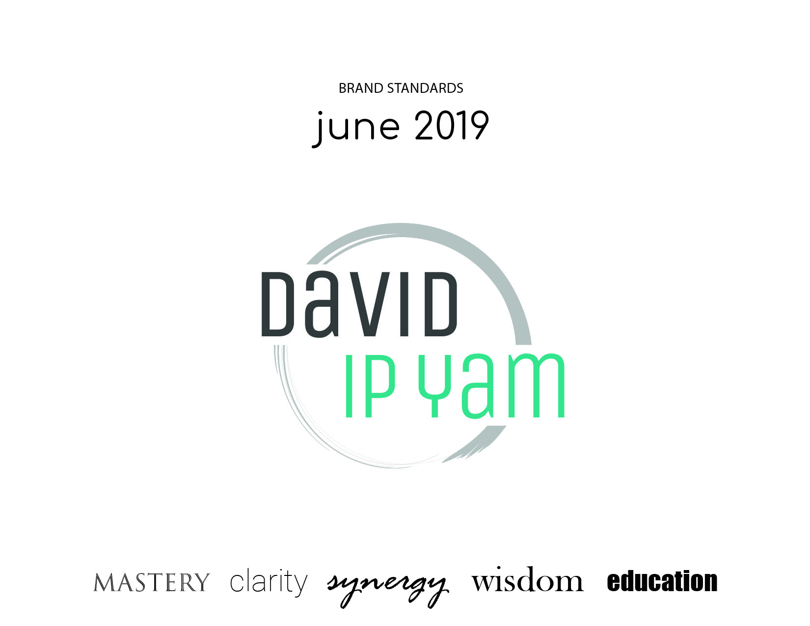
David Ip Yam Personal Brand
Visual Identity Package
June 2019
I worked with an entrepreneur to create a full visual identity package for his personal brand.
After establishing a basic brand strategy, a statement of differentiation was crafted and we agreed on the following guiding principles: mastery, clarity, synergy, wisdom, and education.
Next, three creative directions were considered to set the concept and feel behind the brand.

About the Visual Identity
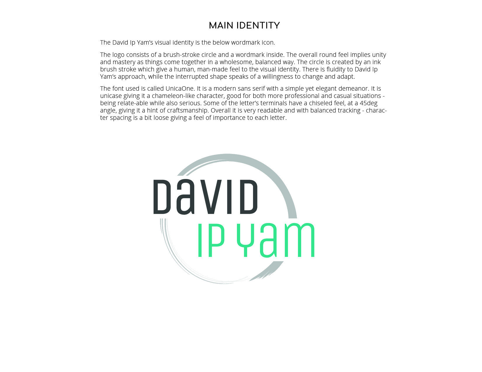
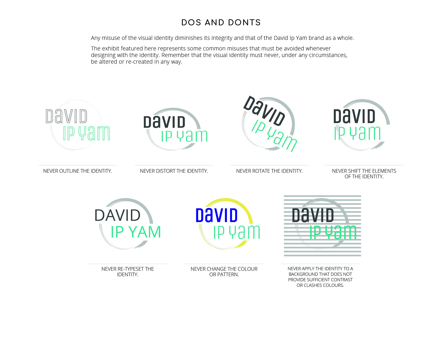
The David Ip Yam’s visual identity is the above wordmark icon.The logo consists of a brush-stroke circle and a wordmark inside. The overall round feel implies unity and mastery as things come together in a wholesome, balanced way. The circle is created by an ink brush stroke giving a human, man-made feel to the visual identity. There is fluidity to David Ip Yam’s approach, while the interrupted shape speaks of a willingness to change and adapt.
The font used is called UnicaOne. It is a modern sans serif with a simple, yet elegant demeanor. It is unicase giving it a chameleon-like character, good for both more professional and casual situations - being relate-able while also serious. Some of the letter’s terminals have a chiseled feel, at a 45 degree angle, giving it a hint of craftsmanship. Overall, it is very readable and with balanced tracking - character spacing is a bit loose giving a feel of importance to each letter.
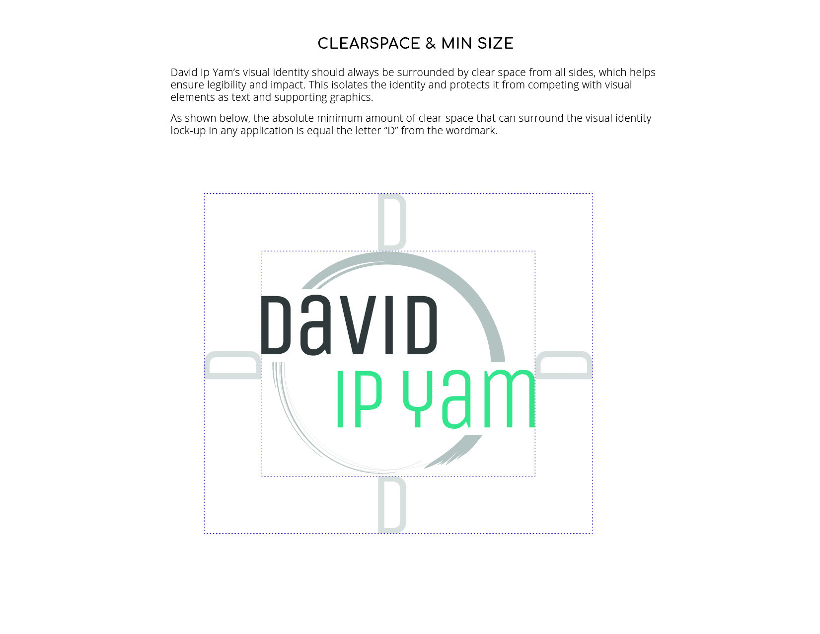
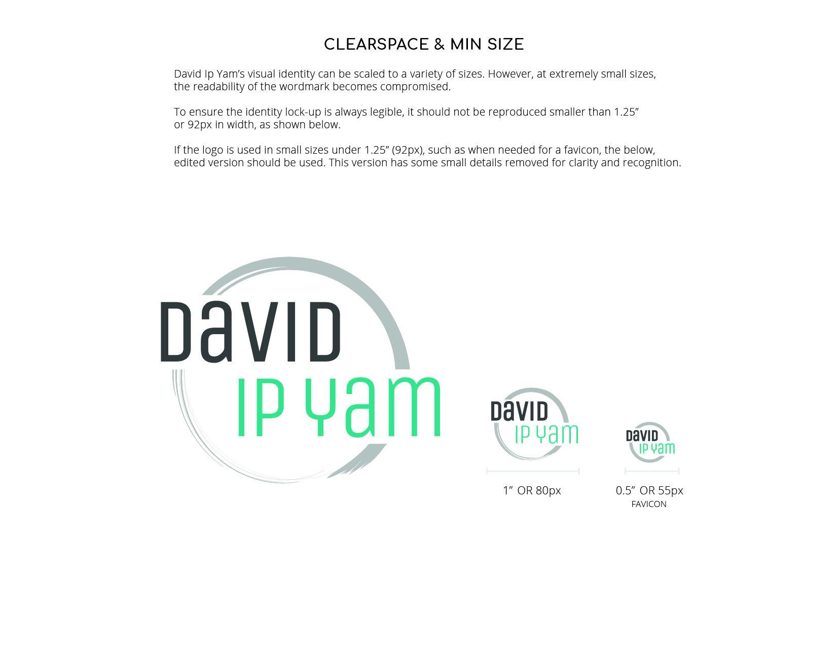
Advanced Brand Standards
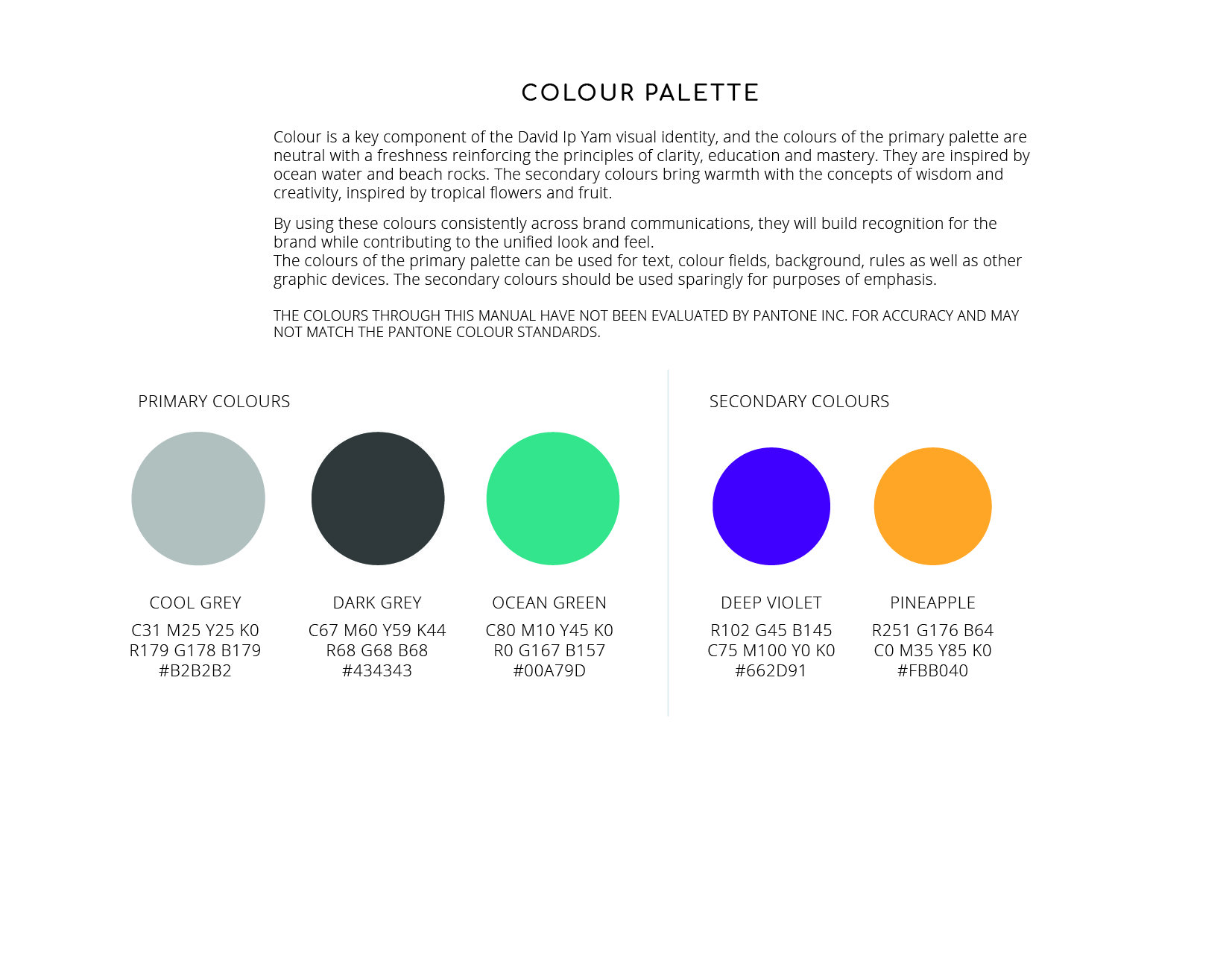
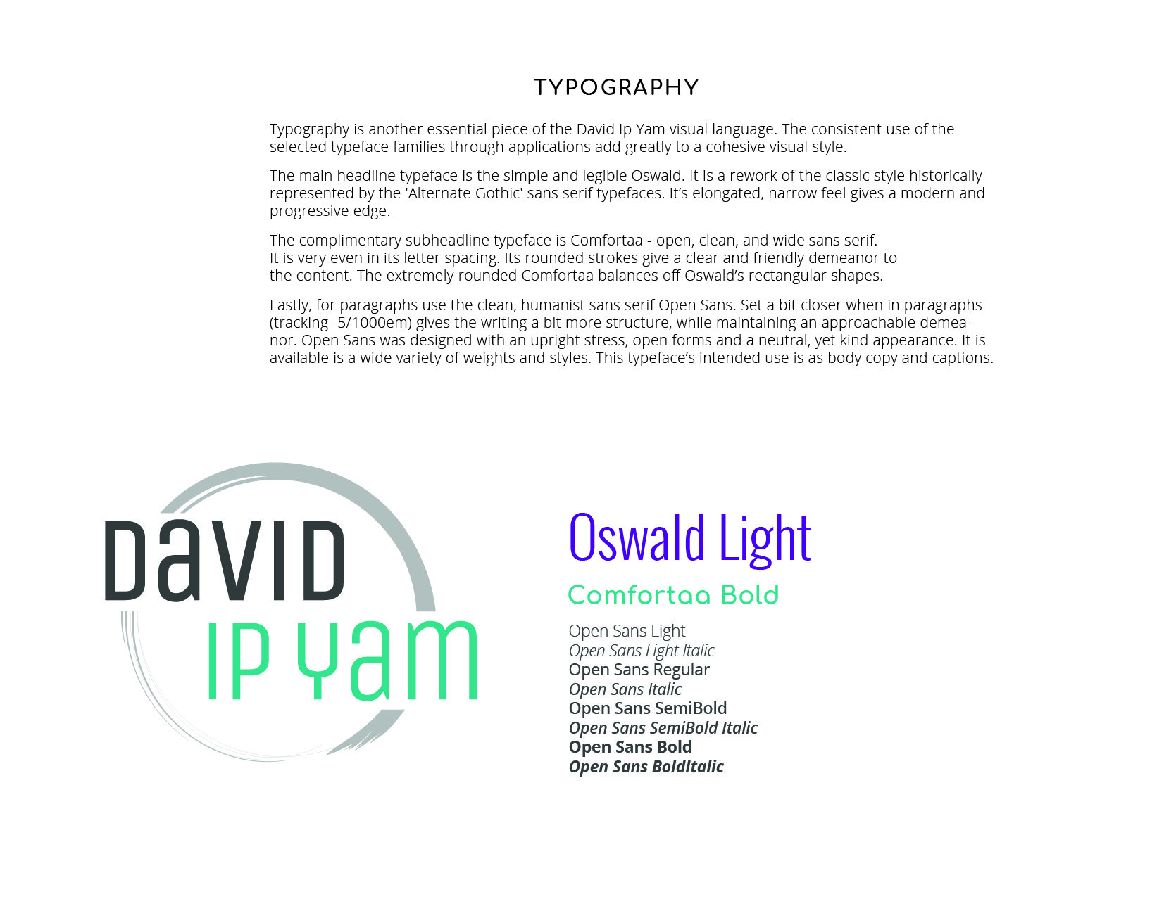
Below is the advanced brand standards package developed, including clear-spacing, colour palette, typographic combinations and more.