
Case Study: Demetres Cafe (Danforth)
Environmental Graphics & Art
Platinum Winner of the International Muse Design Award 2020 - Renovation
Artwork Series shortlisted by the London International Creative Competition 2021 - Nature’s Framed Layers


When a neighborhood spot has been shaken and traumatized by an unfortunate event, there is a need for a friendly space, where one feels safe and can replenish. Our goal was to create a space as such for Demetres Danforth.
Watch the video here showcasing great before & after shots.
IS Design Labs combined design powers with Black Bloom Studio for interior design, and JF Branding for print and installation.
Photography by Nicholas Jones.
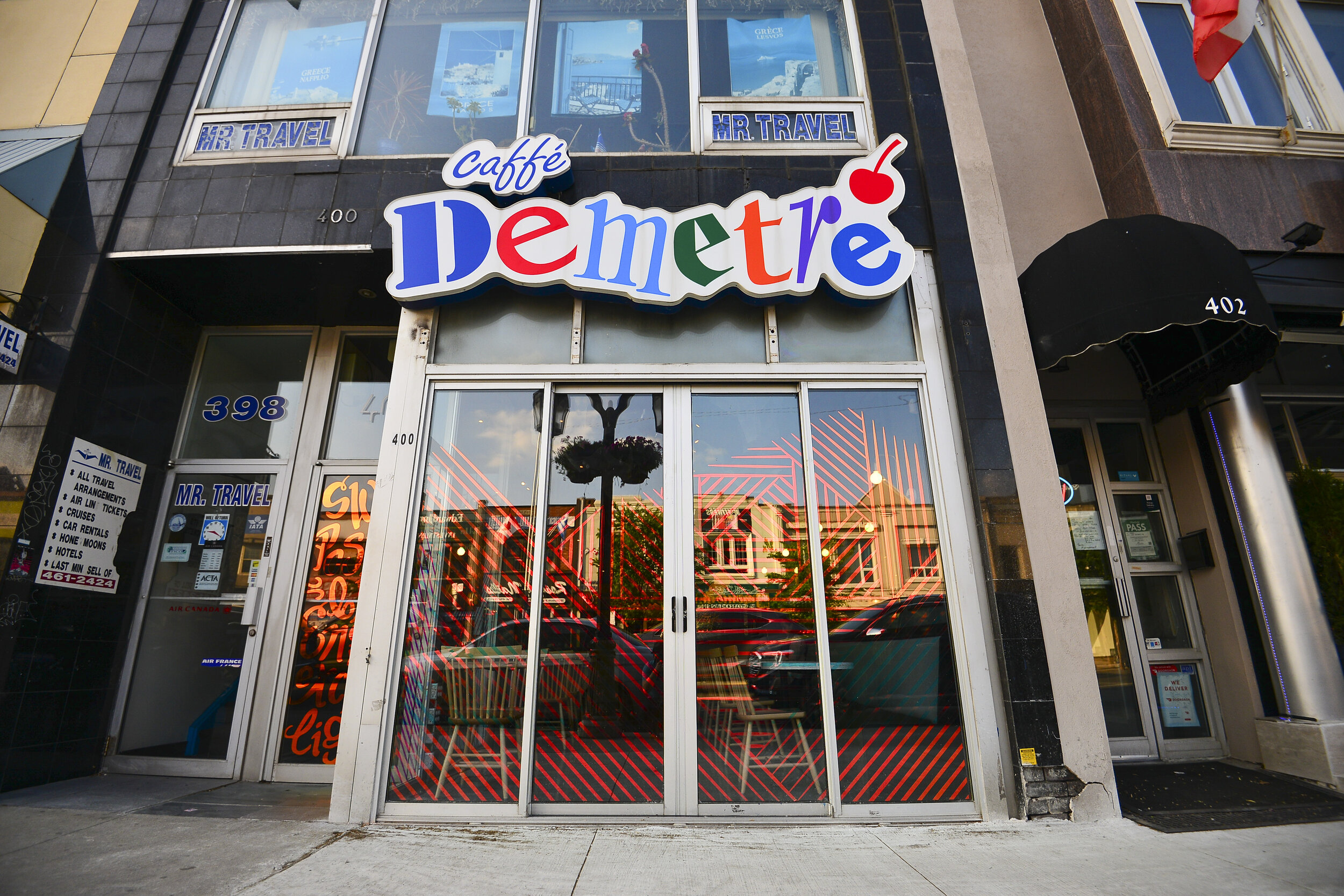
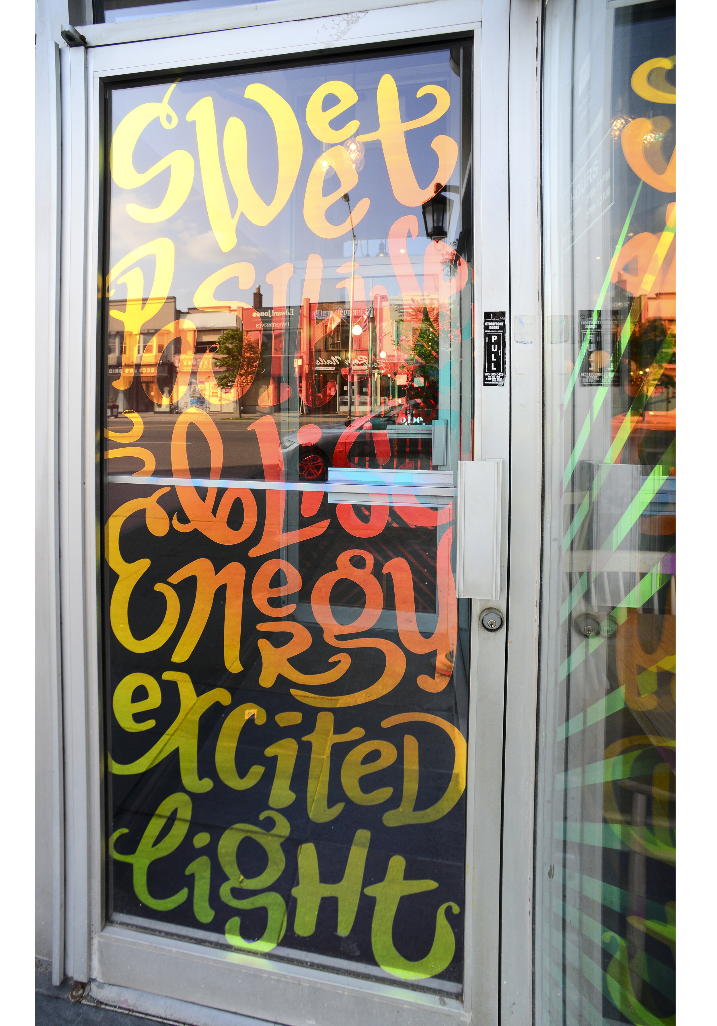
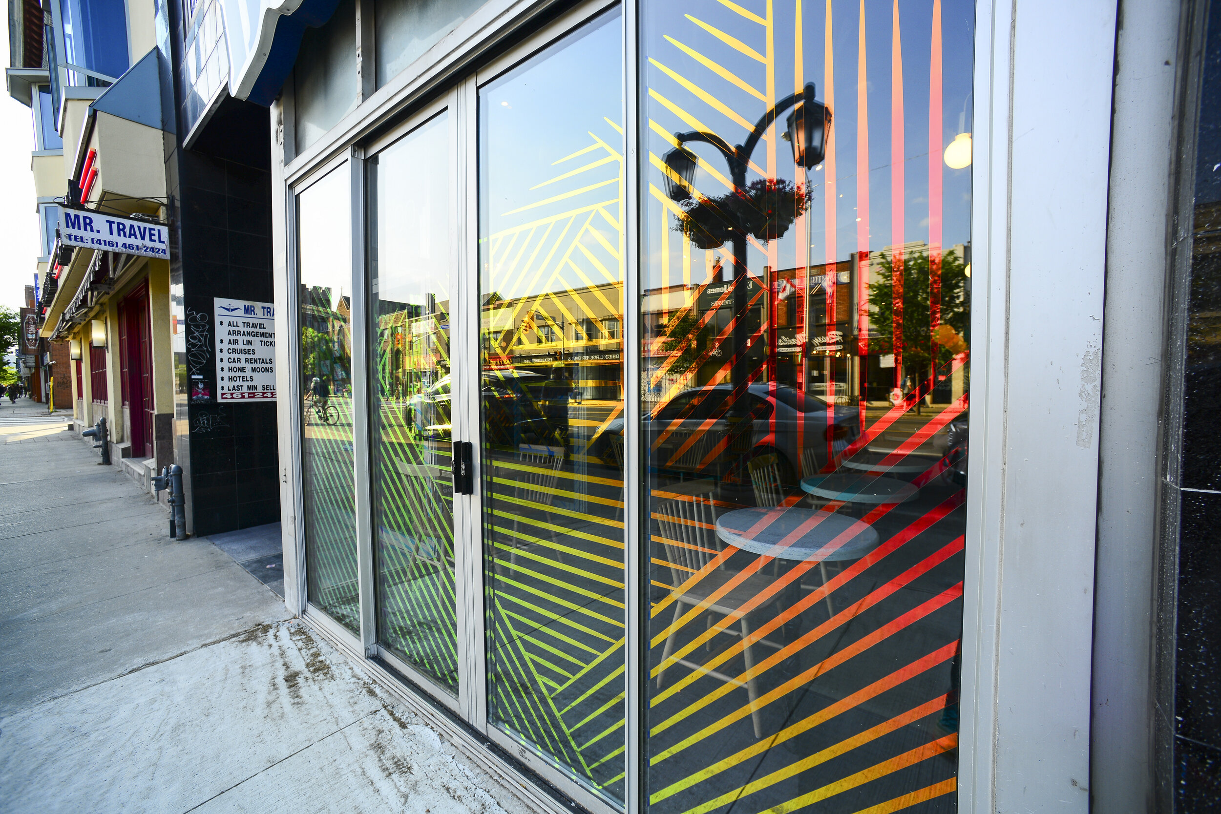
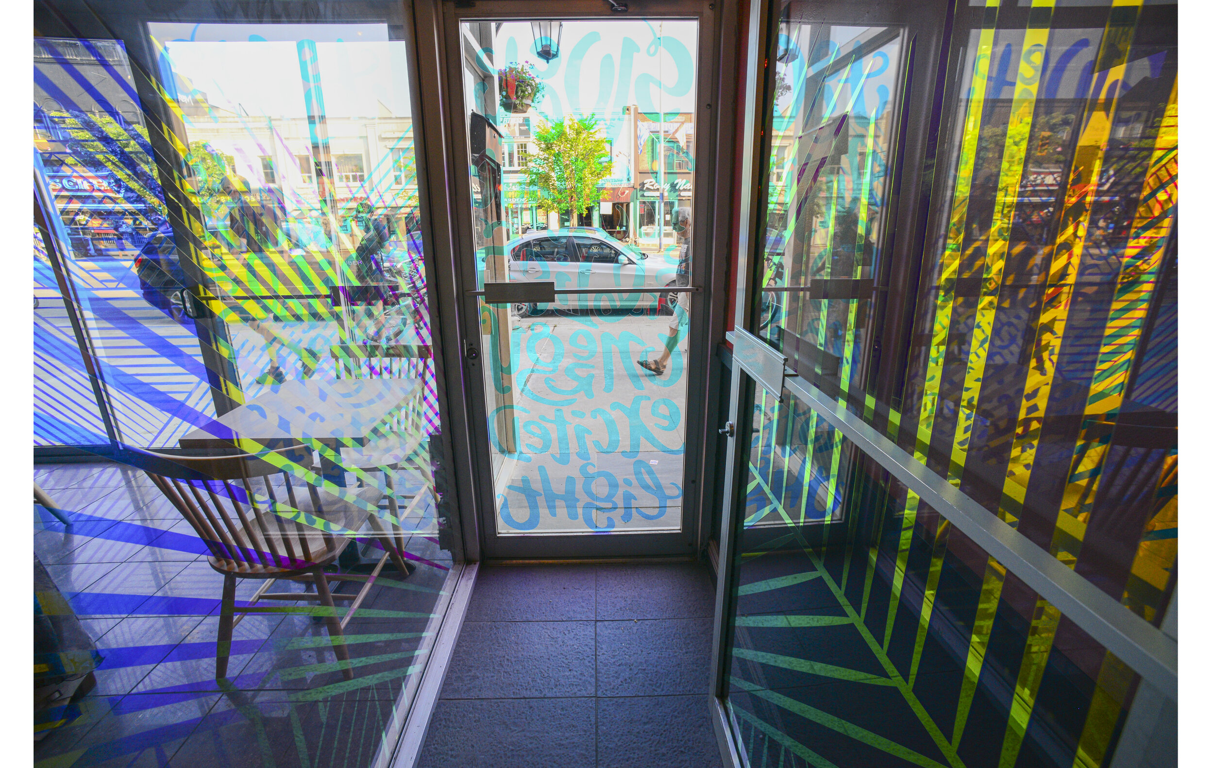
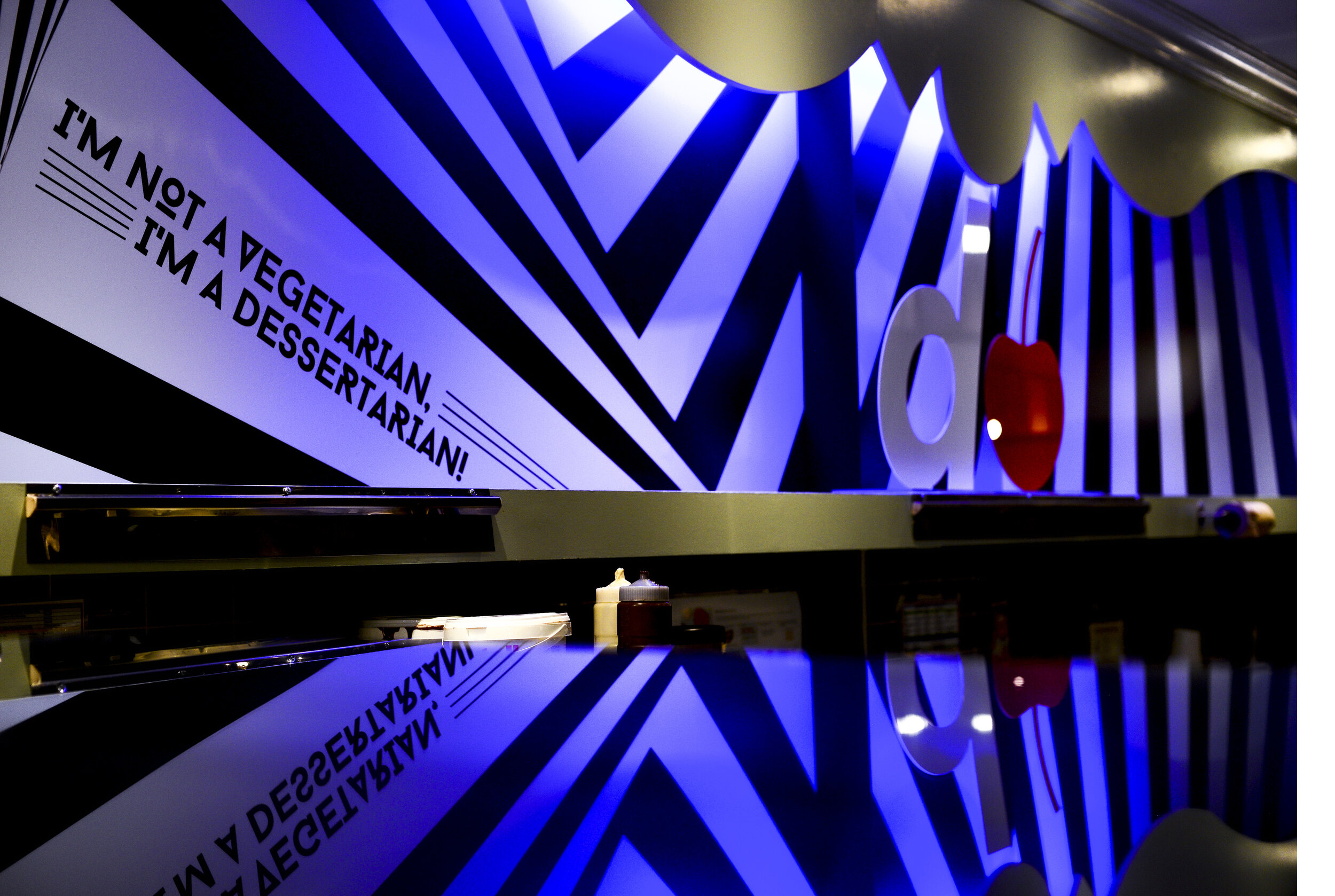
Let’s start from the approach, as change must be seen from the outside. We wanted to engage passers-by and attract them into the sweet world of desserts. This 3M dichroic vinyl is hard to get your hands on, but the effect is unlike any other - mesmerizing and almost illusion-like. The colors shift when viewed from different angles using this 3M multi-layer optical film.
The graphics are rain-like, washing away, healing, and renewing. From afar, the shapes can look like a landscape while the hand-crafted typographic pattern at the entrance gives the door an interactive edge. It is adorned with hand-written words that describe confectionery bliss - enticing feelings and reactions.
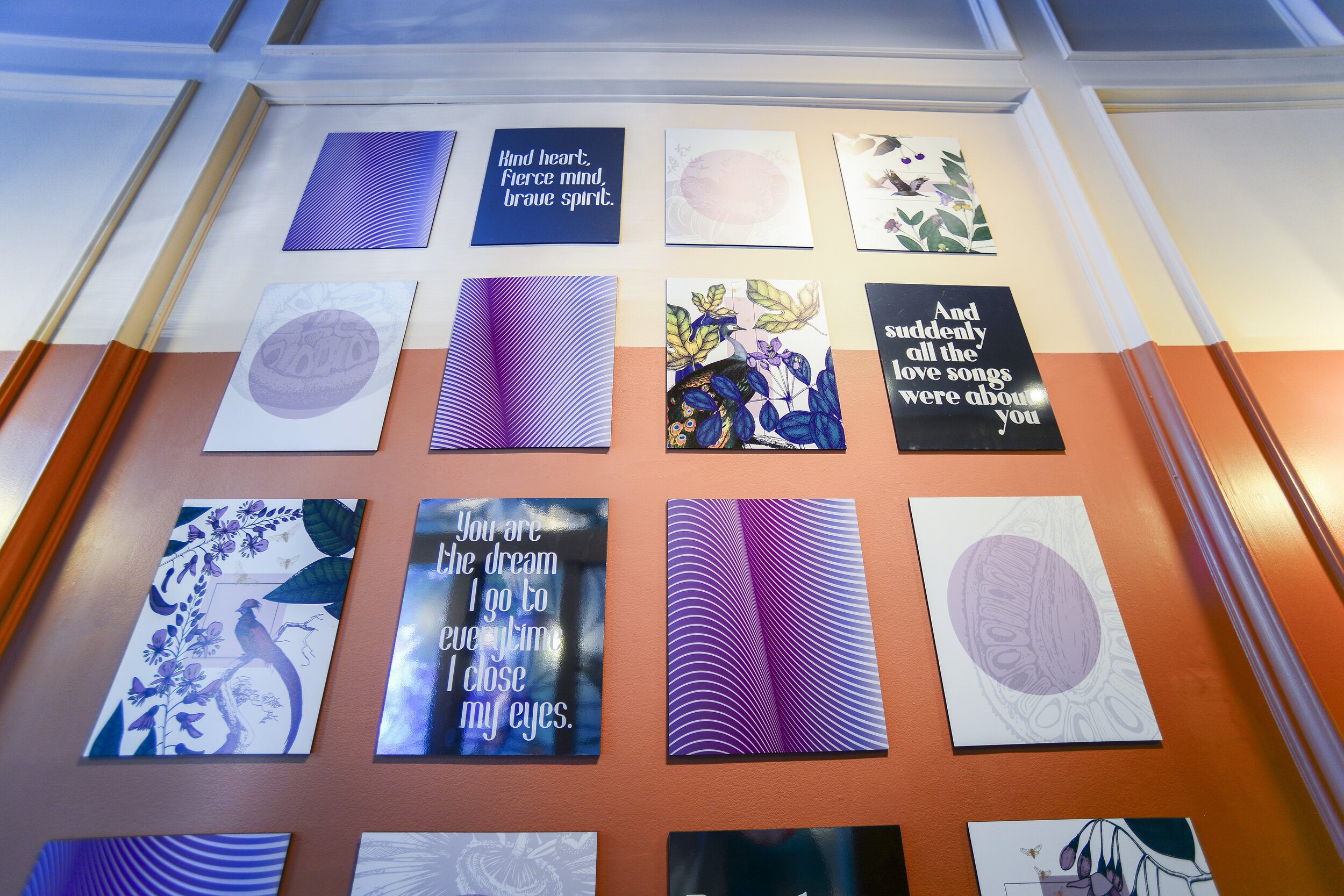
Upon entering the space, a tile wall of art sets the whimsical, biophilic tone. We consulted with a social worker to ensure the quotes added were apropriate and carried an uplifting message.
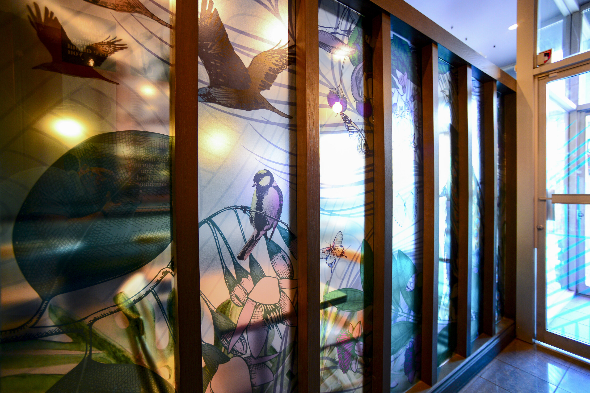
Across the corridor, vinyl panel art acts as both privacy dividers and mood setters for a statement piece. With its nature-forward design, it is a little peek at what is to come inside.

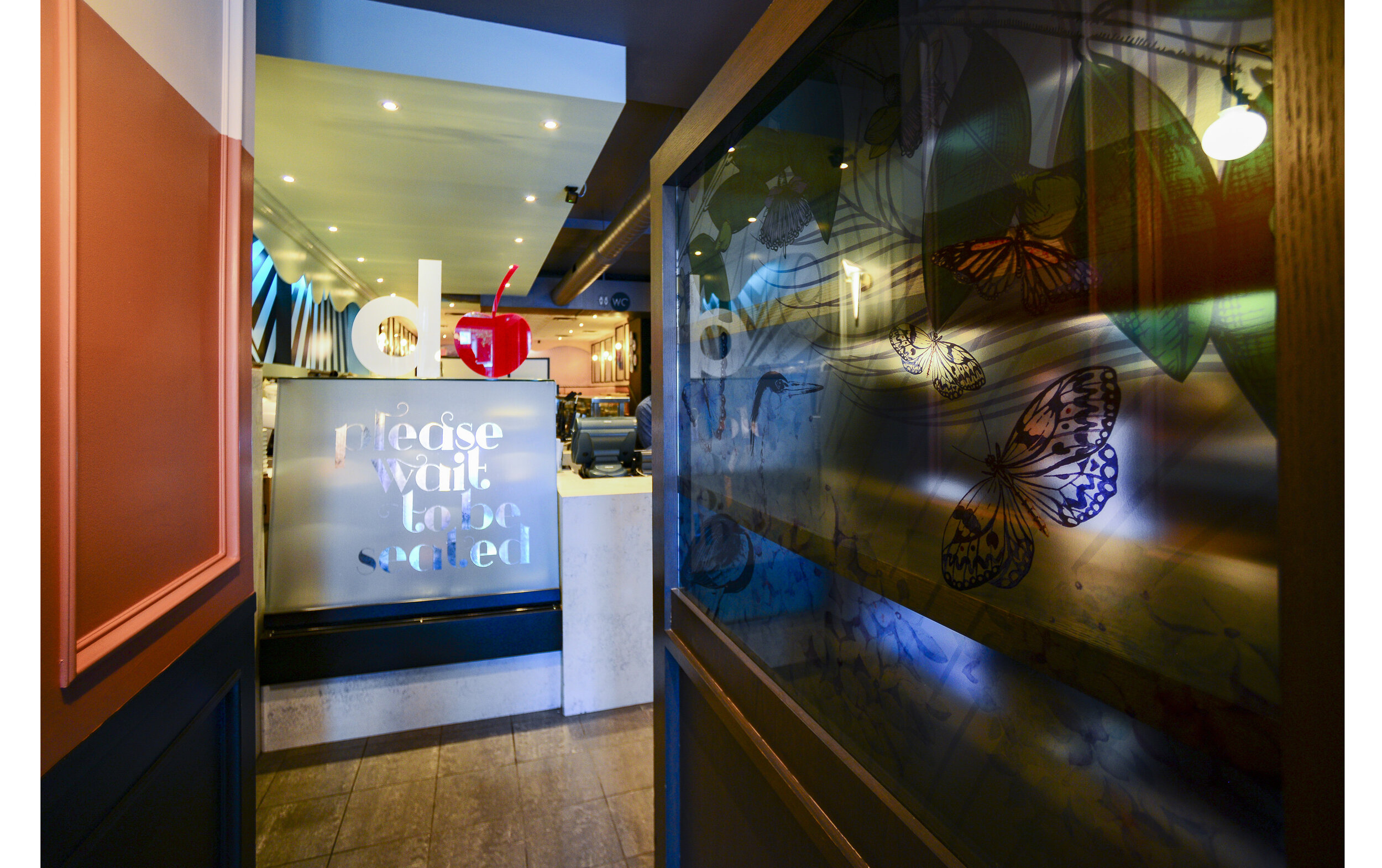
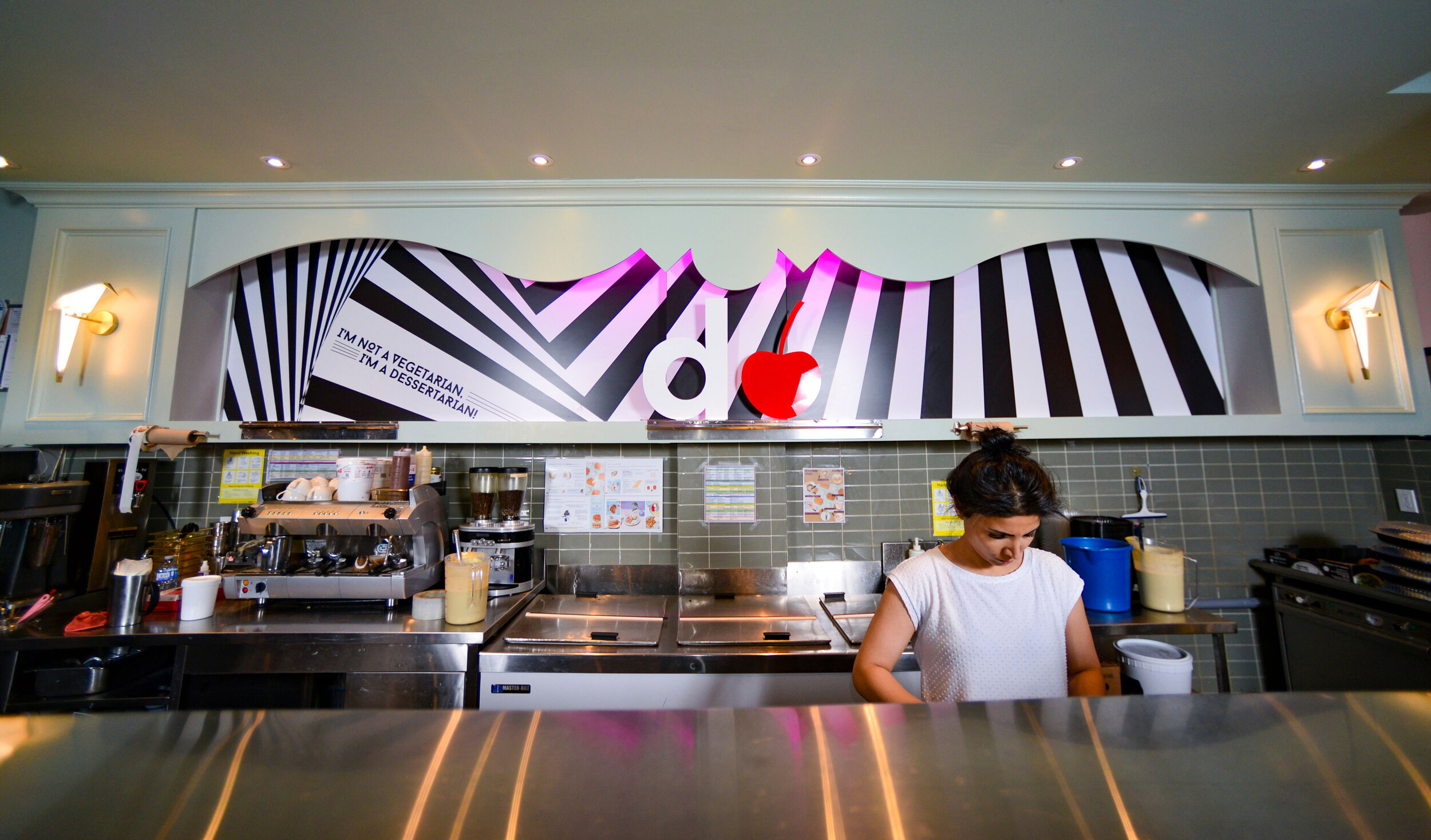
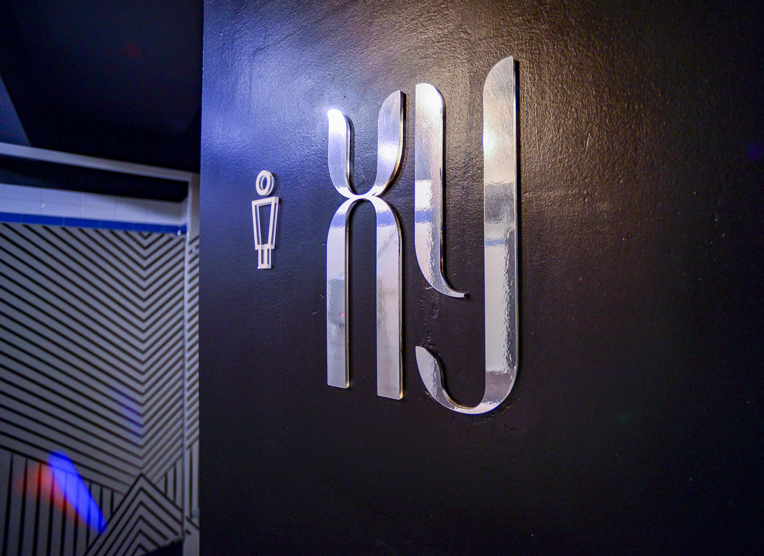
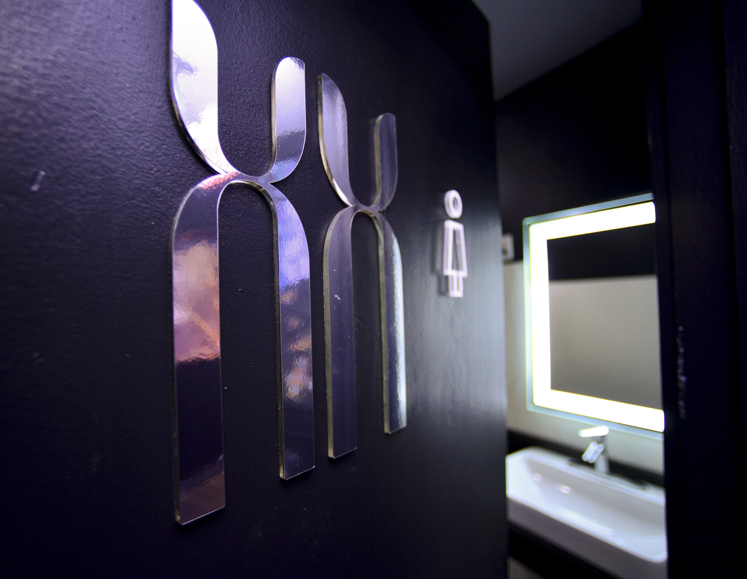
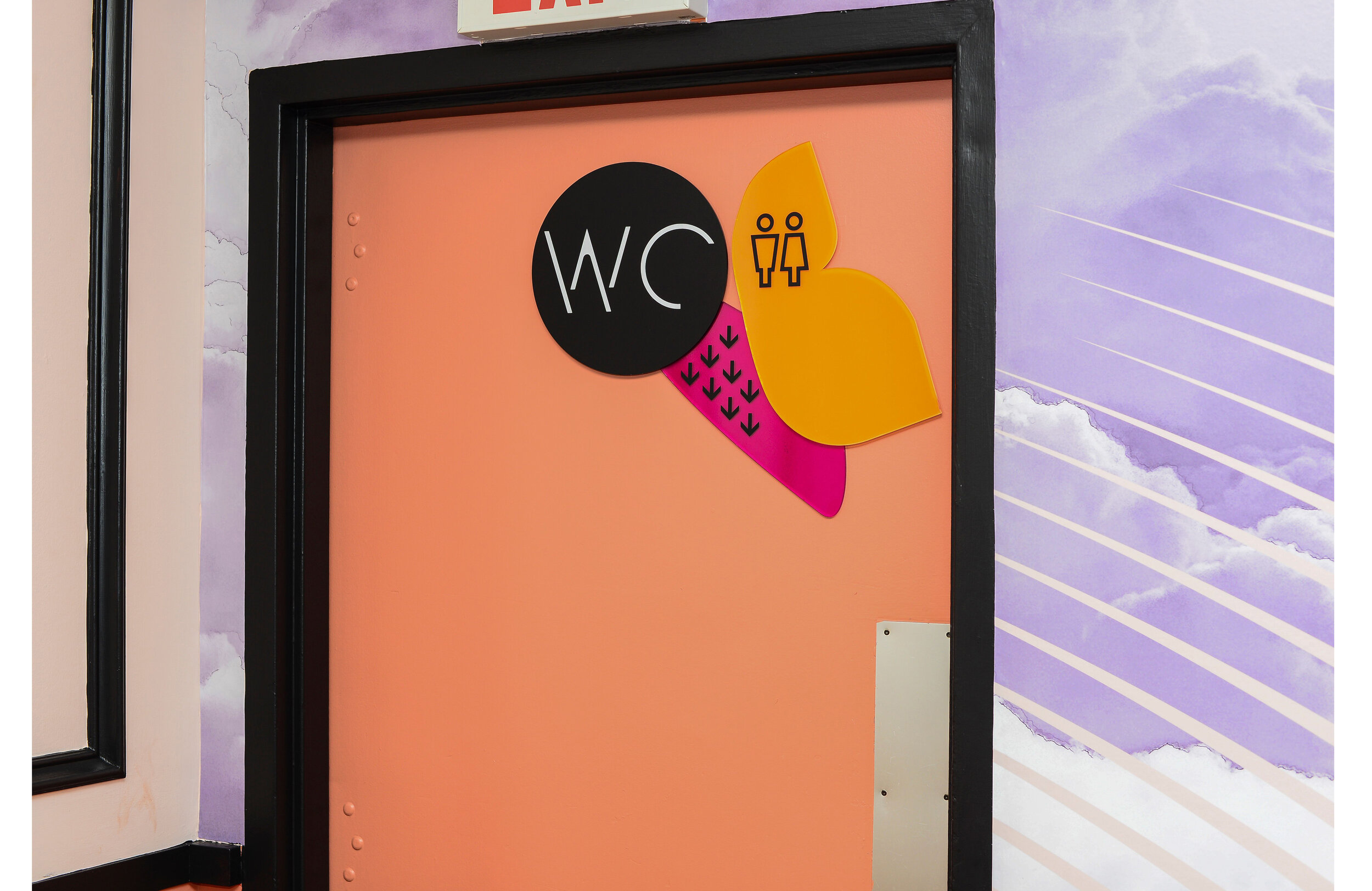
Walking along the end of the entrance hallway is a large chrome sign, to remind people of a basic rule coming into the space. We believe in making signage useful, functional, and artful. This sign is substantially larger, made from chrome vinyl, printed with a floral pattern, and kiss-cut into an elegant font. It is further reinforced by a standing, smaller counter-top sign.
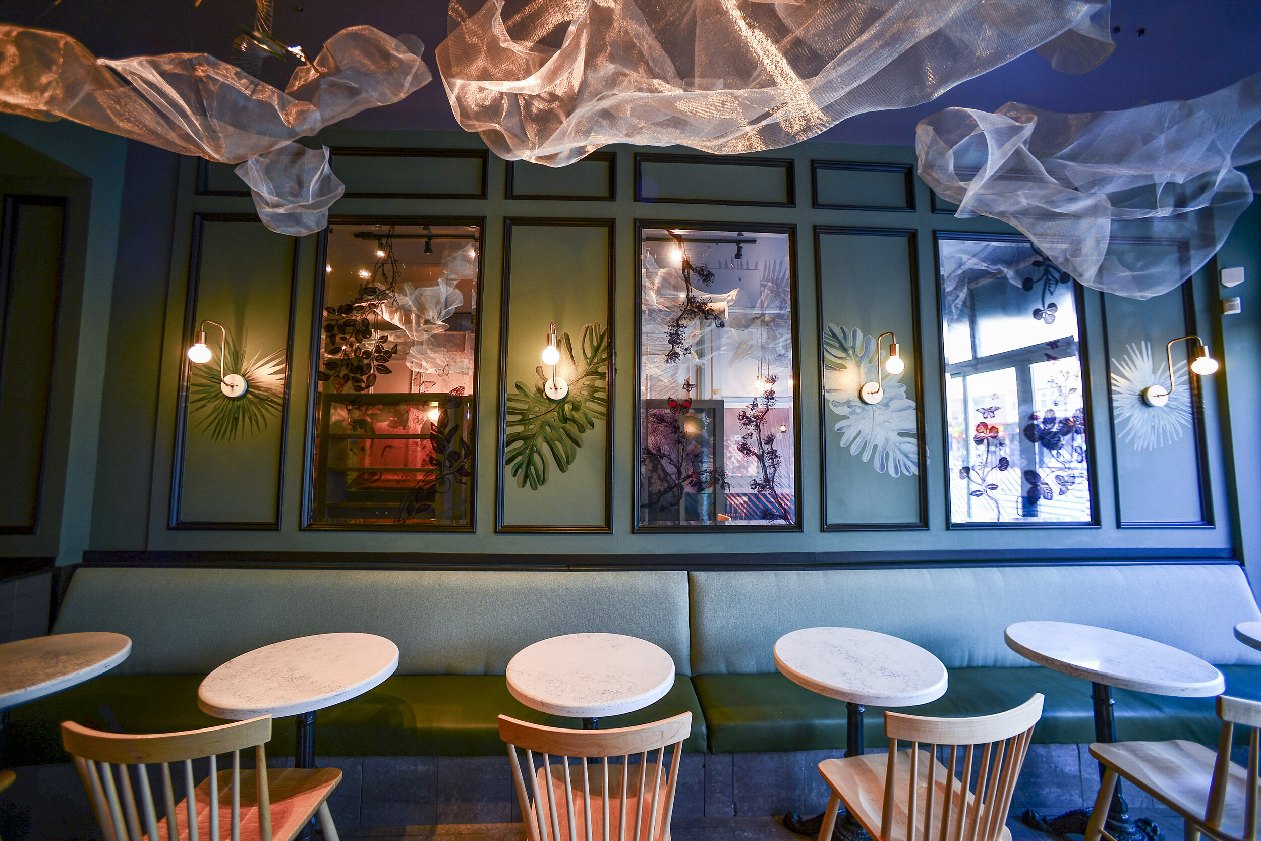
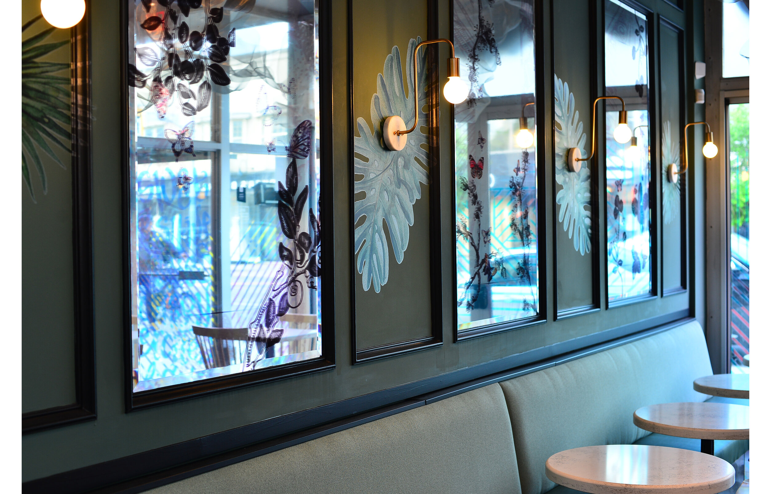
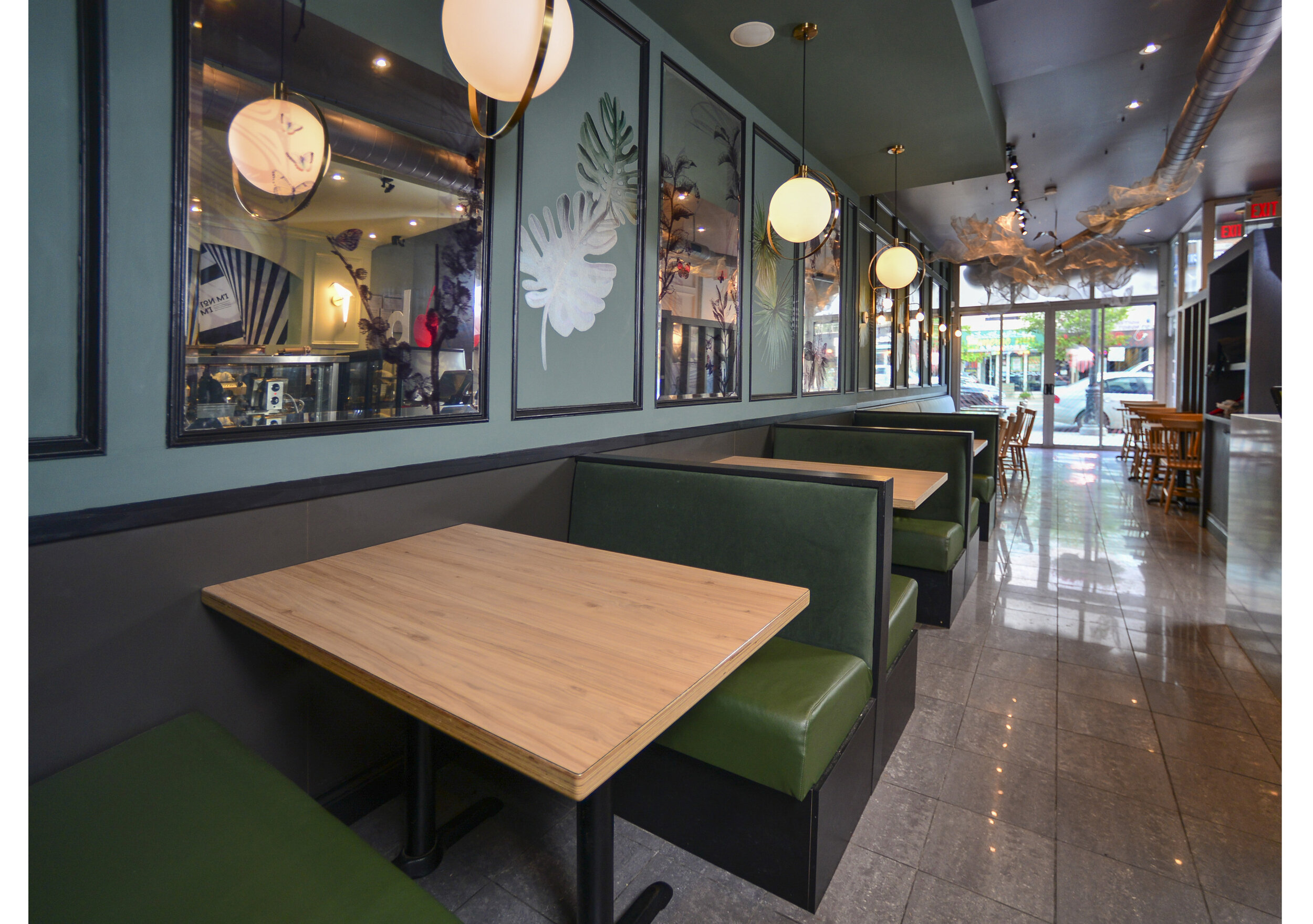
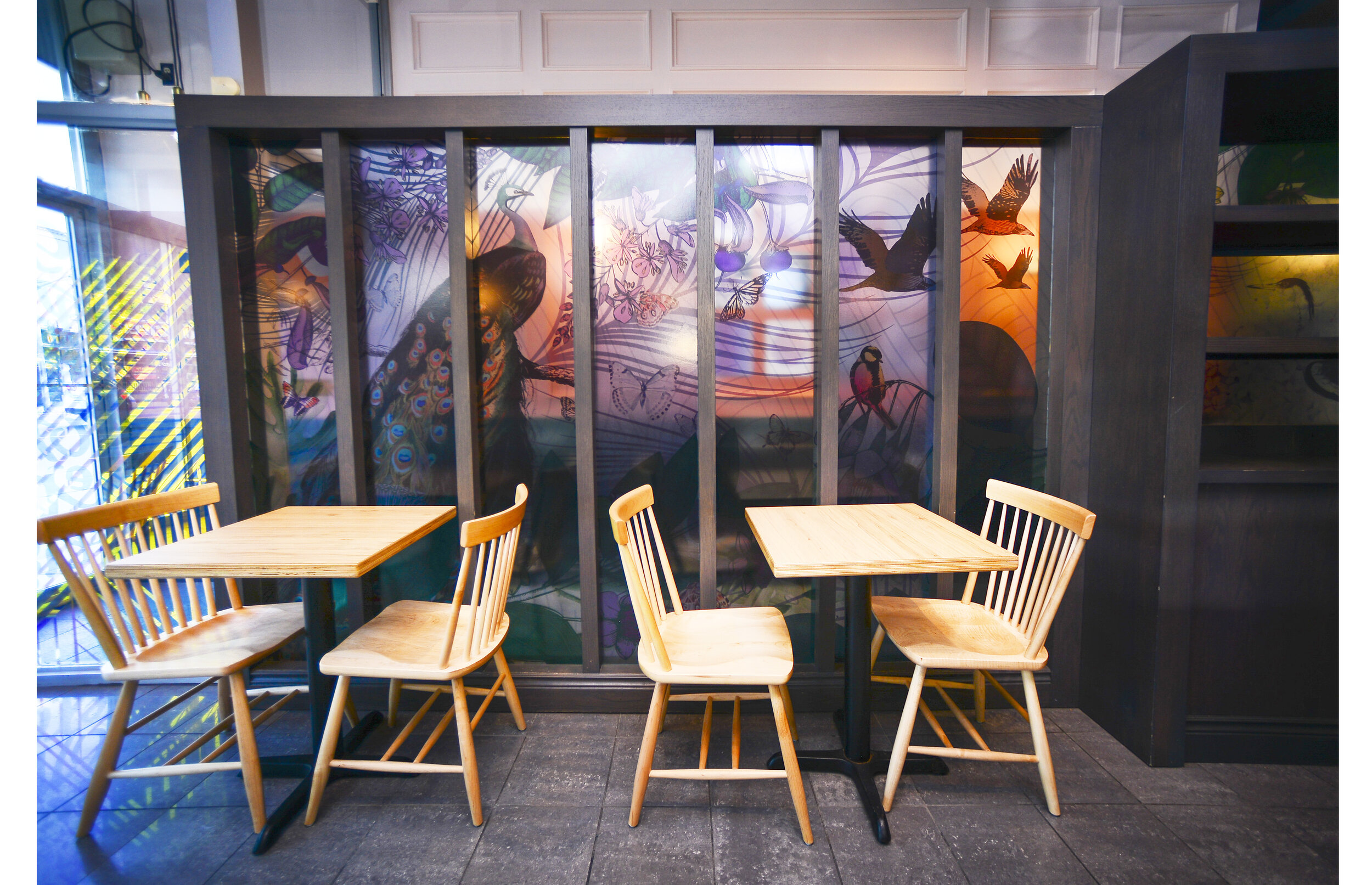
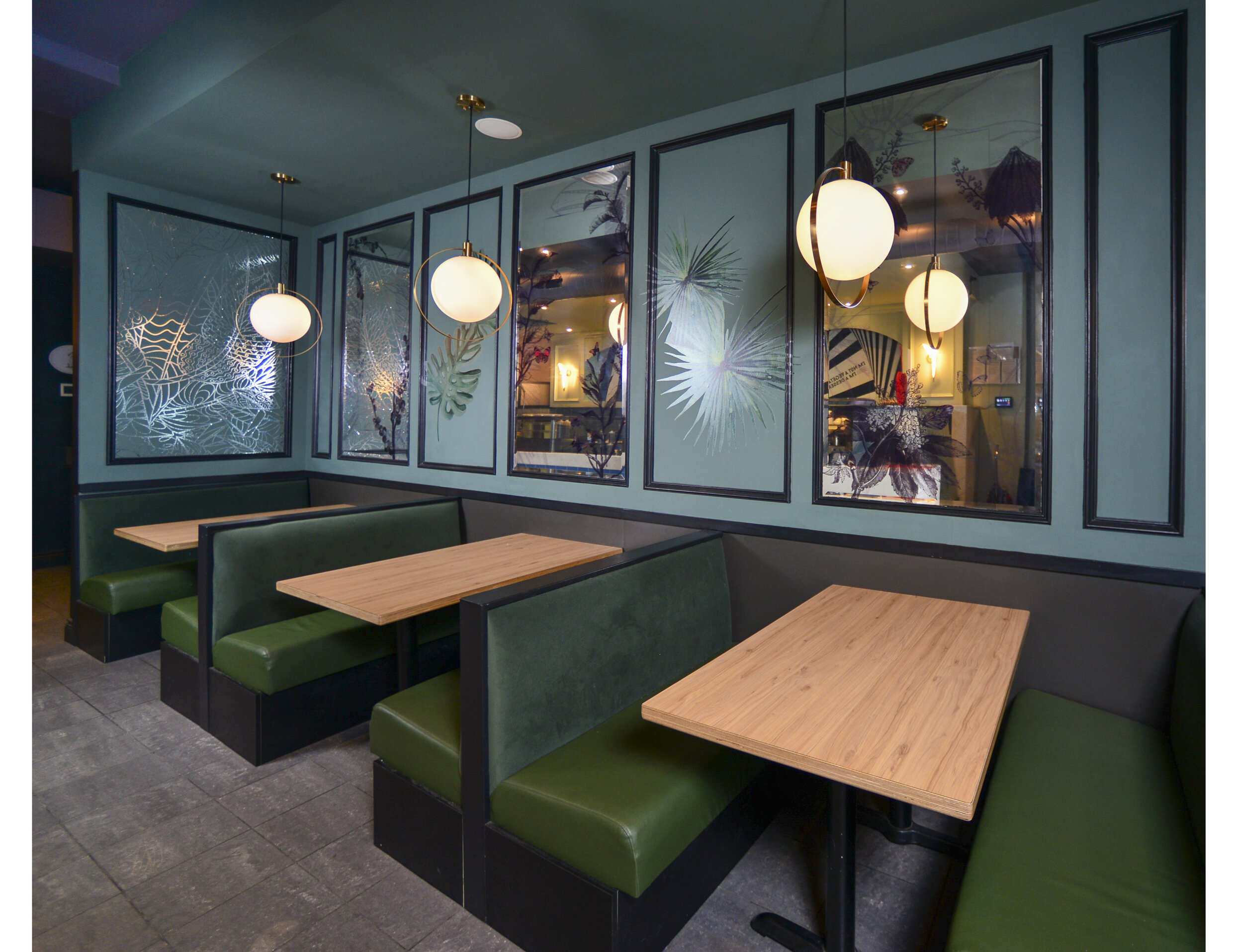
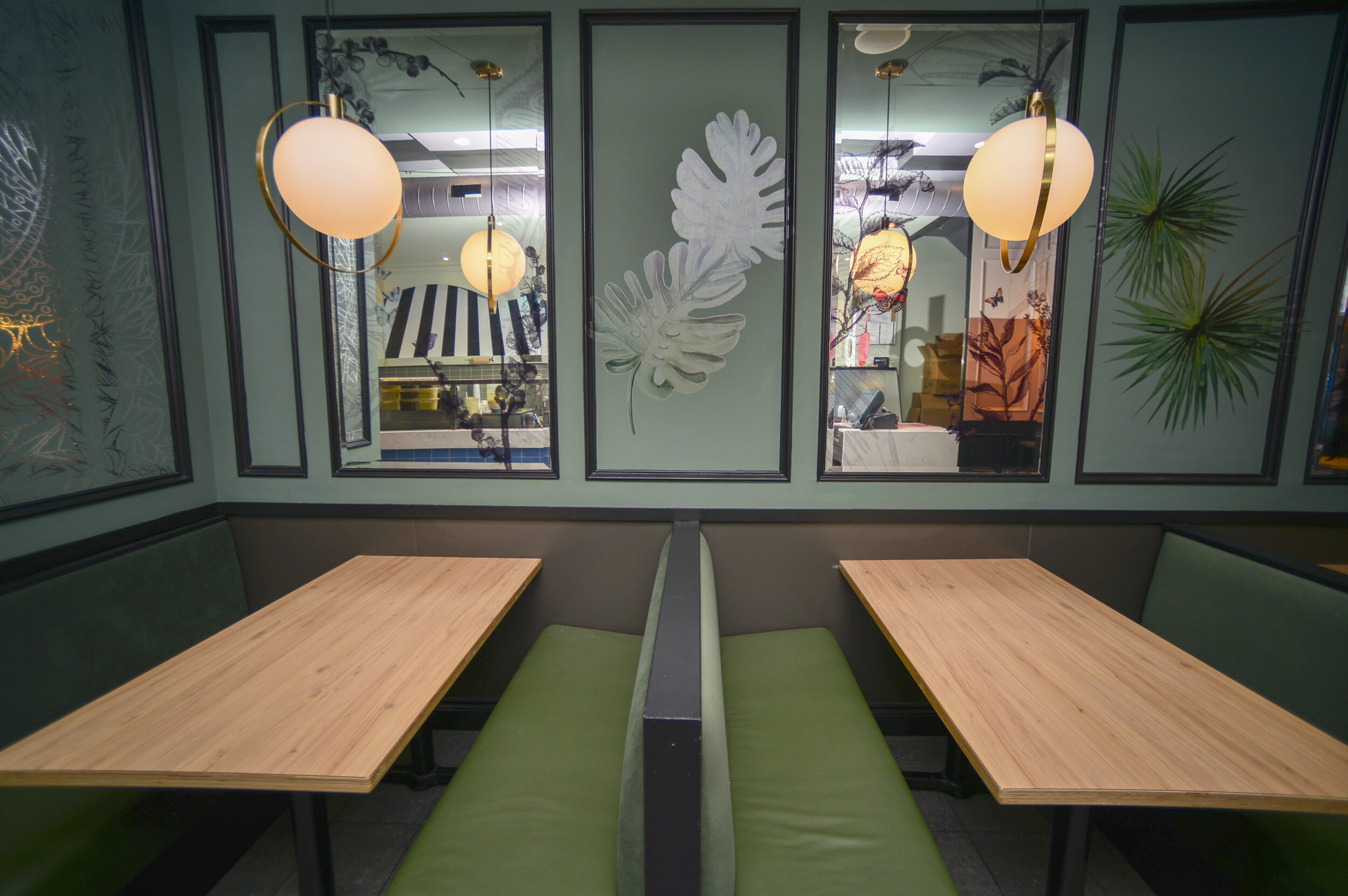
In the front room, it is all about submerging in nature & abundant growth. With dark mossy green walls, butterflies, birds, and botanical illustrations, our general inspiration was art by Kristjana S Williams. The divider statement art makes one feel as if in a tropical hideaway.
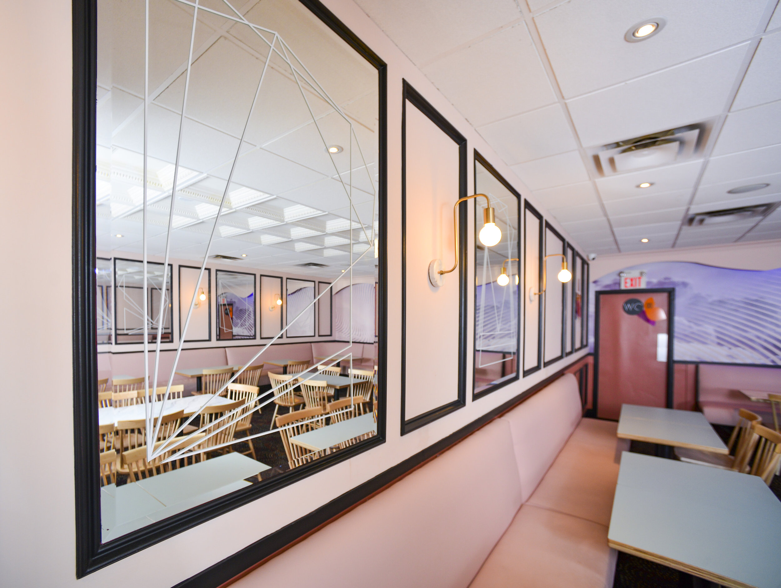
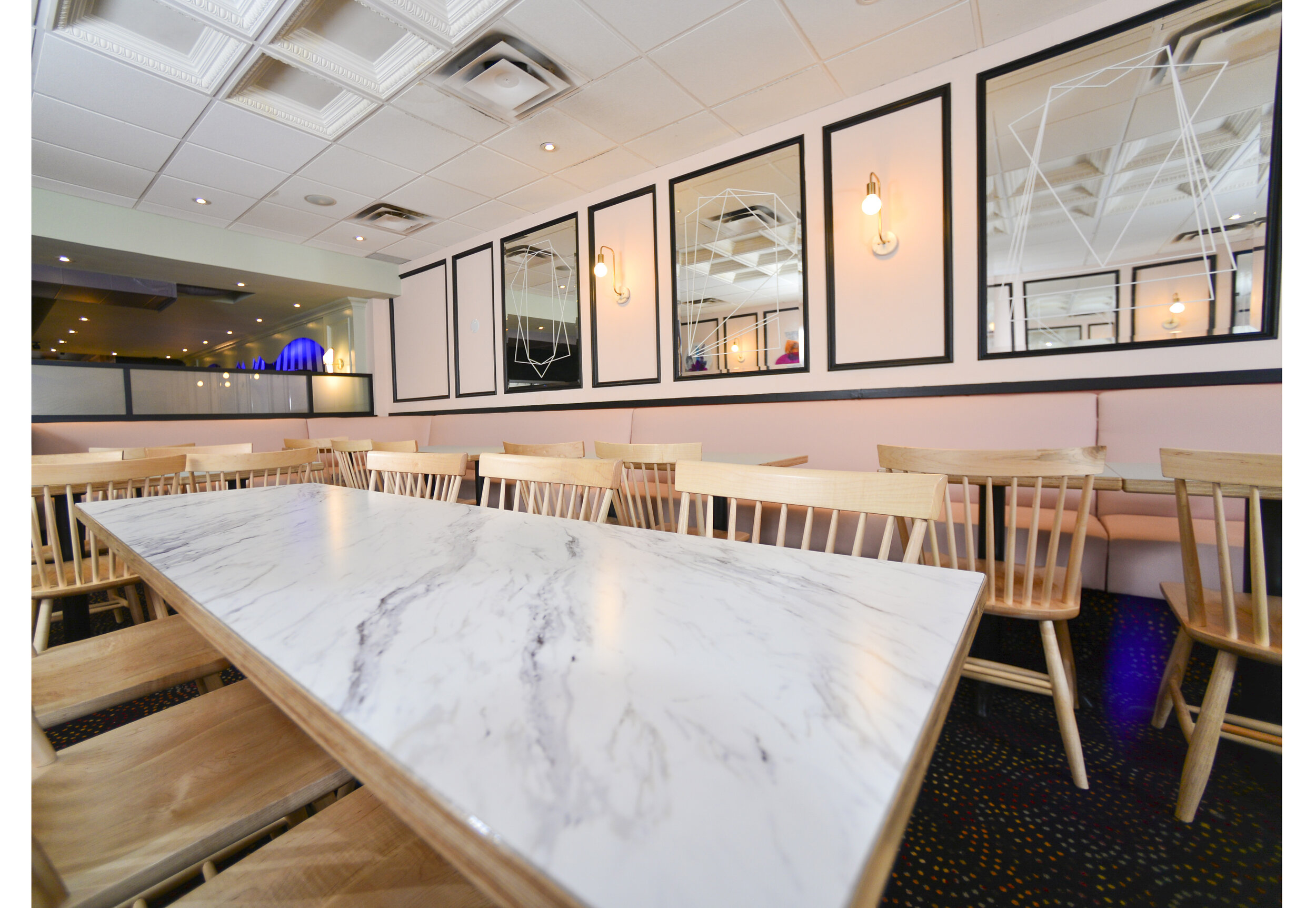
Furthermore, small details such as the sconce vinyl prints add a subtle finesse, while six optically clear vinyl mirror pieces make a great photo op for the young demographic enjoying the space. The goal of attracting the right customers played a big part in our design thinking process - the space is meant to appeal to teenagers, as well as families with kids.
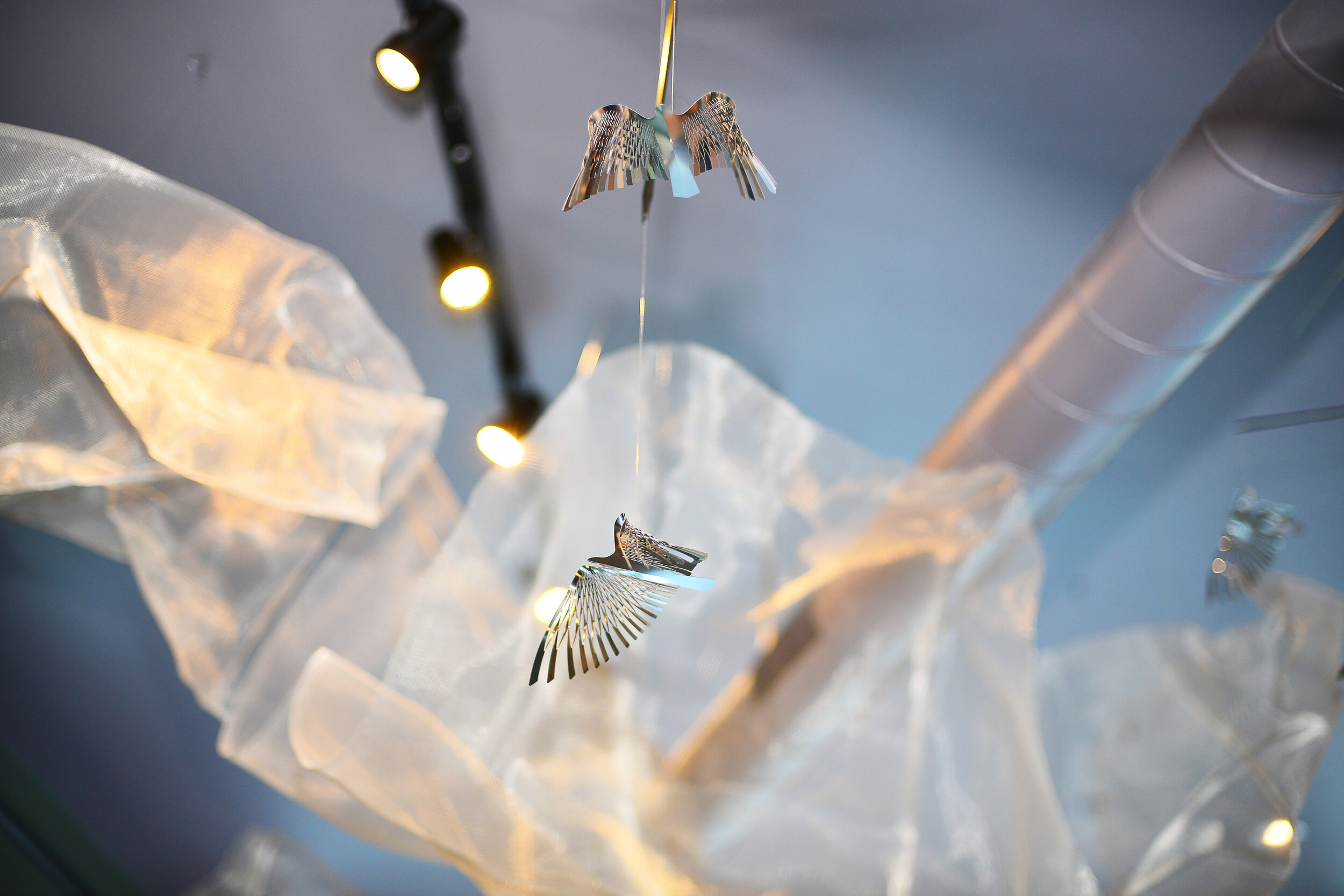
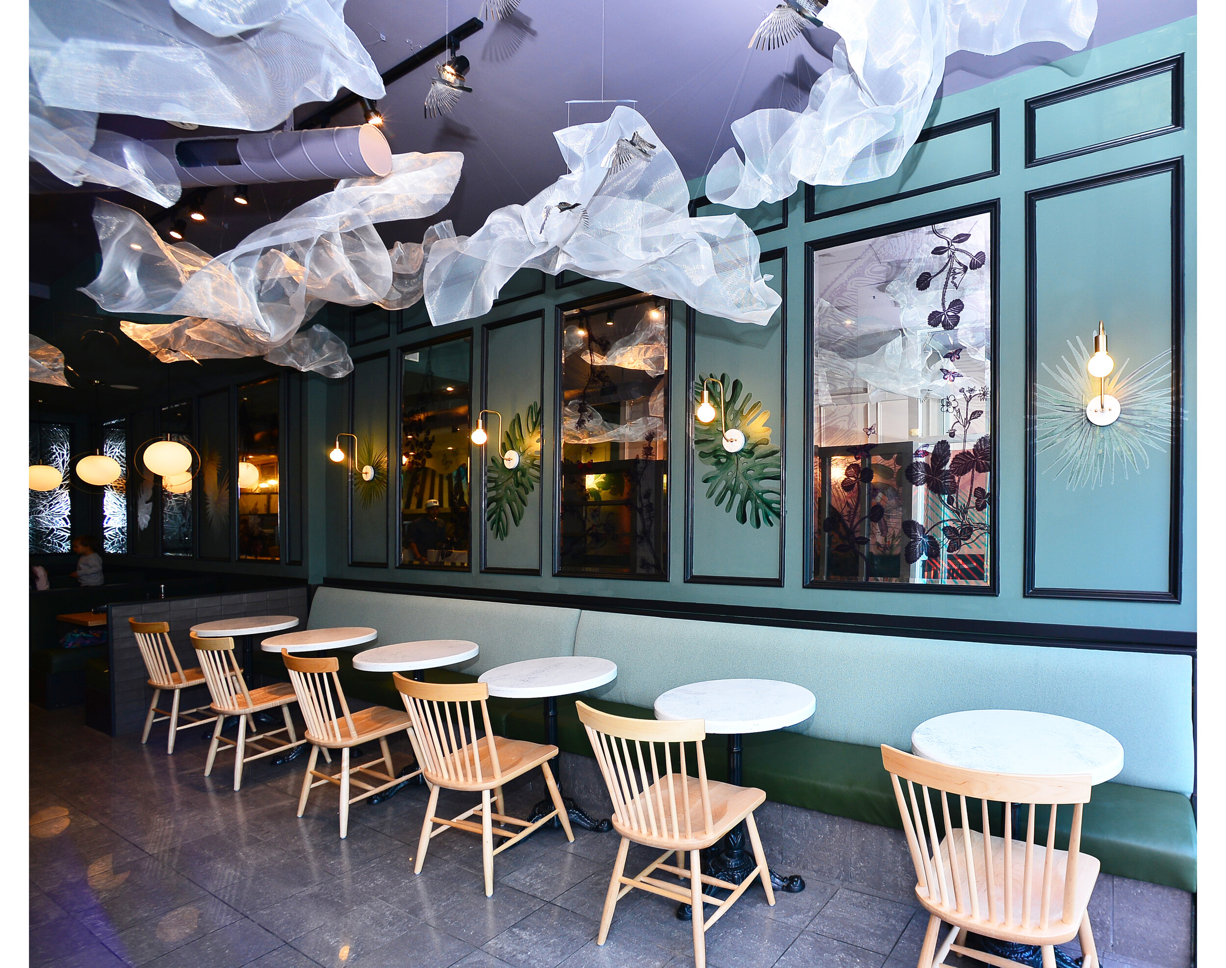
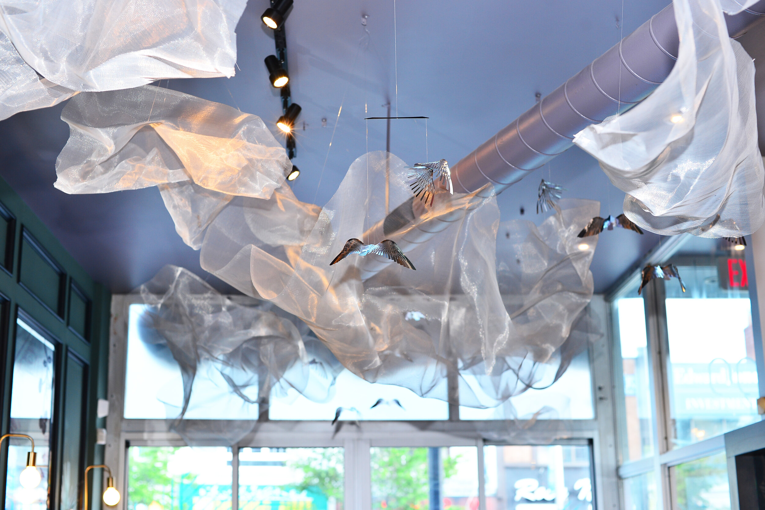
We created an artful installation contributing to the ambiance. It joins the exterior magical illusion with the interior front room natural bliss. It consists of wire mesh clouds and bird mobiles. This installation also has a subtle purpose to distract attention from the large vent duct. The piece is visible from the outside, thus adding an extra layer of visual interest and drawing people in.
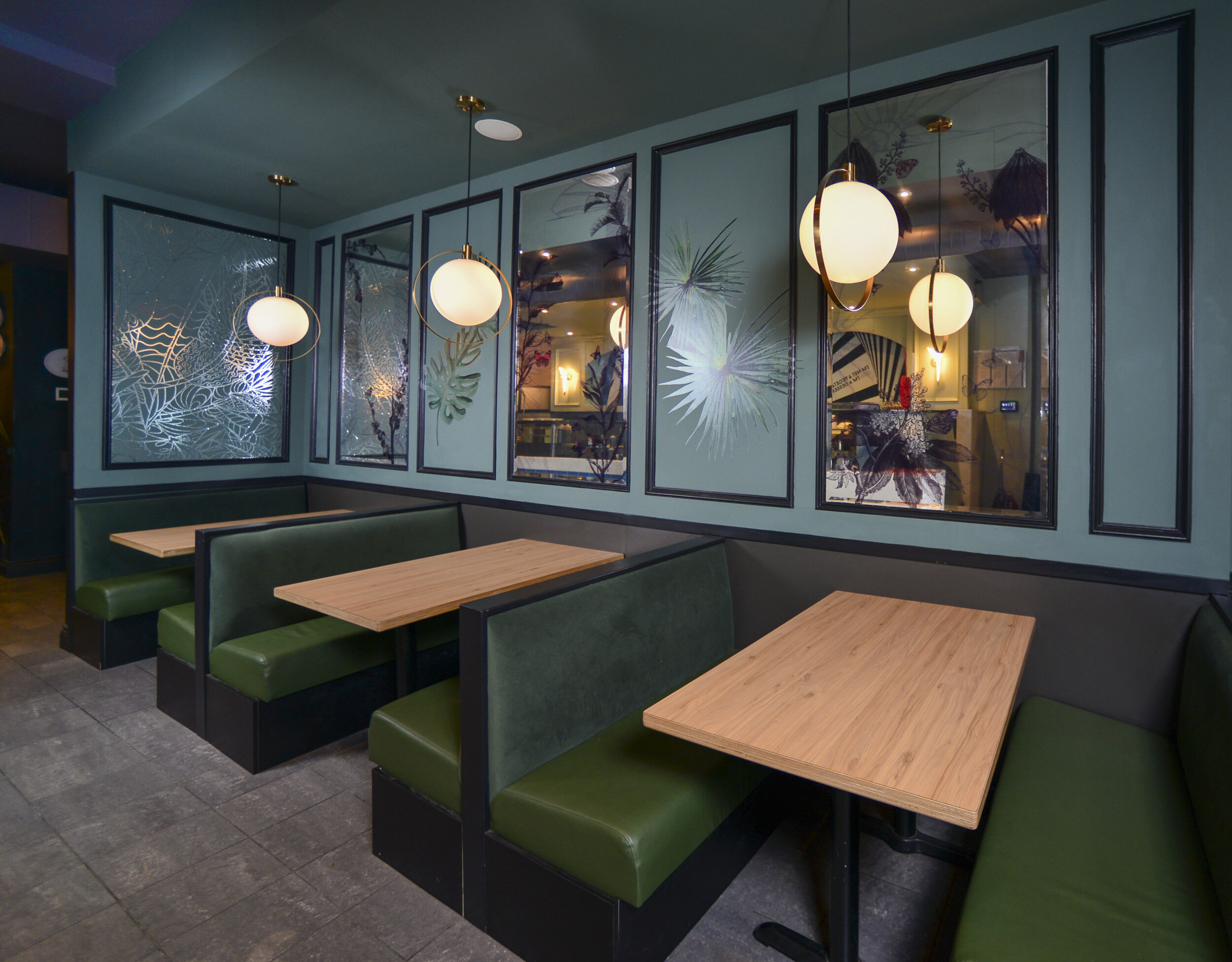
Transitioning over to the backroom, one passes a beautiful pattern chrome wall where nature slowly becomes more simple and modern. The kitchen area has a clean look, bringing back the geometry from the entrance. The small quote addition and the font here has a slight Greek-letter look, which makes it look both contemporary and ethnic for the Danforth neighborhood.
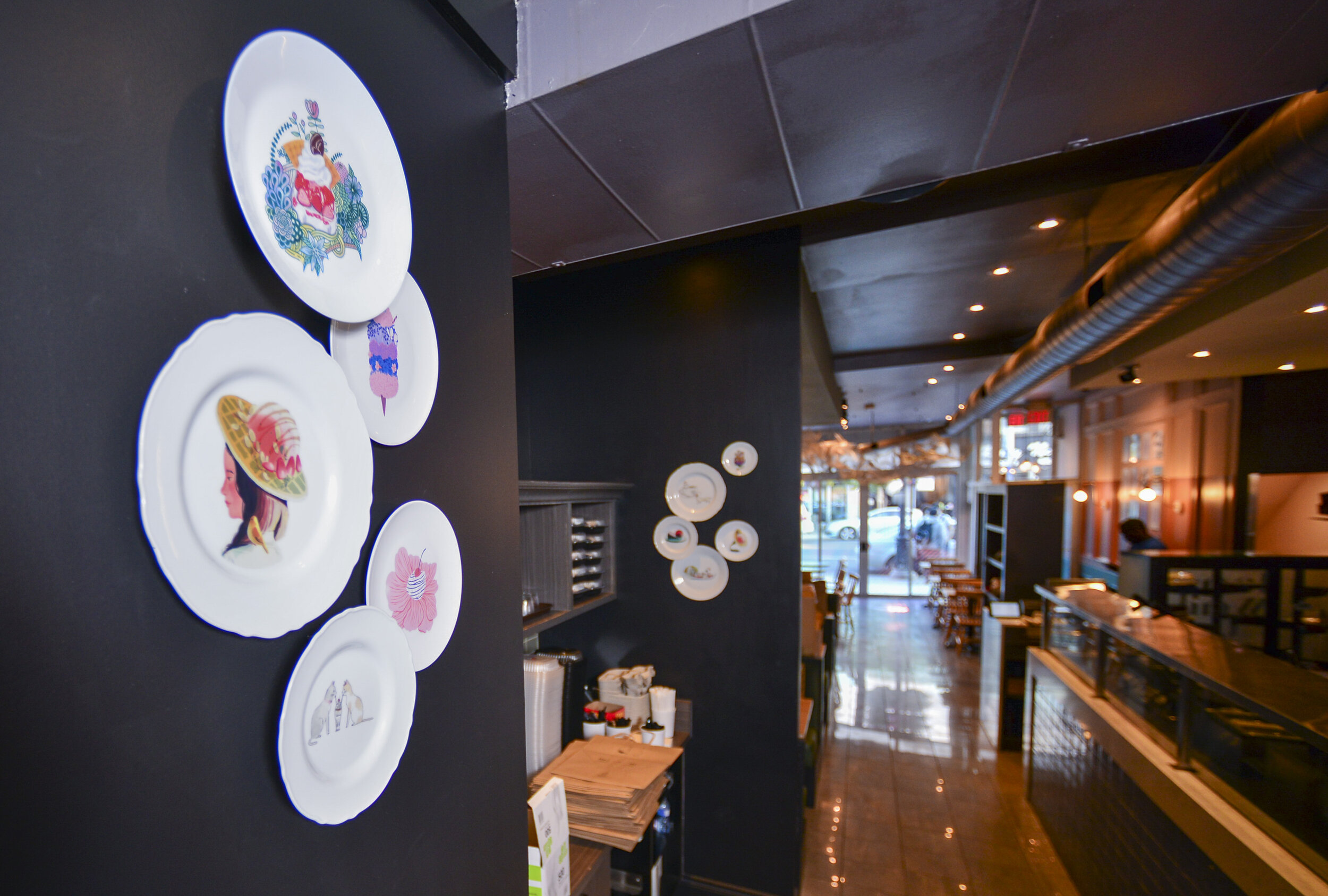
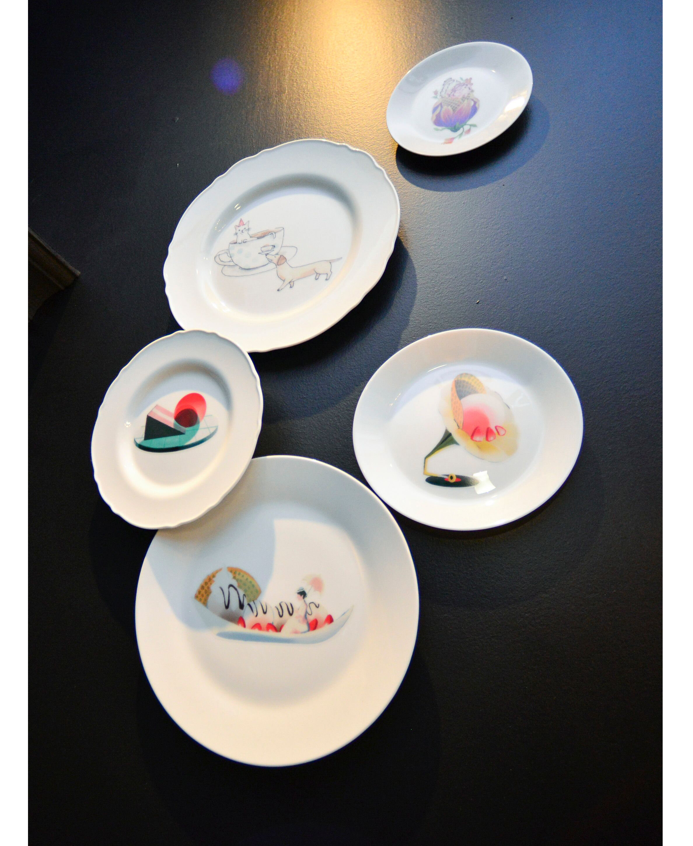
A small plate wall commemorates some of the menu illustrations commissioned over the years, they are all so different and enticing.
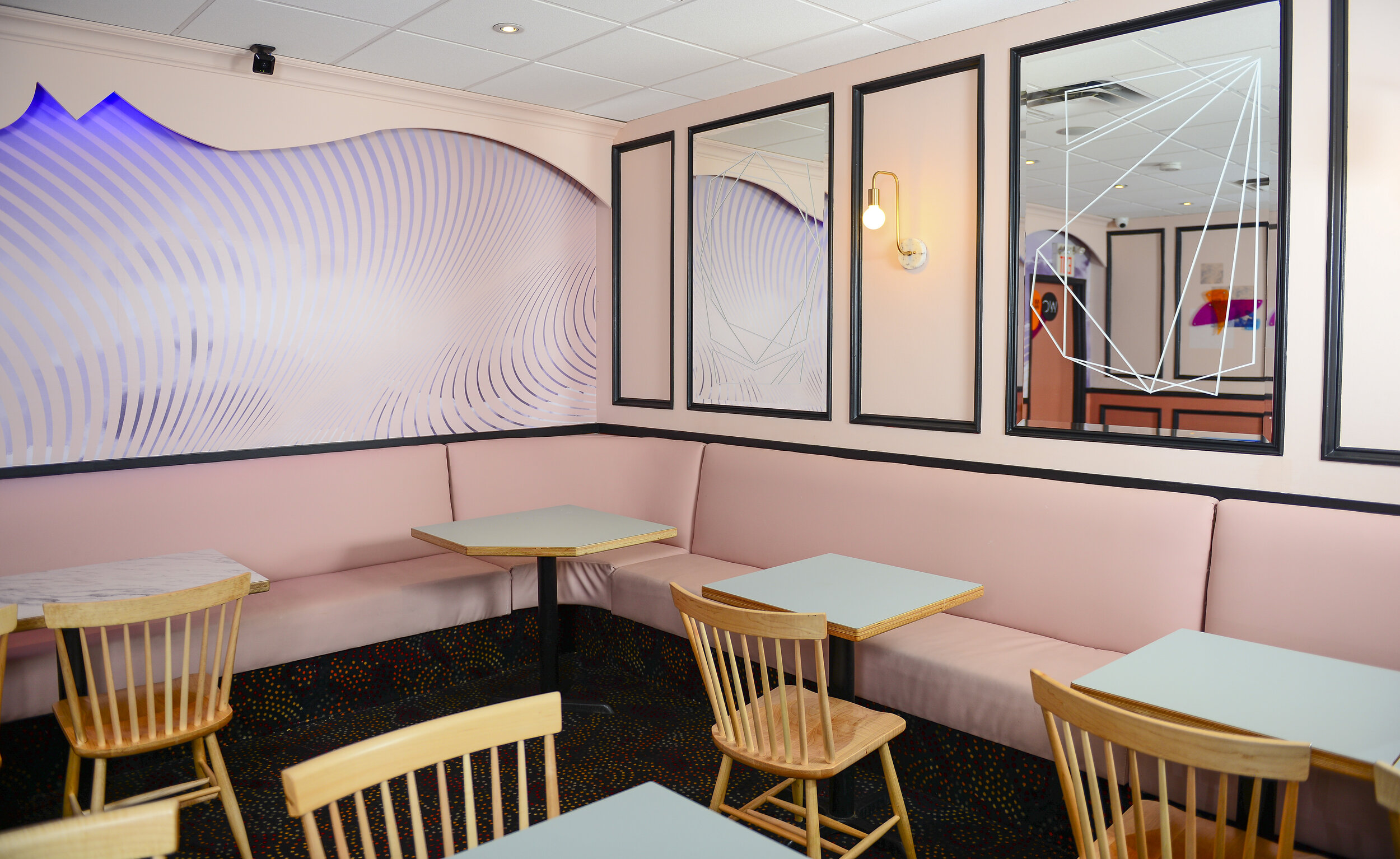
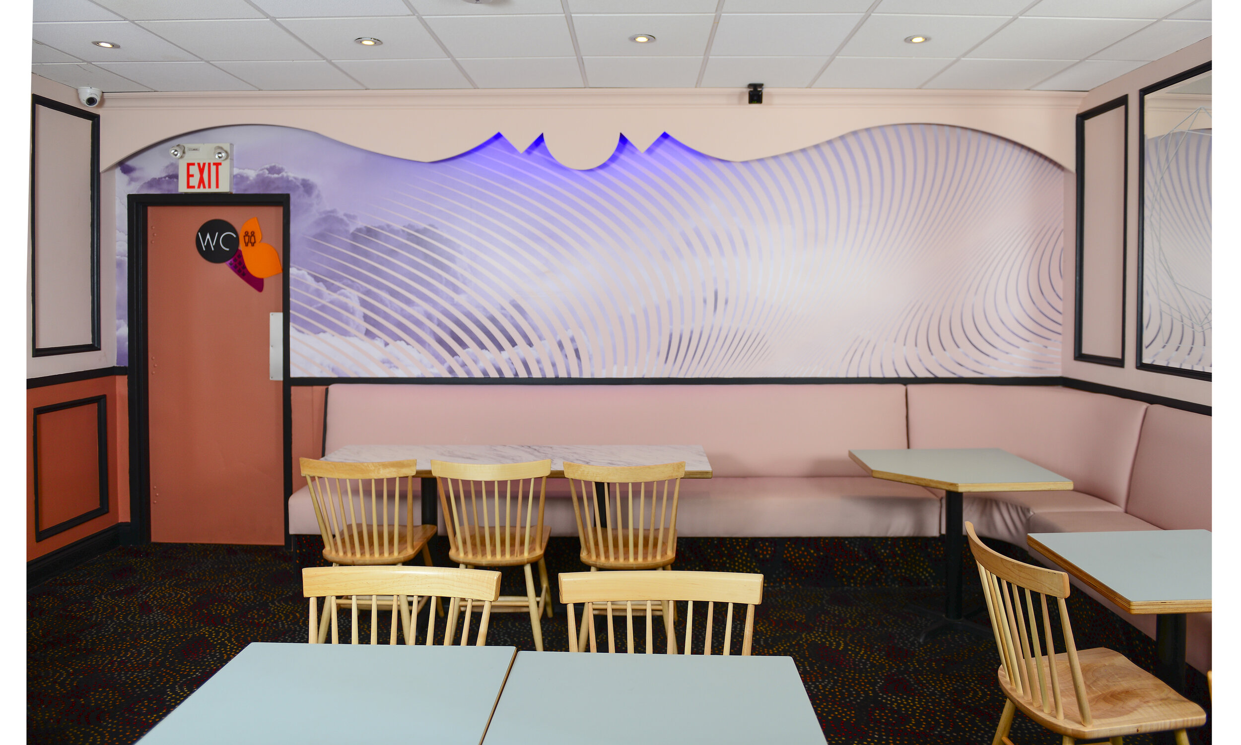
The backroom is sweet, light, and enwrapping. We wanted it to feel modern and had comments that it almost feels like a confectionery jewelry store with the white thin polygonal mirror art. The hero here is the watercolor cloud back wall with soft curves and lines.
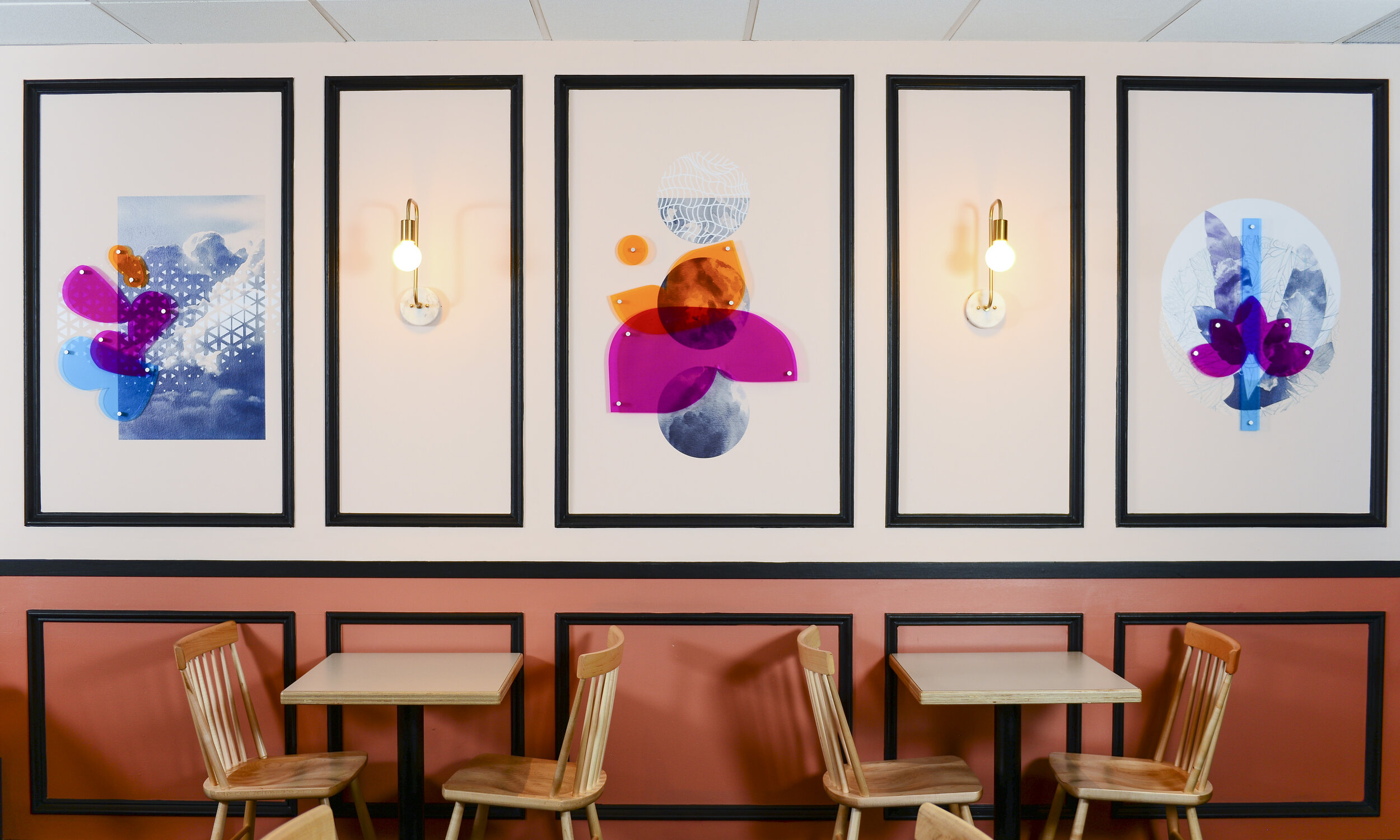
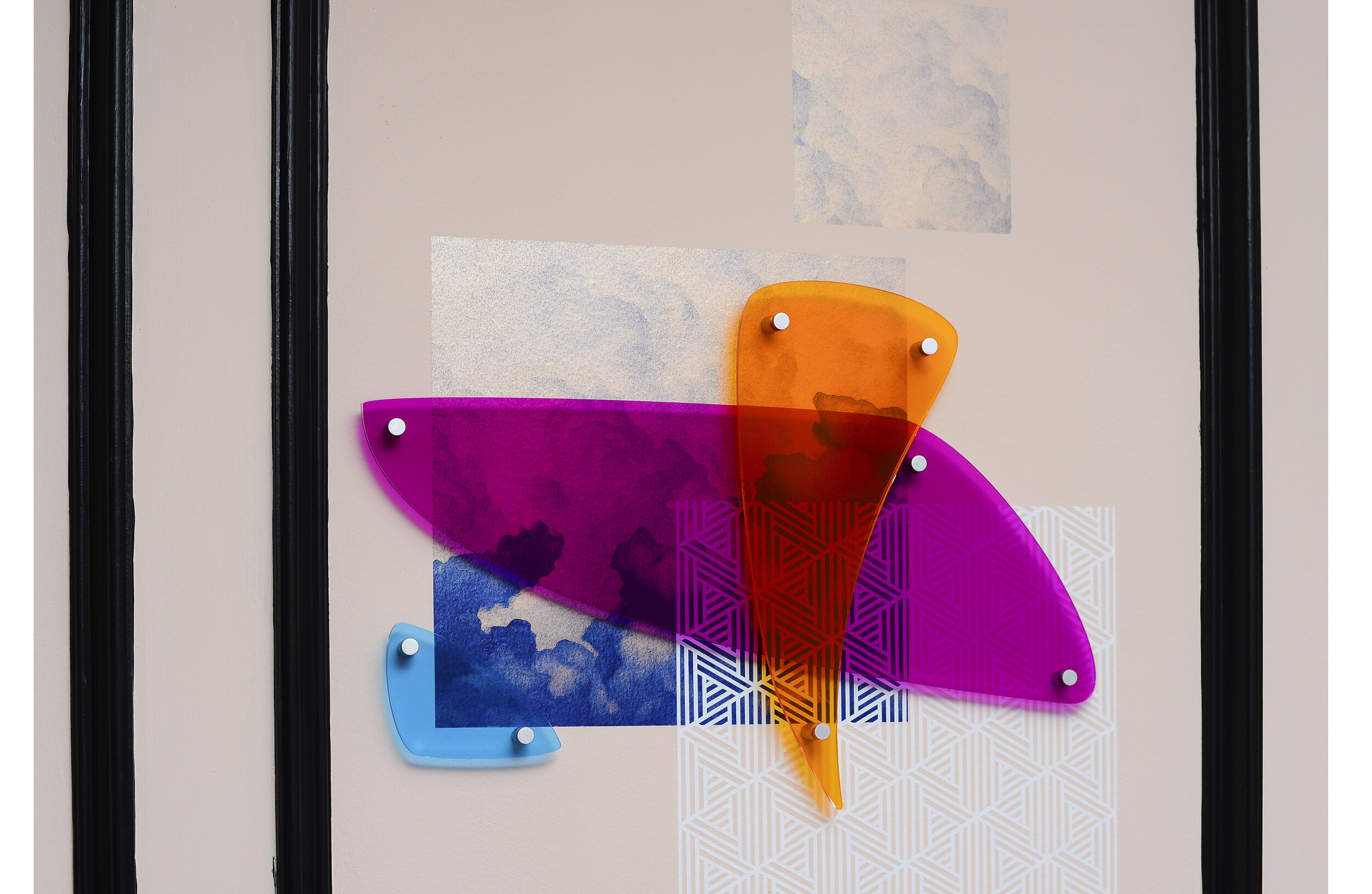
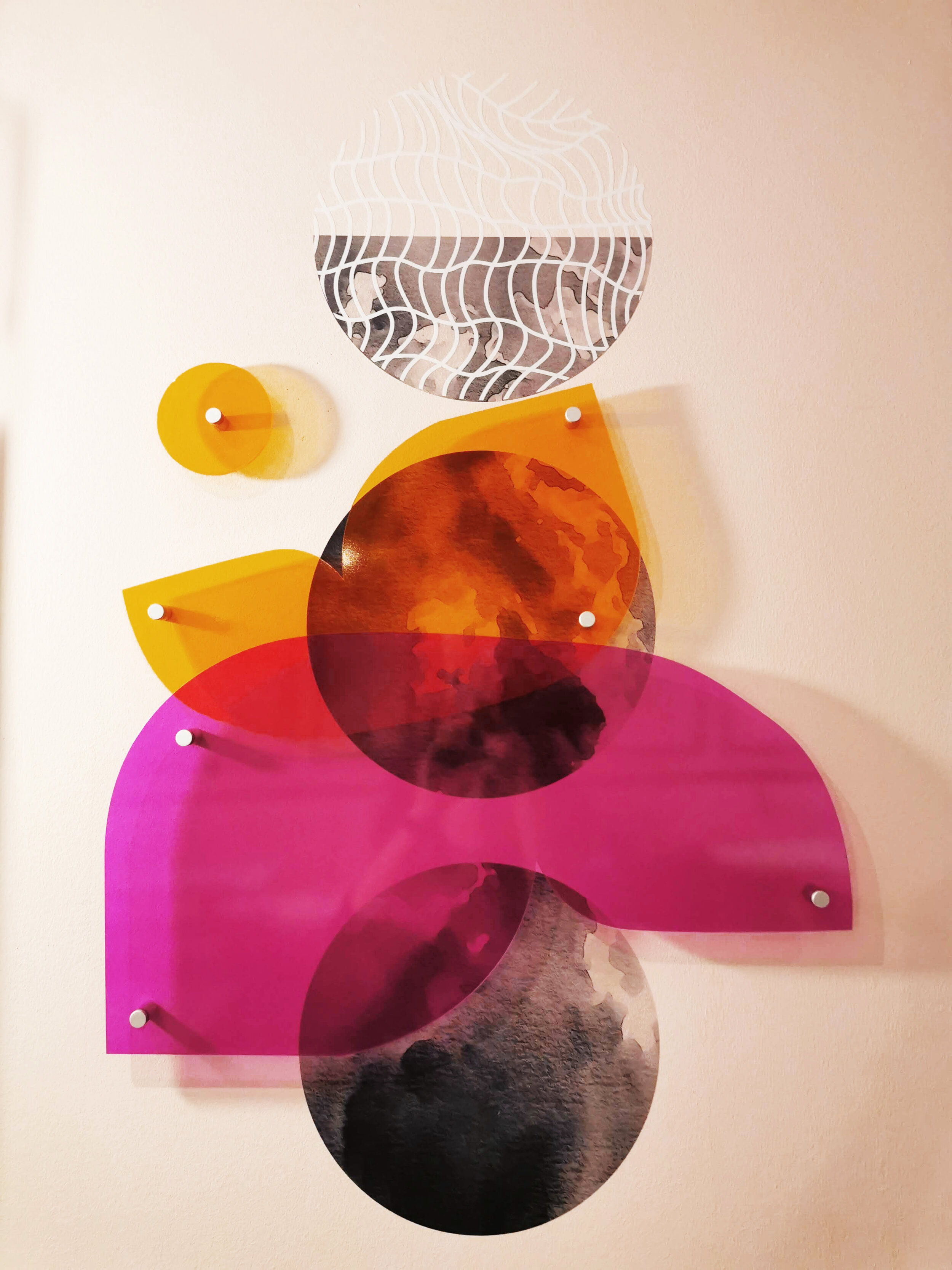
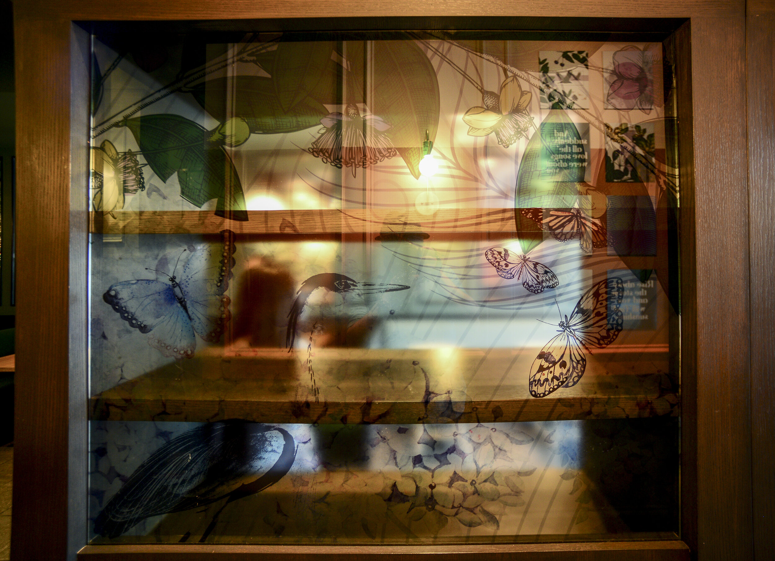
A detail unlike any other is the 4 custom layered art pieces. A big shout out to our amazing print and installer partner - JF Branding. They called the work here visionary, but didn't get scared away from making it happen. Each piece includes a layer of watercolor style art, a textured layer as well as multiple plexiglass layers held by stand-offs. These intricate pieces are very unique and special. The plexiglass forms are plant and animal-inspired but also leave some room for interpretation.
This art series is shortlisted by the the London International Creative Competition (LICC) - Nature’s Framed Layers

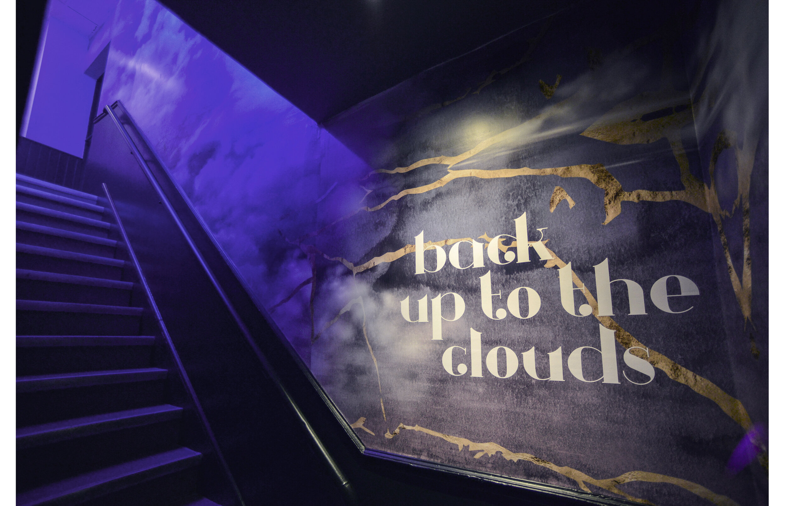
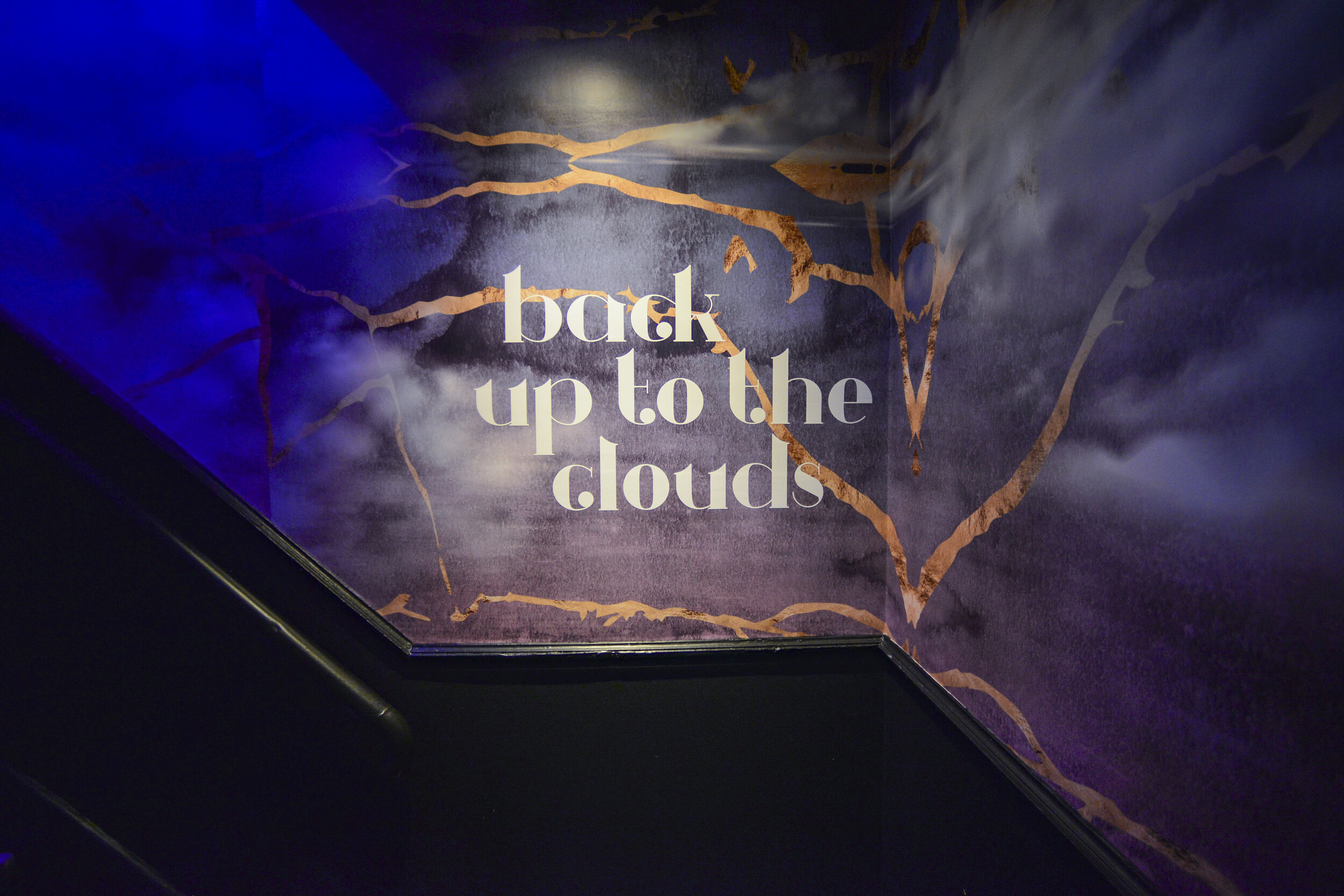
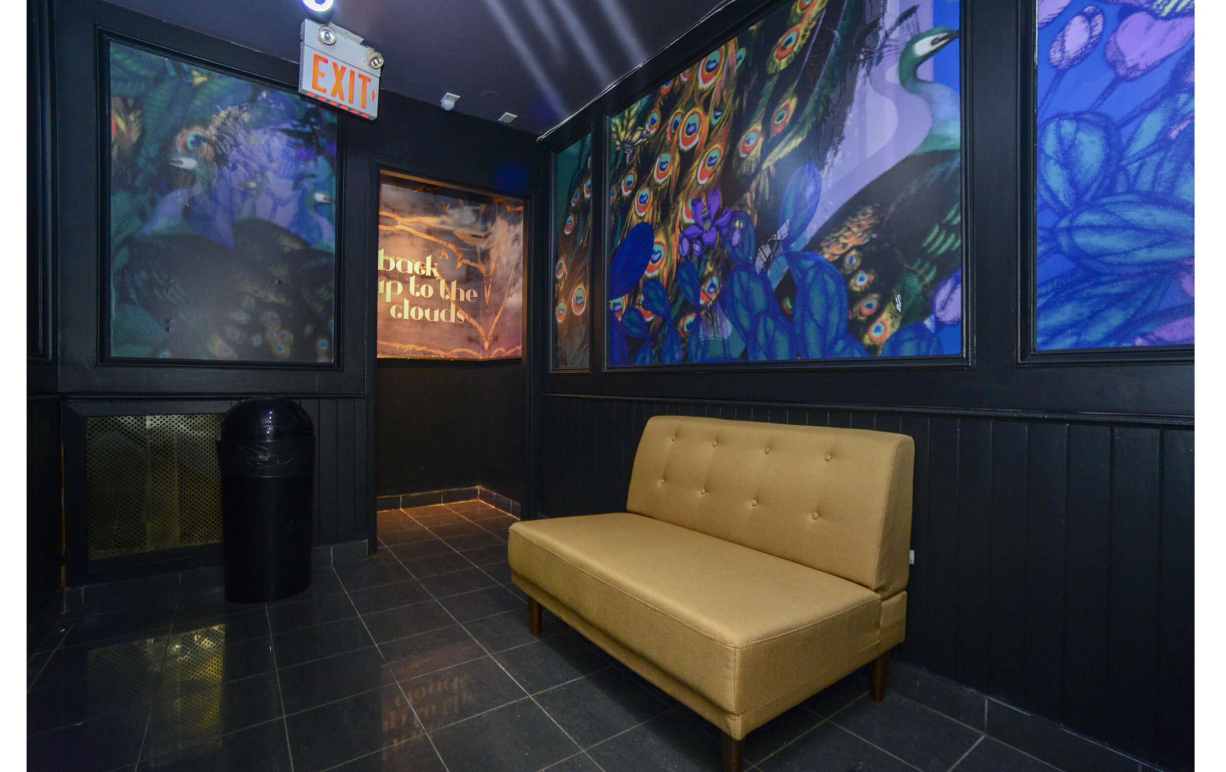
As for the restroom experience, we wanted to address the narrow, dark, and dull stairwell. Here we created a long piece with soft clouds and transitioning gradient colours, as one dives into the downstairs area where the luscious nature theme of the upper floor rooms are allured to in a surprising way.
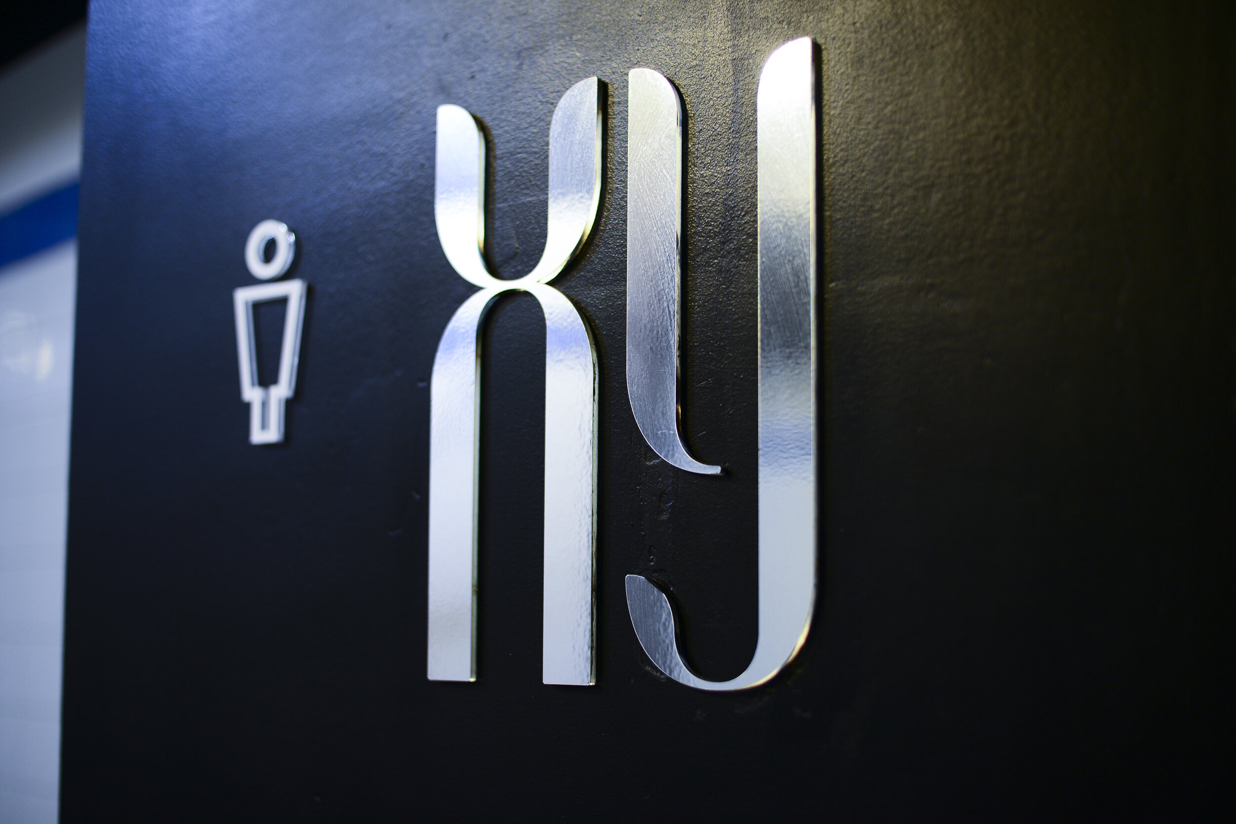
The plexiglass and vinyl material combination created a holistic feel and was also used for the signage throughout the restaurant.
We believe that all these details come together in a holistic way, with a sense of togetherness - making people feel inspired and enwrapped in this make-believe world, filled with emotion.
—-