
Cossara Summers Education Centre
Brand Positioning, Re-brand and Re-fresh
July 2019
It is essential for business owners to re-evaluate their brands. Sometimes, it is just a matter of stepping away and realizing that things are not working out - maybe not the right type of client is being attracted, or the service offering have changed, or, maybe, the competitors leapfrogged.
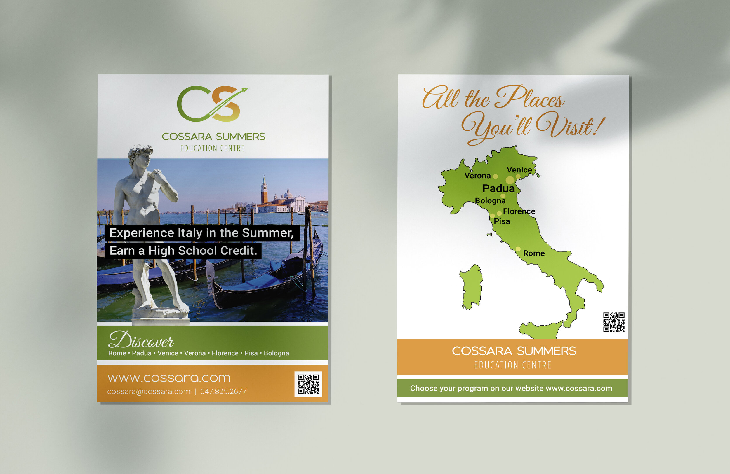
One of my exciting re-branding initiatives this year was work for a travel, summer education center for high-school students. Upon critically evaluating the existing visual identity as well as reviewing the consistency of the marketing materials, a re-brand was necessary to improve the brand's perception and appeal to changing high-school student demographics.
Upon defining the brand strategy, the following brand values were selected as the most important to guide the company's ideals:
discovery & learning, balance, care, quality.

New Visual Identity (above image to the right)
The new approach is based on the agreed upon creative direction of smooth, travel-feel, driven by movement as well as growth and positivity.
It was also important for my client to keep the feel of summer prevalent throughout. The changing letter thickness further speaks to growth and confidence, reinforced by the gradient colour change.
Visual Identity & Brand Standards
Basic brand standards were put in place to ensure the visual identity is always treated as it should be, with formats, spacing, colours, and fonts defined.

On-Brand Visuals & Marketing Materials Design
The most important communication piece for Cossara Summers was their flyer. While keeping the visuals the same, as requested by the client, a re-fresh to the design was done to introduce the new visual identity and strengthen the overall brand continuity.
A smaller, landscape, informational ad was also developed for a printed publication.
For more info about Cossara Summers, visit their website https://www.cossara.com/.

Before & After

Old Visual Identity Review
Visually points at changing directions, taking a step back; suggests to continue forwards on a lower level - go down.
It resembles the letter "Z" which does not related to the company name and carries somewhat of a negative connotation being the last letter of the alphabet.
The colours are bright and contrasting - creating an eyesore. Red and green are known to be a combination associated with pain and suffering.