
Consltek
Brand Evaluation and Re-Branding
May 2024
This project is a comprehensive rebrand for Consltek, a cybersecurity firm, to reposition them as trusted guardians of their clients' digital world. A new brand identity and strategic messaging were developed to resonate with their ideal customer and reflect their core values. The result is a complete brand system that communicates care, expertise, growth and simplicity.
(A snapshot of the original brand is included at the end to showcase the full transformation.)
ABOUT THE POSITIONING
The brand was positioned to appeal to experienced IT Directors, a demographic wary of impersonal service and motivated by a fear of making the wrong decision. With a small team and limited budget, their primary goal is to find a trusted partner to handle the complexities of tech security. The challenge was to create a brand identity that speaks directly to these needs and anxieties, positioning Consltek as a reliable, caring, expert partner.
To address this, a warm and professional brand persona was crafted - combining "the sage" and "the hero" to communicate wisdom, clarity and protection. This narrative directly addresses the customer's need for a partner who can confidently handle complex security challenges.

ABOUT THE VISUAL IDENTITY
The new visual identity is modern, logical, and progressive, with an asymmetrical design that suggests transparency and direction. The icon can be interpreted in several ways: as a labyrinth, symbolizing Consltek's ability to always find a path; as a magnetic force attracting the right solutions; and as a stylized representation of the letters "C" and "T". The name "Consltek" itself is a hybrid of "consulting" and "technology," and the new wordmark reflects this while aiming to make the name easier to remember by breaking it into two words. "CONSL" is set it a bolder weight to emphasize the consulting aspect that elevates their technological offerings. The wordmark is set in the clean, modern sans-serif font, in all caps to convey simplicity and authority.
Brand Visuals & On-Brand Applications Design
A cohesive system of secondary visuals—including unique graphic shapes, clear iconography, and professional photography guidelines—was created to ensure brand consistency. This comprehensive toolkit ensures that the brand's persona as a stable and caring partner is reinforced at every touchpoint, from business cards and presentations to a new website landing page.

Website Landing Page UI Design
COLOR PALETTE
The color palette is a sophisticated blend of warm, reliable browns and a logical, trustworthy deep blue, accented by softer, nature-inspired hues. Colors like Honey Brown (reliable, solid, safe) and Aegean Blue (logical, intuitive, orderly) were chosen specifically to evoke a sense of calm and stability, reinforcing the brand's promise of providing security and peace of mind.

Presentation Tempalte Design


Before & After
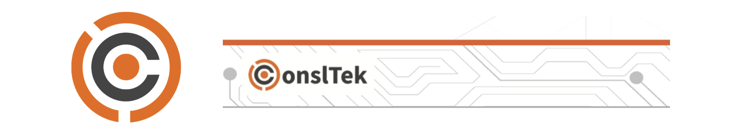
IDENTIFYING THE NEED FOR CHANGE
To begin the project, I conducted a brand audit which revealed that the existing Consltek identity was hindering its ability to connect with customers. The logo and wordmark felt disconnected and were difficult to read as a cohesive unit. This lack of unity was compounded by a limited color palette and widespread inconsistency across all secondary visuals. The brand used a conflicting mix of graphic shapes, icons, and textures that created a confusing visual language. The goal of the rebrand was to solve these foundational issues by creating a unified, professional, and engaging identity system from the ground up.