Bridgeport Visual Identity
September 2016
I was approached by the start-up owners to create a visual identity for them as well as a colour palette.
The main value proposition behind the company is to ensure pharmacy owners retire with a peace of mind. Bridgeport - as a name - was chosen by the owner. Through my visual exploration, I avoided medical references (as requested by the company owners) instead focusing on growth, clarity, stability, and trust - as the leading principles.
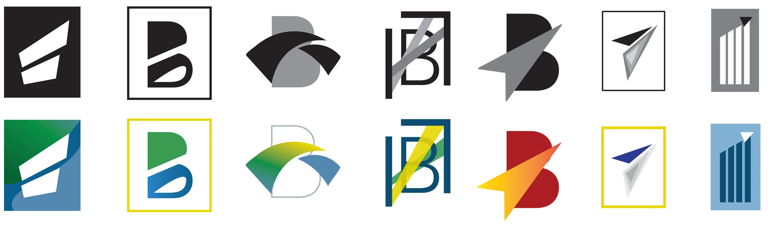
Initially, I presented them with various word-mark options, while in the next stage, I explored more abstract, logo-like approaches, as recommended by the owners.

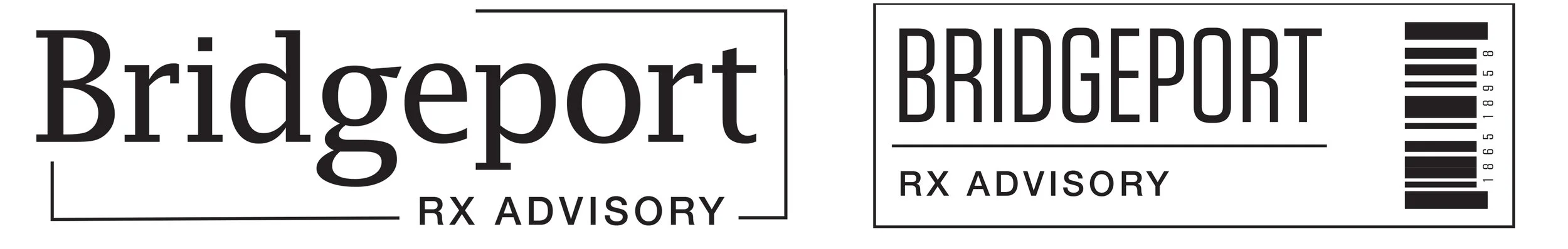
Final Workmark (below descriptor was used to help explain visual decisions)
- “Bridgeport” is written in a slab-serif font named Candida. This category of fonts is known to enhance a sense of trust and security.
- the descriptor/tagline is written in a simple sans-serif font, addressing security, legibility, and complementing the main font.
- line elements connecting the wordmark with the descriptor/tag represent the idea of the company connecting, making sense, aligning interests - being full service, with a holistic approach.
- angular line elements framing the main word-mark also touch on the idea of a company polishing their client’s work (for a presentation), as well as developing a strategic plan.

Application of Visual Idenity to the Website
Below, find various visual identities explored in the process.